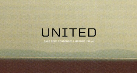
United by House Industries has been my go-to typeface over the last few semesters. It is a massive family — 105 total fonts (three styles, seven weights and five widths). This variety makes it an incredibly versatile collection. I really hate it when I find a typeface that I love, but find it missing a crucial weight or style. (DIN for example — would love to be able to wield more styles). United does not have this problem. I’ve used it on many projects (a few you know; ISO50 EP, Mega Cities book) and in each case the variety allowed it to be implemented in a unique and effective way.
I discovered it a long time ago while searching for the typeface used in a Nike ad (can’t recall which one, but it was amazing). I don’t actually remember if United was employed in the advert, but if you spend any amount of time searching around the typography of the sports world, you are bound to come across United at some point (Fox, I’m pretty sure, uses it for in game football graphics). There is an obvious resemblance of a few of the weights to a very collegiate look, which might be a turn off for some people, but the rest of the styles make up for this ten fold.
The most exciting part for me has always been the fact that each style has five different widths. I love condensed or extended widths and it’s nice to find a worthy competitor to the standards (Univers, Trade Gothic etc). When you need an extra touch of personality, especially if the project skews toward the technical or urban, United does the job nicely.
I don’t know many other designers (at least at school) that use it regularly and I thought I’d spread the word a little. Finding a new typeface is always pretty exciting, so hopefully if you haven’t tried United before, you can give it a shot and experience the sweetness. Anyone else have any hidden gems? I haven’t come across a new super typeface in a while — would love to hear about what people are unexpectedly enjoying these days.


House Industries is an amazing foundry. I use their Chalet typefaces a lot, for the same reason you like the United family (broad selection of compatible/complimentary weights and styles).
I am a huge fan of the Swiss 721 family. Clearly they’re a Helvetica spin-off, with the same clean taste and versatile talent of the Swede. Working in as the presentation graphics coordinator in an architecture firm, it comes in ridiculously handy! from dimension call outs, to big bold titles.
For awhile I really abused Interstate. It’s great at smaller sizes for buttons as well as headlines, good variation. I also am very fond of Helvetica Neue and Signpainter and have used them time and time again.
I’ve been a fan of H&FJ’s “Knockout” for a little while now too. It has lots of personality and all the weights/styles:
http://www.typography.com/fonts/font_overview.php?productLineID=100013
I’ve been frequenting ‘Unisect’ and and ‘Community Service’ quite a bit in the last 2 years and have also been very pleased with anything YWFT delivers.
seen here: http://www.youworkforthem.com/product.php?sku=T0022 / http://www.youworkforthem.com/product.php?sku=T0007
Loving ‘United’ as well. I’ll surely have to grab that sometime soon.
although I must admit, sometimes the YWFT fonts do leave me hangning a bit in not having those few weights and styles I need…
Dave, good call on Knockout. I had the set at an old job and used it frequently, but sadly don’t have it anymore.
Thanks Erik – Interstate is a go-to for me as well. In fact, as much as it’s so common these days, the letter forms I like best in Gotham are probably because they remind me of Interstate! (All caps, at least)
Dave – I agree about Knockout as well, amazing family. Ever since the NYT Magazine started using it for headlines, I have been experimenting with it as well. The only thing I don’t like is the titles — I can just never remember the difference between all that boxing terminology haha.
Erik – Interstate is a great one, and a free download if I recall, which is always nice. It’s amazing how different the pricing is across the board for font families. Either it’s free…or it costs $700.
Definitely a big fan
Thanks for the tip, I will have to check it out. I have somewhat of an addiction to House Industries’ Neutraface. I just can’t let it go.
I love House Industries as well. I often use Neutraface which I think is amazingly beautiful. I use all the classics as well but there’s something about this typeface called Miso that I just seem to love so much. Im not the biggest fan of rounded typefaces, and I know it’s not perfect, but Miso just seems to work.
http://www.omkrets.se/typografi/
all this is awesome, but some people switch to make her own fonts http://fontstruct.fontshop.com/ here is a link where they can make it, is something nice and a diferent alternative.
I’m a fan of United but I gotta say, I’m with Ramun here, kind of a Neutraface diehard also. I’ve been meaning to try out the Neutraface Slab face for something (along similar lines to some of the United faces) but haven’t had the occasion yet. Has that great structural quality that United has. Some of the Chalet family is really pretty too, but I haven’t used any of those for any real projects for a while.
Check this out:
http://www.klim.co.nz/karbon_samples.php
It’s a bit more European than some of the mid-century sans serifs mentioned here, but FF Dagny has a unique grotesque quality like some of the others mentioned and is certainly too new to be overused anytime soon.
On the warmer side, more like Knockout (which I’ve loved for years), have a look at Maple, Bureau Grot, Titling Gothic, Parry, and the work of Jim Parkinson, who captures 20th century American gothics better than anyone.
I attend the University of Delaware and I am extremely fortunate to have two members of House come teach a course twice a week. Let me just say from the few weeks I have met them and seen them teach, they have insane skills in typography and being able to teach it to others, and I am happy to see their recognition on my favorite Art blog.
Robert, thanks for the link to Miso. It reminds me a little of DIN (which I love). I really look forward to having an excuse to use it. Thanks!
If you like Miso you might also dig FF Netto.
Love that face.
Anyone who appreciates DIN, will love Akkurat.
I know this post is like a year old, but I love this typeface, and SXSW is using it in their 2011 branding. Looks beautiful:
http://sxsw.com
The extended weight reminds me alot of Helenic Wide, which I’v been meaning to get for a while, but don’t have the $$$ right now.
United is also the face we are using in a video game currently under development called Jam Party. http://jamparty.com
There is alot to be said about the typeface. I love to use this though. I heard that the rates advertising agency in albuquerque is going to be using this typeface as well.