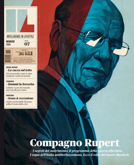
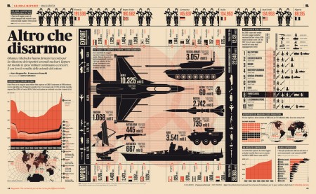
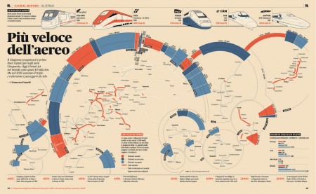
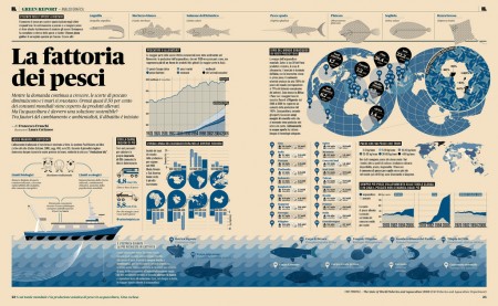
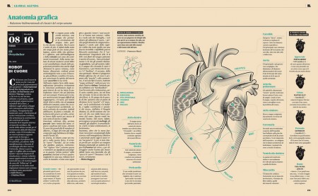
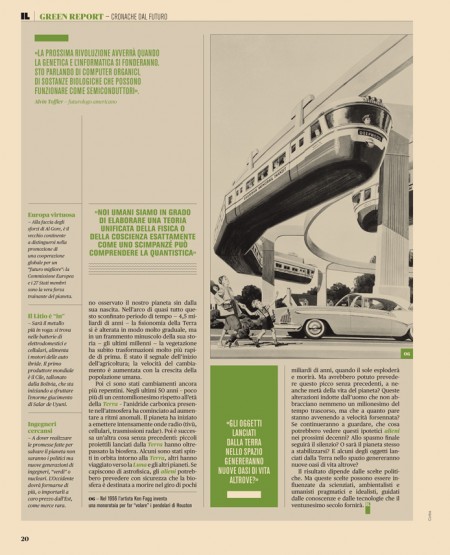
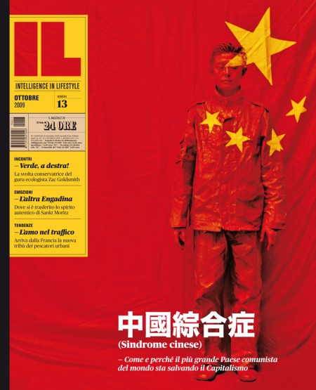
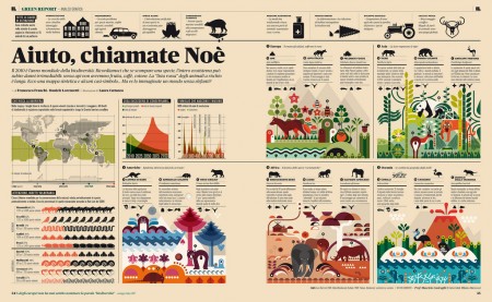
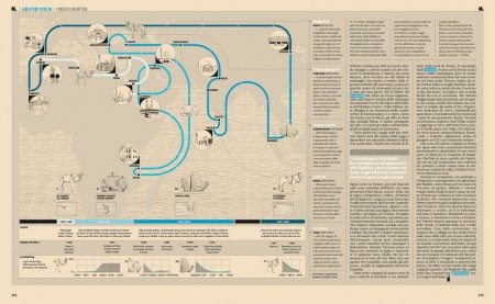
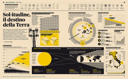
Intelligence in Lifestyle magazine is the new holy grail of infographic greatness. It is a high-end Italian magazine aimed at men. The magazine is equipped with a beautiful design by the art director Francesco Franchi and the creative director Luca Pitoni.
For some of us, getting ahold of the magazine could be difficult. However, several several of the layouts from the interiors spreads and covers are archived on Flickr. Check out the larger sizes, they may compliment your desktop nicely. If in case you’re wondering, the magazine utilizes Publico, a serif face that fits perfectly into the design is much less ubiquitous than say Helvetica or Archer.
On another note prior to being introduced to this magazine via Colorcubic, I was starting to become overwhelmed by the amount of infographics being pumped into the designosphere. Infographics about infographics were being designed for crying out loud. It just seems like it has become trendy very quickly. It’s not to say its a bad thing, but it sure makes me appreciate great design like in this magazine or Nicholas Felton’s works more than ever before.
I’m curious to hear what your thoughts are on this topic.
Do you feel there is an influx of infographics and is it a good or bad thing?
Design trends usually reflect current technology. So I think, given our obsession with mobile devices, social networking and apps, info-graphics appear to be the most complementary interface. Personally, I love watching it evolve. Sure, many attempts turn out looking horsey. But there some that inspire for a long time. One of my personal favorites is the opening sequence of Stranger Than Fiction by Kansas Cities very own MK12.
http://youtube.com/watch?v=9iWbAw-L1lg
I went straight to ebay italia and bought the only issue that was on offer there 😉 sorry guys!
There definitely seems to be an influx of infographics lately, and unfortunately many do a very poor job of representing information in a way that makes it more useful than plain-text would be. This article has a great take on the subject: http://mrgan.tumblr.com/post/551212989/another-much-linked-chart-this-one-deemed
I appreciate when well-designed graphics and charts are simple, obvious to interpret, and augment the text in some way (or replace it entirely). Graphics which are aesthetically pleasing but difficult to understand are not useful — except in the sense that they might make a cool poster 😀
By the way this magazine looks like it makes great use of infographics — I can’t read italian, but they are visually interesting and would lead me to read the text if I were able. It’s like “come for the pretty graphics, stay for the text.”
badass. that is the kind of stuff that justifies spending hard earned scrilla because not only does it looking amazing, it’s the type of thing that you can sit with for a good while and just get into.
I love this work from Francesco and his team at IL. I got my hands on the first two issues and it’s beautiful stuff.
Infograhics have been popularized but a lot of what I see is without much substance. Some of the worst I’ve seen are the Good Magazine ‘Transparencies’. They are build around illustritive ‘chart junk’ (see Edward Tufte) that only makes them more confusing and sometimes misrepresentative of the info. It’s good to see such solid work in IL.
@keenan If you have a way to upload pictures of the magazine, that would be awesome!
Well said. There are so many infograph’s out there right now that lack substance. It’s just like the thing that happened months ago with taking photos of your work and showing hands in the picture ex http://hellopostershow.com/images/hello_home.jpg.
Once again its not a bad thing but once it hits the trends then it immediate over popularizes itself IMO. I do wonder why it eventually died down. Maybe it was because of the other graphics made telling people to cut it out and just show the work…
From a freelancer point of view I know how much information is crammed into a typical infographics project. Considering the amount of information they’re obviously working with, I think they’ve done a terrific job at creating very well thought out dimensional work.
I don’t think these particular examples are overdone at all.
All I’ve got to say is http://www.flickr.com/photos/philgyford/4505748943/sizes/o/
I had thought the typeface was the same as Vancouver’s “Stay Local” maps http://staylocalmaps.blogspot.com/ which myfonts told me was Caslon. Can anyone point up the difference between Publico and Caslon for me?
Oh wait, maybe given the helvetica comparison you were referring to the sans pullouts. Sorry.
The Helvetica/Archer mention was just a statement of how Publico is far less used than say Helvetica or Archer (the two very common choices used in a lot of design today)—no problem. I haven’t checked out what the sans faces are just yet.
What a refreshing header, completely free of infographs: http://3.bp.blogspot.com/_GmUeYsRZBzs/S2uJgkh_C3I/AAAAAAAAApM/Tsz0-P7ovEk/S1600-R/staylocaltiltheader.gif
This magazine is beautiful! I like that quote from Kyle’s link “Information doesn’t care; the designer has to.”
I think the trend can be ridiculous, but at the same time, every now and then, something really inspiring shows up. And I think all the infographics-mania comes from designers being really inspired by the good stuff.
In the same way that the design trends follow technology (as noted by a previous commenter), I think think they also respond to a need to make sense of currently prevalent information. Infographics, to me, seem to be an attempt to give more form and meaning to our current state of information overload. Unfortunately, the numberporn itself becomes an excess of statistics and whatnot, and at the end of the day we have to ask, no matter how beautiful, why should I care whether Blogger Jones ate 19 Big Macs in 2009? My guess is that we don’t care about what the numbers are saying so much as how they’re being said.
T
Beware: opinion and conjecture below.
Yes, there is an oversaturation of infographics. But is such an overflow good or bad? Neither. Is it annoying? Yes.
There will always be a diamond in the rough. Art, be it pointless and trivial or meaningful and full of substance, serves to inspire, albeit to varying degrees.
We need this output, not simply for inspiration’s sake, but for advancing our own process and value of infographics as art.
Basically: The bigger the rough, the more diamonds there are.
I dunno. All the charts look incredible from a design perspective but I feel like having an anxiety attack looking at them.
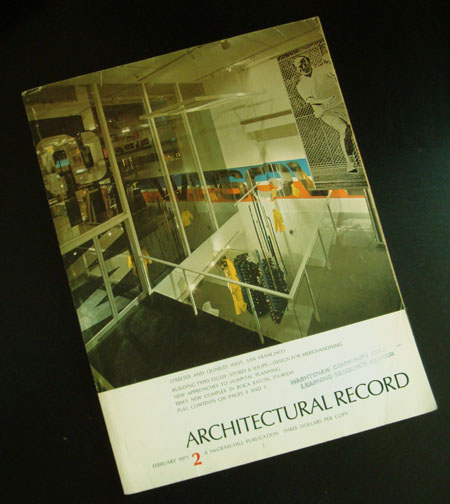
Haha, made me laugh @Scott. I also agree with NAVIS to a certain extent. I can appreciate these info graphics, but what really interested me in this post is the first cover…Love it! When I look at info graphics, I rarely actually read into what they have to say. I usually just look at the layout. If there is actually that much to say, I’d rather just read it in a traditional “article.” If that isn’t achievable due to an overload of statistics, then I’m not interested.
Agreed. Infographics have evolved from a legitimate attempt to make complex data interpretable into an excuse for producing beautiful but equally complex graphics. If the reader is wowed but not actually helped, the designer has failed.
Does anyone know if it’s possible to subscribe this magazine here in the States. I’ve been scouring the site looking for some answers, but I haven’t been able to find this specific magazine.
There are literally dozens of magazine to choose from but as this was referred to as a companion mag, is that the only way to obtain it? To subscribe to the actual newspaper?
@Sam
To the best of my knowledge you would have to obtain the actual newspaper to get the magazine—totally a shame but the newspaper itself could be interesting in itself…if they’ll even send it to the US.
I’m curious as to why this magazine is aimed specifically at men, and not intelligent people in general. The themes seem generic enough.
Info-graphics for the sake of info-graphics are annoying to me. When they are created for a purpose, they can be very inspiring. Either way, I respect designers who are able to arrange a massive amount of information and create a visually-stimulating representation. I’m well aware of the time and effort involved, so I can definitely appreciate them.
Yeah, the infographics look awesome, but I just don’t get “infographics for the sake of infographics.” It feels like people are celebrating the tool that is being used to communicate instead of focusing on the complicated yet important information that is being conveyed.
You forgot to even mention Luca Pitoni, the Creative Director of the Magazine. Franchi’s doing a great work as an Art Director but not mentioning Pitoni seems a bit unfair to me.
L—I appreciate you bringing Luca Pitoni (yourself possibly) to my attention, I wasn’t aware previously. The post has been updated.
No, I’m not Pitoni, although my first name is the same. =)
this is the website of the studio that designes the infographics: http://www.latigre.net/
I don’t think so. They probably designed some infographics but not all of them, as the magazine usually hires freelances (graphic designers/illustrators) for this kind of work.
If you check Franchi’s Flickr you’ll see the credits for each infographic he publishes there.
I agree with Brennan. Design should serve its function. When design that is its own function masquerades as informational, it feels dishonest to me.
Do you know what are the dimensions of IL?
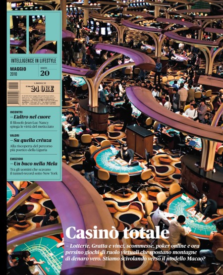
Any idea who took the photo of that casino floor? That’s stunning.
Sweet, a magazine of infographics.
/killself
Hey, extremely good website. We actually discovered this on yahoo, and im happy Used to do. I’ll definitely be returning…
grazie mille per questo omaggio, devo dire che comunque queste infografiche sono nate dando uno sguardo a Wired (rivista tra l’altro fondata da uno statunitense di origine italiana).
Devo dire che oggi giorno è difficile creare qualcosa di davvero originale… comunque “IL” è un ottimo settimanale devo dire.
ciao a tutti