Those who have been following along will know that we’ve been talking about doing a color management guide for a while now. Well, it’s finally done and should go up early tomorrow morning. I’ve always been annoyed that there really aren’t any consolidated, plain-english resources out there for getting your head around color management so after talking with Alex, we thought it was time to put our own together. Over the past couple years I’ve begun to focus more and more on proper color management in my workflow and with the recent addition of the Epson 9900 it’s become even more important. After Alex and I worked through the the process of getting the 9900 online I figured it was finally time to put all that we had learned into a post as a reference point for others who are struggling with maintaining color integrity in their work.
We put this guide together because whether you are designing for print or web, it is important to have a good understanding of color management to ensure that your image looks the way you intended it once it leaves the confines of your computer. After considering the many factors that go into this process, Alex has written a comprehensive guide to color managing your documents from concept to finished product. We certainly aren’t billing this as the definitive manual for color management; it’s intended to be a working guide, a condensed set of essentials based on our own experiences working with various printing companies and our own equipment over the years. To help with the finer points, we enlisted color expert Kirk Economos of Meridian Cyber who has helped edit the guide to make sure everything is correct and in line with accepted industry practice.
So stay tuned, you should see the guide pop up here shortly.


hey scott, have u calibrated your macbook pro? if so, what software/hardware did u use?
All your articles are amazing but this one should be (one of) the best. Can’t wait to read about color management from people that share the same interests with me.
I am currently researching for a large printing machine too. I wonder if you are satisfied with the 9900. It does seem really good but I wonder how it feels when you really use it on a day to day basis!
Keep up the great work!
looking forward to this since i got an epson 3800 recently and printed colors are a bit off when i print.
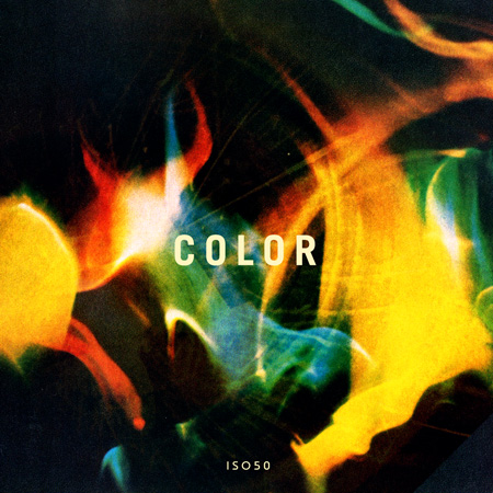
Looking forward to this immensely. totally off topic but what font is the word ‘color’ in on that graphic? I thought it was DIN but evidently not.
This sounds interesting nearly every project i do something goes wrong with the colour and i have to edit reprint again and again so it will be nice to have something to refer to while working on a project….. and to use while looking over what went wrong in the last project!
Thanks guys this should prove to be very useful for design students like myself who are not used to working with printing companies.
Looking forward to reading the guide!
Your image for the COLOR guide is amazing. All of that yellow and orange on the dark background just sucks me in!
Awesome! I’ve been waiting for this for a while.
Siick image. I love learning what you guys have to offer, even though the kind of work you do is completely different from what I do. Can’t wait.
thank GOD.
it’s a bitch to get that stuff straight without anyone saying “look, here’s your best choice.”
so, thanks in advance.
Hey Scott and Alex.
Thank you so much. This will be a much needed ressource, for all of us trying to learn. Looking forward to reading it!