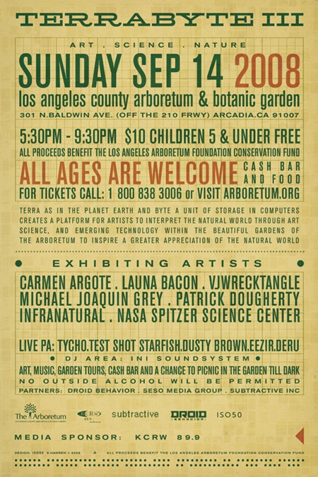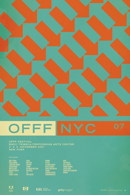
A while back Computer Arts magazine asked me to write an illustration tutorial for an issue which focused on textures. The idea was to revisit the classic Bob Dylan Blowin’ In The Wind / Mister Tambourine Man poster. I really enjoyed the project and ended up using the resulting image as the basis for my Progress Austin concert poster. Computer Arts has made the entire article available on their site as a PDF which you can download here. They’ve even made the original source files available so you can follow along with the tutorial. If you have any questions feel free to post in the comments and I’ll try and fill in any blanks.
Here’s an excerpt from the introduction:
“Creating eye-catching imagery for print can be a balancing act between the two distinct worlds of computer-based design. Scott Hansen shows you how to get explosive results in Photoshop…
The strengths and weaknesses of vector and raster graphics have long been apparent: vector is known for its clean lines and resolution-independent scalability whereas raster has a more photographic nature. Although vector graphics are particularly suited to print work thanks to their scalability, there are some things you can’t do without bringing rasters into the picture.
In this tutorial we show you how to bring together both vector and raster elements to create a seamless piece that sits well in both worlds. The concepts we explore will lend a timeless, weathered feel to what would otherwise be a rather stark design. Relying on Photoshop’s powerful raster tools and quite adequate stable of vector tools, we can tap the strengths of both without leaving the familiar realm of Adobe’s most powerful graphics app. We can unite two styles of design by employing Photoshop’s powerful blending mode options along with advanced gradient masking techniques to produce an illustration style that is truly unique.”


Yeah, I found this a while ago when looking for more of your old work. It’s great, thanks! Another cool resource is the Layer Tennis source files, even if there was a rushed time limit.
Anyway, thanks for these, and I can’t wait for #2 🙂
I remember this tutorial. I bought the issue of Computer Arts magazine when it came out. It’s quite a coincidence cause I know you used a tape texture to achive the stripe effect in the top left corner and just yesterday I released free high resolution textures of sticky tape as well as a photshop brush set. They can be downloaded here: http://www.fudgegraphics.com/2009/01/sticky-tape-free-hi-res-photoshop-brushes-textures/
Sorry for the self-promotion but I figured these could come in handy for anyone who wants to follow the tutorial.
Great, I was asking about a tutorial like this a little while back and here it is. Thanks a lot!
Thanks to Franz too for the resources!
Thanks Scott!
Great post Scott. Thanks for some insight into your work flow.
I met you at that Progress show and talked to you briefly asking about design and how it tied into your music—I’ve kept that signed print ever since—and I just recently finally found a frame for it.
Always inspiring, thank you.
sweet…
really great work!
Thanks a ton…. I’ve always wondered how you go about your work. Truly amazing stuff. Any chance you could post other tutorials?
Thanks Franz for the resources
Thanks, I’m excited about reading this!
Nice! By the way, what is it about Dylan’s hair that inspired all of these design riffs? I’m thinking of Milton Glaser’s famous poster too. http://images.businessweek.com/ss/06/01/milton_glaser/image/dylan_poster.jpg
Although I like this “blowin in the mind” one better.
Best post ever! They don’t teach you this stuff in school…
Harley: where can one find the Layer Tennis source files? I couldn’t find them on the Layer Tennis site.
Thanks to both!! This post made my day.
thanks! love your work, it will be interesting to get in your head a little.
Hi there Scott, so thanks for your deal, and well I obviously got this tutorial time ago, I have many inspirational issues from you. But let me say, some time ago, before you released this tutorial in C A mag, on this mag you have released another tutorial inclusive this was more extensive than this tutorial, so the question, is any chance to you can deal this first tutorial in CA mag? let me say that when I saw the tutorial on the magazine, nonwise who are you, and after when I already knew who are you, oops I ran to get the mag, but too late, I never could get this issue.
Sorry my english, Im spanish speaker, im just trying…
All regards!, and have a great one.
thanks everyone, glad this could be of use… I have some more tutorials I will be posting up periodically once I get clearance etc. the next will be monitor calibration.
Yeah, I found this a while back and still haven’t gotten around to going through the process. Looks pretty solid from what I’ve read though.
Can’t wait for more.
Sweet man! I remember picking this one up!
This is what I call value! Thanks a lot man. I just downloaded the files and will check them out tomorrow. Also, very much looking forward to your tut on monitor calibration. That’s a science in itself 😮
Thanks for posting this up, I’m surprised to see how my own style intersects with your own, and then how it differs.
I used to take a very long-handed approach to vector shape creation in Ps, but I’ll start using the path selection tool to make things easier. I have only recently begun to employ layer masking, gradient masking a little less, but that will also help keep things cleaner and more efficient.
Layer Blending has added a lot to my design work, I use mostly multiply and screen blending modes, but color and linear dodge have a tendency to completely change the design direction in great ways.
Looking forward to the next lesson, if color choice is an art, Joaquim is right, calibration is the science.
Great stuff! Thank you so much for recognizing the value of sharing wisdom… ~Sean
Thanks Scott! It’s amazing to see how you work 🙂
I hope to see more soon!
ka
Hey, great – I’ve actually got this particular issue of CA Projects, it was my first Computer Arts magazine ever I had bought 🙂
To be honest – this is how I found about Scott in the first place!
the crazy thing is that I have that issue! you do such great work.
I don’t know but I have a hard time beleiving that you don’t use illustrator in this workflow.
Thank you Scott. Thank you.
Hey, sorry, but I can’t open the pdf for some reason… it says “attempt to call a method that has not been implemented”. Do you know what this means?
Hey Scott,
Awesome Tut. I feel like I am missing something however in regards to the watercolor splash and the color burn blend mode. I have tried using a few different brushes of varying grayscale percentages and cannot seem to get that luminous effect you get in your tutorial.
I briefly tried with a bit of color applied to the brush but had no luck. Any insights as to where I might be going wrong?
Thanks!!
What’s the license on the source files? Can we use the textures for our own work (ie royalty free), or is this purely for edutainment purposes?
Cool tutorial! I am definitely going to try this. Thanks
Great work , thanks for sharing !!
The pdf download is not working right now and I’d love to check it out.
neil ashby was also inspired. his album cover for thievery corporation is stunning. http://www.designerid.com/portfolios/p/pi/pinnyblue/cosmicwithFAKEsticker_med.jpg
Very open and informative.You have beautifully presented your thought in this blog post.
A fantastic presentation.
Hey very nice post!! I will bookmark your blog and take the feeds also discovered almost all peoples will agree with your post.
The download link doesn’t work anymore. How can I get it?
This comment is to reply to Chris. He needs to ‘command’ click or ‘right’ click on the link for the file downloads and select download linked files. Then the .zip file downloads. If it is a PC then he needs to select ‘save target as’ and to the desktop.
Chris buddy, you should be good to go with these instructions.
nathan
Nevermind, it didnt work for me either.
So can you get the attachments link back up and running please, thank you!
nathan
I am linking this webpage from my private weblog . this has all of the usefull data necessary.