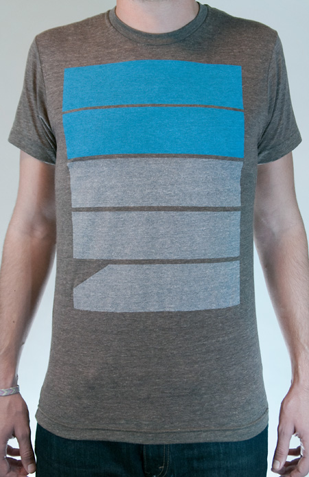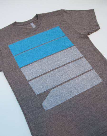

A new shirt design is now available at the shop. Five’s is printed on American Apparel Coffee Tri-blend and available in Men’s and Women’s sizes.
ISO50 Fives Tee
10.25.2010


A new shirt design is now available at the shop. Five’s is printed on American Apparel Coffee Tri-blend and available in Men’s and Women’s sizes.
Comments are closed.
Looks Beautiful, Scott. Nice job.
Great design! Check out my “Modern” tee. http://www.obscuritees.bigcartel.com/product/modern
Thanks for the new shirt Scott! Unfortunately it’s your weakest design yet. But I suck overall as a person and can’t make up my mind about anything.
Disagree with Dude, it’s simple and bold.
Dude probably wears Ed Hardy T’s
@Chris ha!
I saw it @ Merchline, looks even better in person, loving that blue
I don’t get it 🙁
It looks nice, but I don’t get it. Anybody care to explain?
Not to sound obsessed, but I’ve been waiting for this day. Only request: please make a long-sleeve version! Winter’s a comin’ baby!
@Landon we have something in the pipeline.
@NEOKEITARO the point of alot of the shirts designed by many people is usually to make something the designer would want to wear, so yeah I guess thats the point
@JAKUB
Well, I love the design and I sure wouldn’t mind wearing it (postage fees kill me though…), I was just wondering if the design meant to be completely abstract or if there was anything behind the shape else than an aesthetic consideration.
Sweet! Thanks for the update, Jakub. These shirts are literally the only thing I wear these days – haha!
I’m also curious behind the design of this one…
Jakub’s right, I usually just try to make a shirt I would wear. This particular design says “57”, but the meaning doesn’t really go beyond that. I like to play with letters and numbers in a sort of arbitrary way, just relying solely on their aesthetic value.
DUDE (jon?)-
Thanks for the critique….but it’s always interesting to me when people who normally comment on this blog as themselves decide to go anonymous for critiques. I enjoy your work, so would have made the criticism all the more valid knowing the reference point that it came from.
I like it, it is very subtile. Also I think design is really all about accuracy and detail, which in this case you see in the colour choice and the placing.
It’s nice, playfull and suggestive.
I might buy one, but the shippingcosts make it pretty expensive.
Still waiting for the 79 shirt..
Dig the chunky color block, purchased… picked up ol’ 77 too.
@JAKUB I second @Landon’s request. A thermal version of this design will be the best for the cold weather approaching.
@Scott way to take the high road… I applaud your commitment to your design style and vision
dude, somebody feed that kid a sang’which. I don’t think he’s had a full meal in 6 years…
“SYV” in coffee is without a question my favorite shirt in my wardrobe and I have gotten countless compliments on it. Something that is somewhat rare for a non-“graphic” for lack of a better word, tee.
I’m sorta torn on this one.
I like the design on this, however the transfer to apparel is somewhat awkward looking. I don’t know if it’s just placed too high up on the shirt or what but it’s almost claustrophobic.
I hope to see more additions (not just shirt type/color, but new designs).
The blue on grey is vibrant, and that’s nice. But come on guys, you’re designers. This isn’t much better than Illustrator 101: How to make a rectangle, and you’ve already covered that with your “SYV” shirt. Seriously. Sorry, but it had to be said.
i like it, especially the blue.. i’m waiting for 81 or 87.. curious what you would make of those
loving this. i like it it carries the theme of syv over to another shirt. will there be more like this? if so, i’d like a 75 or an 11. thanks! haha. excellent work.
whooohoooooooo FREE CANDY TOO!