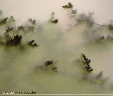

Stereogum asked me to design a cover for their latest tribute compilation. Entitled Enjoyed: A Tribute to Bjork’s Post, the collection features covers by the likes of Dirty Projectors, Xiu Xiu, and Atlas Sound to name a few. You may remember the post about Drive XV, the REM tribute, this is the follow up to that release.
In the spirit of the tribute album, they asked that I base my cover off the original. I really enjoy this sort of work as it’s a lot of fun to approach an existing composition and try to see it from another perspective.
Below is a taste of what’s in store. Check it out then download the full album for free from Stereogum!
[audio:hyper.mp3]


Dang! that is really super Scott!
Stunning work Scotty.
Nice cover also, Bjork’s songs are fun to play with.
Welldone!
I just didn´t understand why there´s not a Tycho Tune in the compilation.
Totally off topic here:
The documentary about your workshop in Stockholm is now on YouTube:
Part one:
http://www.youtube.com/watch?v=5ZWhfA2ZPis
Part two:
http://www.youtube.com/watch?v=CxvV2ceuPR8
I know, there’s a lot of traveling in there and not so much of the actual workshop, but I guess it would be interesting for some people to hear about Scott’s workshop in Stockholm from this perspective 🙂
Enjoy 🙂
Oh, just some quick viewing tips:
Part one (04:07) – A beautiful view of the wing of the plane bathed in red light from the rising sun, as we land in Arlanda, Sweden. Music: Tycho – A Circular Reeducation [feat. Jianda].
Part one (05:40) – Psychedelic sequence as we walk through halls of colored glass at Arlanda Airport. Music: Boards Of Canada – Ready Lets Go.
Part two (00:41) – Footage from the workshop. Music: Tycho – Red Bridge.
Part two (05:11) – Takeoff. Music: Tycho – Dream As A Memory.
Very pretty, nice use of color, aligns pretty well with Bjork’s style of music too I think. I also like the titling, it’s unobtrusive and is logical in terms of placement.
Nice vid btw Joaquim!
Nice work!
That’s some serious texture going on here! Nice.
On the face to the right, it almost looks as if her mouth has been torn open. Yikes 😮 That’s her evil side I guess. But it fits well with her other to faces. Then one to the left, although kind of hidden, could be a representation of her good side. In between these two faces, we find the “completed” Björk. A combination of the before mentioned faces: wild and untameable yet subtle and sensitive in her voice. Gotta love this cover!
And thanks for watching the vid Alex 🙂 Glad you like it.
ahhh great to see some new work! I’m always surprised when I see something new, you really work your creativity well, Scott. also, I loved the video, Joaquim! Thanks for taking the time to put it together, its a fun watch :p
You should look into to the following. We have a lot in common when it comes to music:
Built to Spill – Perfect From Now On/You in Reverse
Kings of Leon – Because Of The Times
Metric – Live It Out
Pavement – Wowee Zowee
dude congrats!
that’s awesome.
dude congrats!
that’s awesome.
Pretty slick.
Album art is amazing.
Probably my favorite of your work so far :).
(Which means you keep getting better and better.)
http://www.youtube.com/watch?v=j7S2idX_r0I
A-ha! I saw that yesterday and I thought it looked familiar. (: Great job, as usual.
Exceptional.
I’d love to know how to create your stained edge effect. It’s so natural. I can do it on canvas with my airbrush but haven’t a clue how to do it via photoshop. Perhaps I’ll invest some cash into a workshop if you ever do one in the LA area.
The new cover was better than the original. Cool work…
Beautiful!!!
Great!!!!
Album cover is awesome, a masterpiece.
Bjork + ISO50… I’m so impatient to see if we’ll ever see something like “Bjork+Tycho” as a remix or even better on stage… she’s been working with people like mathmos so it’s not such a big leap…
As venue I suggest the Arena in Verona (it) Bjork seems to love playing there…. by the way it’s a roman amphitheatre that’s where the name comes from.
Ha! I saw the cover the day Stereogum released the tribute album and thought “how Hansenesque…” sure enough…
Wonderful.
you do good work…your style always impresses.
beautiful art, scott!
i agree with RENZO.