

With all the fuss over the Pepsi and Tropicana re-brands it’s nice to see something that I think most people can agree on. Under Consideration’s Brand New recently ran a piece about the new Jack in the Box branding. I don’t think they have these in San Francisco, but in Sacramento they were everywhere and as much as I can’t stand their television campaigns (the exploits of their terminally unfunny and somehow vaguely 80’s-esque — in a bad way — globe-headed CEO) I have to say that they really did a good job with this new identity. The re-brand was headed up by Minneapolis-based Duffy & Partners and I think they really nailed it from a purely aesthetic point of view. The only question now is whether people will still recognize it as a fast food joint. I don’t know if everyone is familiar with Pluto’s or Jack’s Urban Eats, but that’s the sort of restaurant this branding conjures up for me. I don’t think that’s necessarily a bad thing, but you have to wonder what sort of effect it might have on what I’d have to imagine is Jack in the Box’s core demographic: people looking for quick, cheap food. So what do you think, design success or design fail?
Jack In The Box Rebrand: Success
03.05.2009


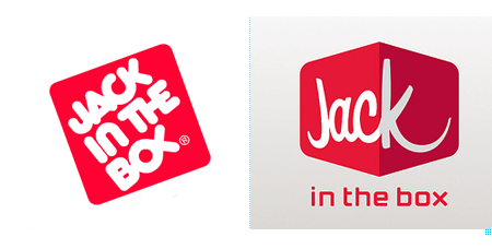
Yeah it worked. I like it a lot better then the old logo. Dig the perspective. Steps up the joint a bit.
You can almost see my building in the shot above!
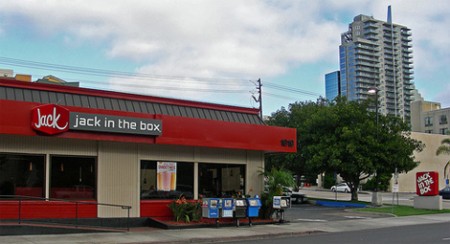
I like it. Pity they forgot to re-brand the sign on the bottom right.
yeah, it’s so classy. I can usually tell when a re-brand has gone right when the old one instantly loses any value for me. seeing those side by side, the old one just seems ancient all the sudden.
I think that it looks good and is a nice system for their growing menu but seriously what was it really going against in the incumbent. All I remember of the old stuff was the logo, mascot and color scheme. Bottomline: as long as they keep on serving up a jumbo jack, a sampler trio and large fruit punch for under 5 bucks I will still occasionally drop in.
I wasn’t surprised to see that this was work from Duffy and Partners, but Duffy is Minneapolis based.
When I look at the rebrand on the sheet and see all the permutations they’ve done I love it. But as soon as I scrolled down and saw the actual modifications to the signage something slipped away. It could be the dated facade of the structure but moreover I think the font for “jack in the box” beside the logo doesn’t completely unify the design. They started with this great retro-modernization in the logo and then shifted to trendy on the logotype.
I do think overall that this is great. But my one concern is some of the color choices. Grey doesn’t really work well for food products. Perhaps a maroon or burgundy would be more appropriate. Also, I’d rather not eat that burger in the green icon.
I love the box and the “Jack”, but I’m not feeling the font for “in the box”. Looks too arcade game-ish to me.
Yeah, mixed feeling on this one. I agree with some of the comments above. I do like the new type treatment of “Jack” but the rest of the type already seems outdated and doesn’t complement the main logo. The old logo may not be as nice from a design standpoint, but I think it better portrays the type of food/atmosphere of the restaurant: greasy fast food burger joint.
NO NO NO. The thing is a mess. In addition to losing an awesome logotype mark that had character, they’ve landed on a mediocre combination of elements that certainly do not work well together or read well. Looks like some store called, “Jack” and… I guess “in the box” weakly added in a teched out sans-serif. read this link for an even harsher review:
http://dismissedblog.com/2009/02/26/jack-in-the-box-you-have-been-dismissed/
As an outsider I can say that for me the first logo looked more fast food-ish then the new one. If I see the photo of the store it looks more like a virgin record store then a fast food joint.
I’m going to have completely disagree. I think the new logo doesn’t fit the brand at all. Especially given the humor seen in their advertising and tv spots, the old logo is much more appropriate.
The perspective and type choices are much to inspired by the Virgin brand and it’s hard for me to make the distinction when I look at the new version. I certainly hope this is just a study and not real.
Also, Scott, if you have a hankerin’ for Jack in the Box – there is one on Mission and 4th, kitty korner from the Metreon.
The new look is progressive but still maintains that old school feel to it, which in my opinion helps the legacy of the brand. I’m not 100% on adding the “in the box” underneath as I feel the Jack with the red box already solves that. Maybe they will eventually get rid of it once everyone is familiar with the new look.
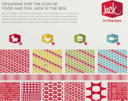
I love the rest of the components such as the paper wraps, icons etc…
Duffy did I really good job, but aren’t they based in Minneapolis?
I completely agree with the_surgeon. NO! To be honest, I have always admired the now old ‘Jack In the Box’ logo for a few reasons. The typography is inventive and completely modern even today, with its rounded forms and angular treatments. Very creative. In my mind it stood out as a quality mark in a jungle of really atrocious branding. The old logo fits it all in a VERY compact shape, and it really feels like the designer of the new logo wiggled his way out of a really tough design problem by completely separating ‘JACK’ from ‘In the Box’. It might be a very smart move if the company is slowly becoming just ‘JACK’. But as it is now, these fonts together make me think of two things… ‘Jack in the xbox’ & ‘Mall of America’.
I think it sucks for various reasons, most of which have already been mentioned here.
Definitely dismissed.
they do have them here in SF – downtown by the metreon and in the inner richmond (those are the 2 i know of).
I don’t mind the perspective box, but that sans looks completely out of place.
That’s the Jack In The Box right next to my house / studio in Little Italy….I think. Hahaha!
I would say….Fail. I feel like it’s now an eatery in Disneyworld’s Tomorrowland. It’s hard to see something like that with two typefaces going on for one logo that are on opposite ends. One being script and one feeling like a machine punched it out.
I totally dig the re-brand. I may be a bit biased though. My Friend is the designer / illustrator who did a lot of the work on this project at duffy. She is hella talented and always blows my mind with her creativity. this one is just pure genius, http://www.duffyevents.com/detail.aspx?article_id=1815
Really awful. It looks a late ’90s dot com logo for a webtv type of service. They made the box 3D for absolutely no reason at all. They added a second color to what was an elegant single color logo, just to add that useless shading.
The perspective on the word Jack doesn’t look correct, and what is the logic behind having Jac on one face of the box and k by itself? Why not Jack on one side and the clown head on the other? Or at least JA CK split evenly? The little icons of the cow, chicken and fish don’t seem to bend around the box at all, so what’s the point?
The mixture of a vegas-y house-industries-esque 50s looking font for the word Jack and a generic 90s techno font for “in the box” just doesn’t work. The way “in the box” dangles down there, they may as well just drop it all together and call the restaurant Jack. Also, that font combined with “in the box” split out as a separate phrase brings up all sorts of inappropriate connotations (mixing in the box, thinking in not outside of the box, that box interactive music video channel).
They’re making the mistake that all of these other companies have been making lately which is that while the old logo may look dated to tasteless corporate suits, it’s right on the verge of looking classic and retro. It has a nice bubbly ’70s, ’80s look that is actually much more in style currently than this new P.O.S. they’ve come up with.
john & juan-
thanks for the heads up, fixed that.
Alot of people seem to dislike the “in the box” text, which i agree, clashes a bit. but as I have read in couple places, they seem to be positioning themselves for dropping “in the box” altogether, being known simply as “Jack” so perhaps it was intentionally made to look somewhat out of place?
I like it. I love the color distinction on the different food types, and the way the squashed hexagon logo repeats for background patterns. The ‘k’ in the wordmark ‘Jack’ kind of reminds me of the ‘r’ in the Quicksilver logo.
http://tinyurl.com/dm7emk
Overall I enjoy it. It’s totally different than the previous branding, but it works. I really like it.
By the way, is the font in the lower left of Scott’s second image – HTF Gotham?
(where it says “CHIPOTLE CHICKEN” etc.)
I like the idea that it is “the box” from a different perspective. The shape of box without the shadow has a nice retro feel, kind of like a vintage automotive industry logo or a drive-in. The placement of “Jack” feels a little awkward.
I was wondering how they would transfer the logo to B&W? I am assuming the shadow would be eliminated and the off centered jack would be it’s recognizable characteristic.
I like the new icons, but I don’t like how they are solid white and are void of the same treatment as the “Jack” logo. In other words they have a 3D box, and the smack a flat image directly over it.
I don’t love it or hate it. Besides I don’t live anywhere near a Jack in the box , so it doesn’t really matter.
I think it’s pretty average… I don’t really love or hate it. If you look at the new logo next to the Quiksilver logo it seems a bit out of place for a fast food logo, which I think are typically a bit zany and roundish. But, I guess that’s no reason not to mix it up a bit.
Actually, now that I look at it again, 2 things stand out to me… maybe working towards a bit of a Chipotle vibe? And, does anyone else find it slightly off putting that they’ve created the adorable icons that will tell you which animal you’re eating?
Interesting that some people here have never heard of Jack In The Box. I wonder if that colors people’s perceptions somewhat. I’ve been around that Jack In The Box logo since I was a small child so for me this rebranding is pretty major and horrible and destroys something that evokes a little bit of nostalgia I didn’t even knew I had in me.
I think this is 100x worse than the UPS rebrand for example. That logo was nice from an intellectual point of view but really, UPS? Who cares? It’s practically invisible. This on the other hand is major signage on the corner of every other intersection, a place where childhood meals were eaten, etc. I’m not sure I can look at it from the objective point of view of somebody who has never seen a Jack In The Box in their life.
Also, this seems really half assed unless they actually build big rotating Jack cubes at each location. Like the old rotating 76 balls. That would be cool. Of course that would only bring more focus to the problem that one face of the cube says Jac and another says K.
The interesting thing about the old logo: if you look at the “OX” in “box” they form what appears to be a Jesus symbol. We used to always call it “Jack In the B-Jesus” then I found out that the original owners of the company were hardcore Christians and the subliminal imagery was intentional. I was so frightened that I have never eaten there since.
Are you sure you’re not thinking of Carl’s Jr. or In N’ Out? Carl Karcher was a notorious right winger and In N’ Out puts bible citations on the bottoms of their cups. I think the Jack In The Box logo is just a weird bubbly ’80s take on an Avant Garde special ligature kind of look.
i didnt mind the old one, but the new one seems to convey a more specific feeling easier, over all success!
I agree with jeff words “the old logo may not be as nice from a design standpoint, but I think it better portrays the type of food/atmosphere of the restaurant: greasy fast food burger joint.”
This new logo feels looks like “the jetsons” type of environment. i may like the font on their new logo but rather see that font logo type for like an In and Out outdoor dinning/fast food places. OH, the new logo feels like an X BOX video game of Jack in the box and Jack is the main character of course (HEY IF JACK AND THE BOX WHATS TO US MY IDEA OF A VIDEO GAME. U NEED TO TALK TO ME! :)…
I dunno. i hope they dont change the logo here L.A.
Oh by the way. Carl’s Jr’s logo is poorly done too..
the mark is good.
the type is bad.
and im not sure they needed to touch anything in the first place. perhaps it would have been a better use of the money to redesign the interiors and to overhaul the brand that way—not just by slapping a new logo on it. i think there are enough examples that tactic doesnt usually fair well.
Junk re-design. I agree with all the comments regarding the “in the box”. Everything about it (placement, weight, typeface, etc) reeks of somebody spending weeks on getting that box and “Jack” looking oh-so perfect and then somebody reminded them “Uh, its Jack in the Box, not Jack” and the designer just picked the first font that wasn’t bubbly and fat and slapped it down there.
I do not like this at all. “frank” above is spot-on when he says the old logo was on the verge of being “classic”. The new logo looks rushed.
Oh, and above all, I do not think “food” when I see that. I think of vacuum cleaners and abrasive cleaners.
Fail.
Horrible. They should’ve kept “Jack in the Box” in the box. Way to ruin a great logo. The typography of the old one gives it so much more character.
both logos look like a trainwreck.. it comes off as some collage kid did both logos. horrible…
both logos look like a trainwreck.. it comes off as some collage kid did both logos. horrible…
I think the old one was better too.
I actually like the old one, it was unique and easily identifiable. Think the redesign is a step backwards.
I like the new logo but the type treatment for “in the box” is just not working. Although, something about the all lowercase monospace techno-ish feel of the “in the box” makes me think they were going for the teenagers who are addicted to video games… it gives me a very video-gamey feel.
The “Jack” over the 3-pt. perspective box is very appealing.
But the “in the box” retro-future typeface is about 10 years out of date. Looks like a font Airline Industries would have used on a club flyer in 1998.
Just arrived in a US a few days ago – one of the first brands that stood out for me was the “old” Jack In The Box logo! Even recognised it across a huge airport when the text was unreadable!
Haven’t seen the new iteration yet… not sure it will be as striking.
I think the 3D box is kind of gimmicky looking. i do like the script, but the “in the box” typeface is pretty gross. the little gray box attachment thing is weird as well
I think it failed as well.
“The only question now is whether people will still recognize it as a fast food joint.”
I’m pretty sure you just answered your own question. If there is any doubt at all that the logo belongs to a fast food joint, then it’s a FAILURE. “Nice from a design standpoint” does not exist; this is advertising, not art.
IMHO, the TV campaigns have been brilliant and some of the funniest in recent years. The new logo blows though, and is a great example of designers taking their egos too seriously.