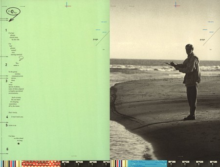


I had the great fortune to study under Jennifer Sterling at the Academy of Art, a couple of years ago now. She taught two of my typography classes (one of which I completed the Pantone Poster for). I’ve always been a big fan of her work, and as Fabien points out, her long disconnected site, has recently popped back up. No new work that I can see, but it was exciting to see the archive back online.
Jennifer was definitely one of my favorite instructors at school. She was intensely critical, which I loved, and I feel like her exacting evaluations drove me to do some of my best work at the time. I can’t stand it when people hold back during critiques or are luke-warm on giving feedback. If something I’ve done is bad I want to know. Maybe I’ll disagree and we can argue about it, but it is in no way helpful for students/teachers to hedge around giving honest feedback. I always appreciated Jennifer’s classes for her honest and precise critique.


jennifer sterling was at her peak of popularity when i was in school on the west coast and it was a shame she disappeared… thanks for the post, looks like there’s new work in her “more” section.
Love her works soo much. Inspiring. Thanks for sharing it with awe.
I feel the same way about critiques. That’s the best time to learn and that all class crit isn’t something that happens as often in the real world. Because I missed out on that, growing as a designer has really been sluggish.
Jennifer Sterling was a huge influence on me as a designer and to me one of the most eloquent designers to date. It was so weird when she “disappeared.” I assumed being propelled to Graphic Design “rockstardom” the way Jennifer was, was probably very intense. Glad to see she is back.
Love teachers like that. Best way to learn is through mistakes. Everyone’s hearts would sink when he would critique the whole class, one by one in front of everyone. I loved it. I only had him for 6 months but my work improved 10 fold and everything seemed to come together after that.
Jennifer’s website is quite difficult to navigate. It sort of reminds me of the donnie darko movie website. http://www.donniedarkofilm.com/ . You’ve got to be the Magnum P.I. of websites to get around them. fun though
Wicked work. Her site is a bit tough to navigate though.