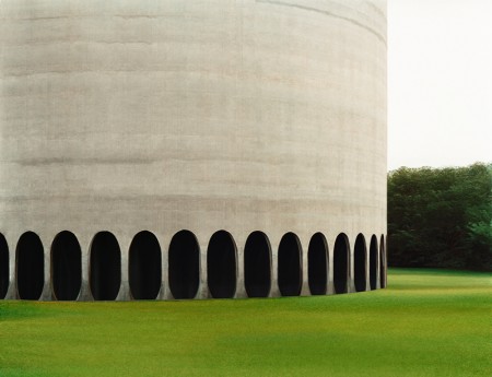
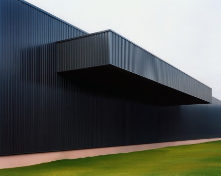
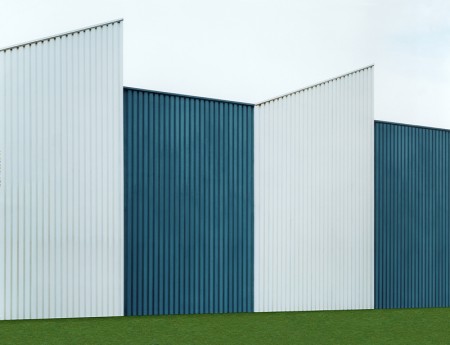
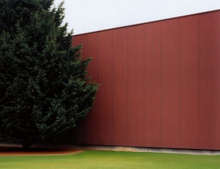
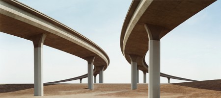
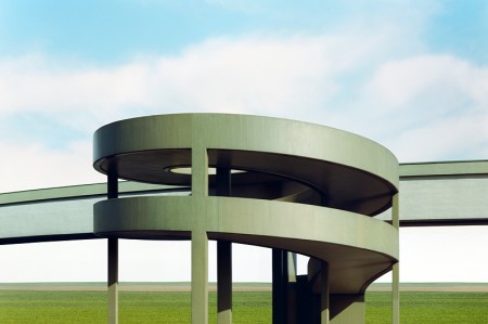
You may remember Josef Schulz’s series Sign Out from a while back. I was a big fan of that series, but these photographs, that focus on the subtle details of architecture, are much more intriguing to me. It’s all about the lines and the color. I am reminded of the work of Philipp Schaerer — that or video game architecture, where environmental details are obscured just enough to allow you to focus on the bad guys (or reduce processor load).
Using digital image processing, the analogue picture produced is then “cleansed” of the few remaining hints pointing to age, location or environment of the buildings. All details that might possibly allow conclusions concerning the actual size, users, time or place of the buildings are completely removed. The physical reality of the buildings is changed in such a way that they seem to become virtual blueprints designed to perfection.
— Excerpt from an essay by Thomas Ruff.


I love these! Great shapes and composition, very inspirational.
Wow, the composition of these photos is great. He definitely knows how to bring architecture to life
Reminds me of that old IDM scene from the late 90s and the cover art from that time period of music/art/design…
http://warp.net/records/releases/various-artists/10plus1-influences
btw – the Warp site sucks now that The Designers Republic are apparently no longer on the scene
So nice.