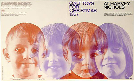
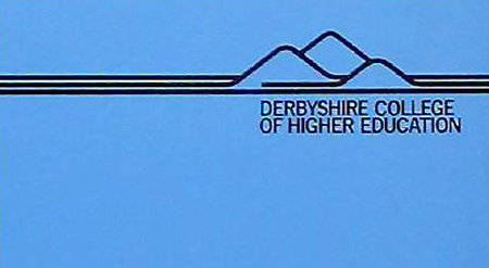
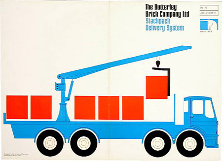
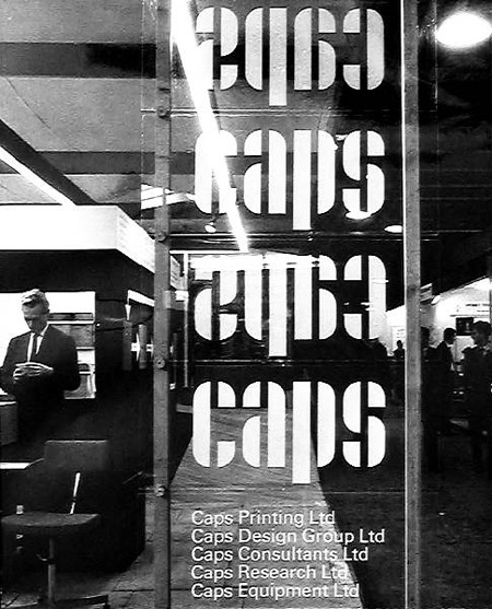
The beautiful graphic design of Ken Garland and Associates, from storefront font layout to pamphlet covers these guys have been putting together solid work since 1962.
Ken Garland and Associates – UK
12.16.2008


The beautiful graphic design of Ken Garland and Associates, from storefront font layout to pamphlet covers these guys have been putting together solid work since 1962.
Comments are closed.
Nice to see a bit of Derbyshire up here, the Derbyshire Dales logo is a little reminicent of the college logo on show: http://www.eyam.info/images/link_derbyshiredales.gif
Plus it’s a rather nice place to visit!
Butterly Brick’s lost some style recently (indeed is only just still open thanks to a series of mergers) the latest stuff is corporatly bland in nature (Now named HANSON but owned by heidelberg cement):
http://www.heidelbergcement.com/HcInternetStandard/App_Themes/00374d/images/hanson.gif
We used to walk over the brickyard on our way home from school, dodging the forklifts with stacks of bricks on!
Love that GALT TOYS design. Saw it a while back somewhere else and I always go back to it…
Jakub – plan on getting into design? You’ve been posting some pretty spot-on stuff lately.
Ghostly has a whole design team… never know.