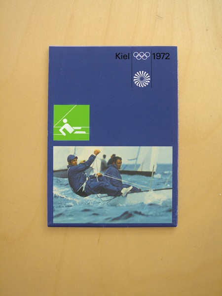
Design: Otl Aicher / Kiel Design Team
Broadsheet containig maps and information for the Kiel sailing events of the Munich Olympics. Via Alphanumeric
Kiel 1972
10.27.2007

Design: Otl Aicher / Kiel Design Team
Broadsheet containig maps and information for the Kiel sailing events of the Munich Olympics. Via Alphanumeric
Comments are closed.
so simple…
too simple i guess…
I sometimes wish design was as simple these days. For me this era was something of a golden age for graphic design.
I love how the graphic reinforces the photograph (or vice versa).
this layout and color scheme can’t be beat, its sooo on point
Thank for showing the work of Otl Aicher. I Remember that I saw some posters of him along time ago, but I didnt know who was the designer. This posters are simply brilliant!!
I think you wrote the wrong Design Team.
There was no Kiel Design Team.
Kiel was the City where they made the sailing competitions at the Olympics 1972. (North of Germany)
Aicher worked in Rotis. (Rotis Typeface, etc…)
By the way. The Layout is perfect.
Thank you for posting it.