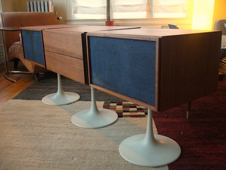
This image comes in via the Mid-Century Modernist in the comments of the RCA HiFi ’67 post. Very similar design here, I definitely prefer this version best. I love wanut / white combinations (if that is, in fact, walnut) and the blue screen is a perfect touch. Be sure to check out Mid-Century Modernist, it’s a great resource for vintage designer furniture.
KLH 20+
11.24.2007
