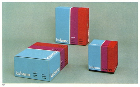
Some nice packaging via Crabstick’s Flickr. I have to say that the quality of product packaging design has seriously declined over the past 20 years. If I ever saw anything in a box like this now I’d buy 15 of them regardless of what was inside.
Kobena Packaging
02.08.2008


“the quality of product packaging design has seriously declined over the past 20 years”
Agreed.
I couldn’t agree more! We had a pretty cool packaging course at our school, where we researched the market and came to the very same conclusion :p
Everything has to be made as fast and easy as possible. It rare to come across aesthetically pleasing product packaging, where you can tell that every detail has been carefully thought about.
– J
I really like your aesthetics and couldn’t agree more on the point of packaging design being on a general decline since the 1980s. I recently found the TypePad blog of the original packaging designer of Polaroid, PAUL GIAMBARBA. The URL is http://giam.typepad.com/the_branding_of_polaroid_/ and I hope you enjoy it!
You can always count on the Japanese for great packaging design 😀
“If I ever saw anything in a box like this now I’d buy…”
That is exactly why I got into Lemon Jelly’s ky album in 2000 or 2001. I didn’t know Airside and wasn’t even in Graphic Design. I hadn’t heard the music or seen the name before but I bought it on the packaging. Needless to say, the music was just as awesome! It doesn’t happen often… I do wish it happened more.
Love the boxes! A friend of mine (Alex Meyer) has a nice collection of light bulb boxes, some can be seen on his website:
http://xyz.ch/inspiration.html
Unfortunately the pictures are smaller than they used to be, but you get the gist.
perfect