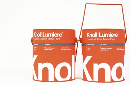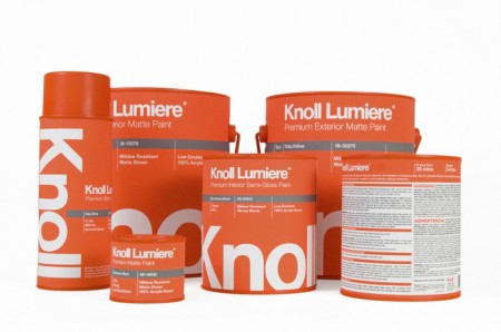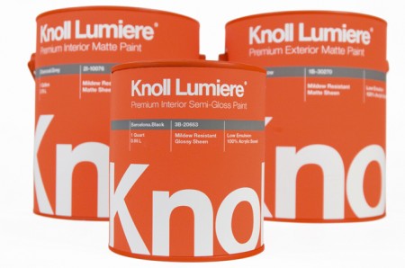


Knoll paint! Sorry, it’s not real. These mock ups were made by Kristin Agnarsdottir for a package design class. Really amazing stuff, and I was just complaining about how bad packaging is these days.
More over at Kristin Agnarsdottir’s site (cool logo too!)


Her portfolio is insanely impressive!
The layout is beautiful, but the neon orange screams “industrial paint” to me, not “house paint”. I’d feel like it would only come in white and beige.
scott: being a woodworker, I’ve always been impressed with “sikkons” brand design on their products.
Very nice work. Alex obviously doesn’t recognize the importance of brand recognition. Can you imagine Knoll in beige? Need to read up on your design history Alex.
Yes. as soon as I saw this I thought – i bet he’s taking back what he said about package design.
This is the shite that I’m talking about. The world would be a much better place if there was some thought put into packaging
They look great! 😀 I like the play of colors in this mock up. It’s like I’m looking at a website, though, the design would be a header. Very nice!
To Alex, if you wanna know what industrial paint is all about, check this, Indianapolis Industrial Painting