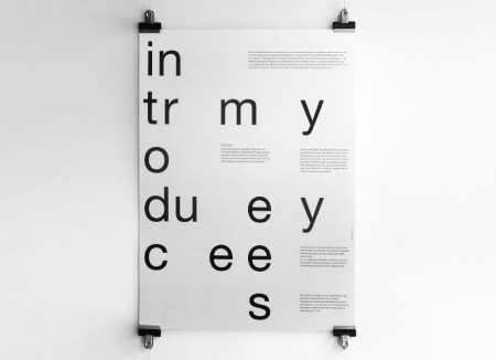
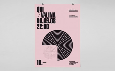
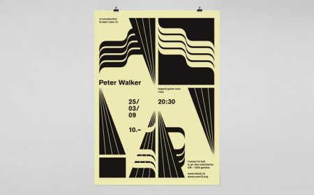
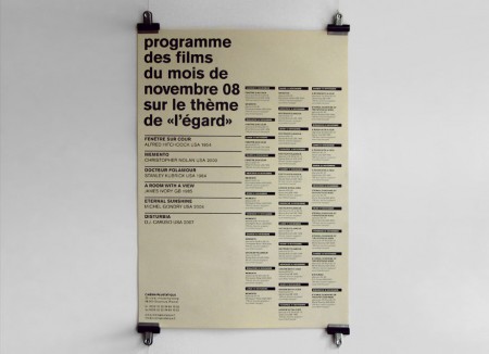
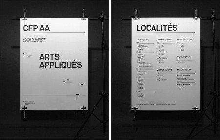
Yes! League! When I look over my ffffound over the last few weeks, there has been one dominant style I’ve been gravitating towards for its beauty and sophistication. This work by League sums it up perfectly. It’s often imageless, utilizes type in some unusual way, is bold and graphic, and has some crazy asymmetrical balance at work that makes me want to practice graphic design forever and quit it immediately…simultaneously.
I love layouts with many scattered elements, all necessary and unable to be removed, but you’re not sure exactly why. For example, those tiny thick black lines on the CFP AA poster above — wee bits like this are amazing to me.
And by the way their home page might be my favorite single page on the web right now.


I would normally think that it would be uncool to use the comment forum to ask for a ffffound invite, but since the only other comment is a robot, do you have one you could spare?
would you like to exchange fffound invitation for demonoid one?
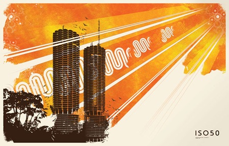
Can someone tell me the name of the font used here…
Can someone tell me the name of the font used here… LOVE IT!