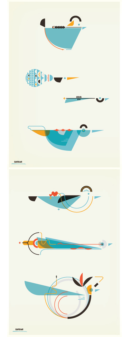

A few pieces by Argentinean illustrator Leandro Castelao. Terrific attention to detail and great color at work here. I feel like I’m looking at a retro instruction manual for some super bad ass birdhouse. Illustrations like this remind me of the work of Feric. Castelao’s are a little less intricate, but the playful/scientific aesthetic is reminiscent of some of the Fevolution renderings. Some impressive work from both artists.
Leandro Castelao
07.03.2009


I saw that he was featured on TinyShowcase this week. Really terrific stuff.
really good work.
I’m seriously fascinated by that second image down. I want a giant poster of that in my room.
Yeah, 2nd image is really spot-on, it communicates a little more than the others, really intriguing. Color choice really is excellent in each, love that goldenrod yellow and how it mixes with the deeper, redder orange.
Isometric illustrations are great when done well. Reminds me of Felton, but with a Deco twist.
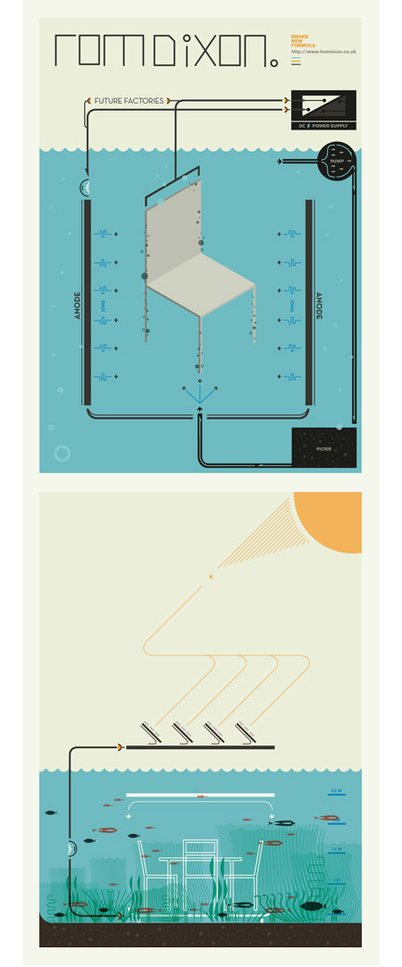
Would anyone happen to know what font that first “ROMDIXON” is? Or something close to it, anyway…
Cheers!
it’s beautiful. makes you wonder at first what the design is for, until you come to the conclusion that the design is for itself.
Looks more like Charley Harper to me than anything else.
http://www.charleyharperprints.com/
The website is garbage, but his work is amazing.
The color is rich and the lines are clean.