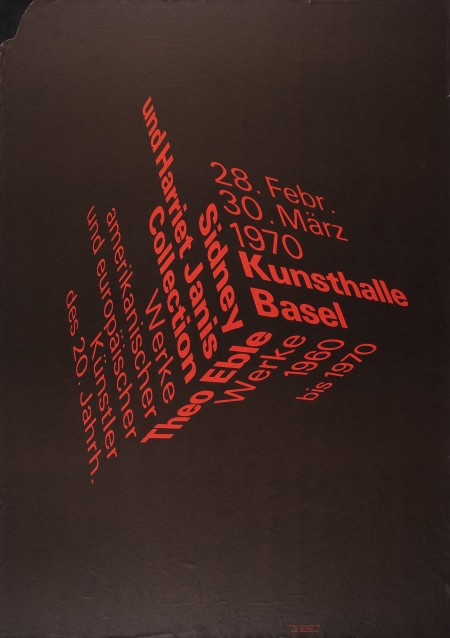
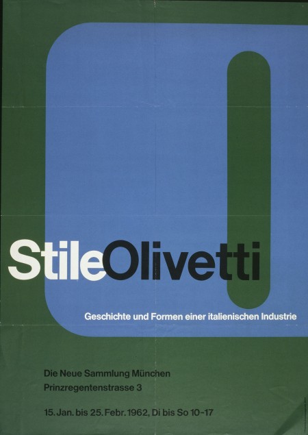
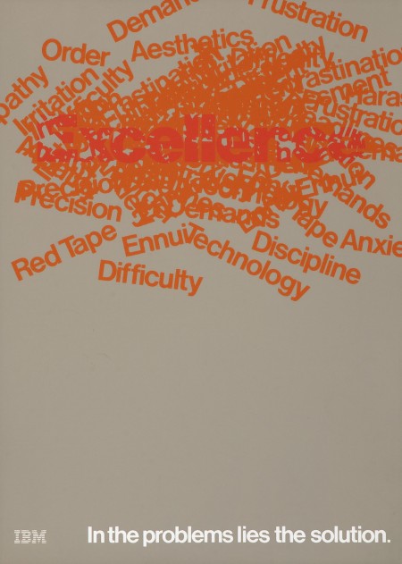
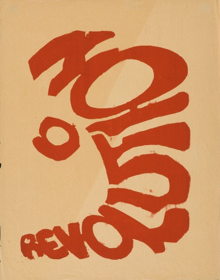
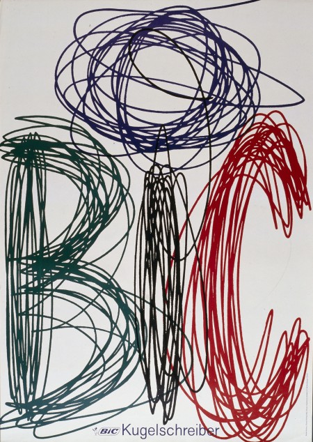
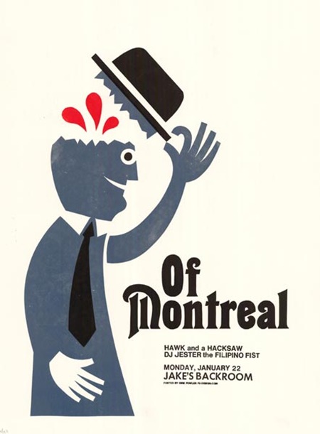
Eye Magazine has great piece on typographic posters and were kind enough to supply some very high resolution scans of these beautiful prints (click any image above for full resolution or visit the original Flickr page). There’s more info and analysis over at the original post.
Eye Magazine via Simon Smith

I saw the original of that BIC poster when I was Switzerland, it’s even better in person.
That first one blows me away every time
Thank you for getting higher res versions. This is very inspirational.
The first one is so amazing, so simple idea, so big efect.
欢迎您来燕子,娟子的博客空间转转,看看我们最新的照片,及书法作品
http://blog.sina.com.cn/lsj7208
BIC… i like it
I think the BIC one is really awesome 🙂 Love it. Relates to what they do. Thanks for sharing !
Great job for sharing these with us, Scott. Very much appreciated!
Regards.
Looks cool. Take a look at typographic art of Eugene Lvovsky: http://www.eugenelvovsky.com/typeis