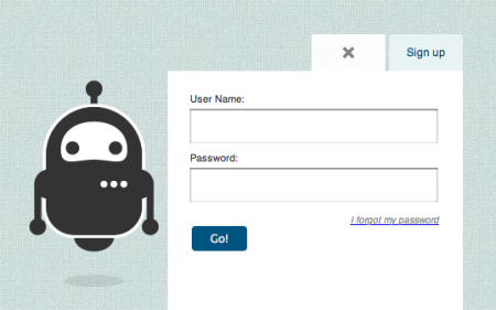
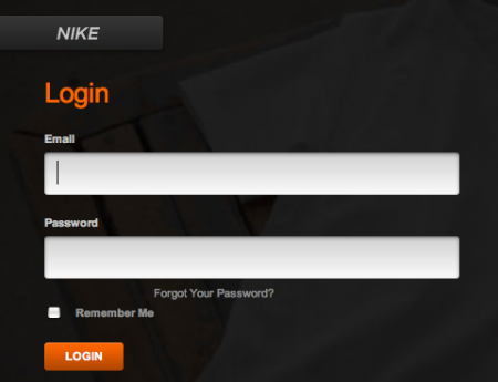
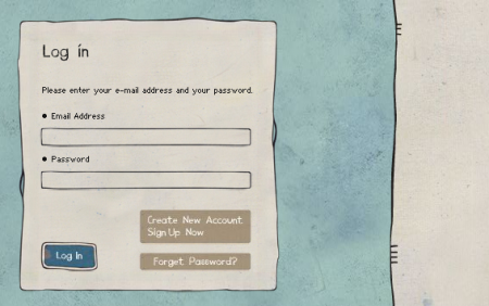
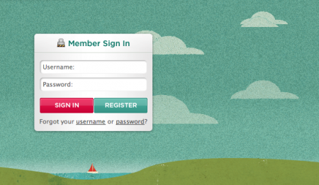
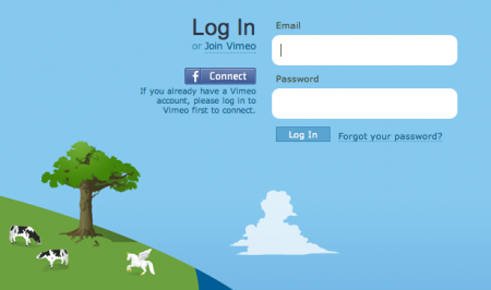
Recently I’ve been obsessing over an often overlooked part of web design: the login form. There are few sites that have aggregated examples of login forms for perusal; this one by Design Reviver is pretty good. I’d prefer the list to be more like 500 examples, but it’s easy to go in search of other cool login form designs. The ones above are fun, but I’ve yet to find one that really knocks my socks off. Anyone know of some really superb login forms?
One of my favorite trends is the use of oversized text in the forms. Tumblr was one of the first places I saw it. Scott and I discussed it a long time ago in reference to the Nike login form, pictured above. Still not sure what it is about the giant text field that feels so right — maybe it just seems to reinforce what you’re writing. Like “Yes this IS my email address. BAM.”


How about this for some more inspiration:
http://emberapp.com/search?q=login
A search for login forms on Ember which is a social app for collecting and sharing snippets of visual design inspiration.
I really love Vimeo’s as it makes it look like you’re about to enter another land, and it’s not just a formality standing in your way.
http://yayeveryday.com/login
Just the “Weeee!” gets me all excited to click on it, no joke. I always say it out loud when i click. haha
I love the examples you posted, but a few more come to mind…
http://www.mint.com/ (their sign up form is amazing too, with it’s in-line validation, and surprising lack of required in for such a site)
http://www.kontain.com/ (again, a very good sign up form as well)
http://kashi.com/
I love the front page of Miranda July’s page:
http://mirandajuly.com/
big text and nice colours = double win!
I’ve purified the login form of my current project to a single button. Why still implement a signup and login process with OAuth, OpenID and fbConnect?
http://www.patterntap.com is a pretty good resource for stuff like this – although I don’t think there’s a ton of login form examples.
My god that scared me…i work on the Nike site and when i saw the above Nike login in my reader i thought my computer had screwed up! I cant see the love for the that particular login when comparing to the rest, but maybe thats becuase i see it day in day out?
I love the Soundcloud login. Floaty!
http://www.soundcloud.com
Did you forgot Twitter? Their login form is one of the best for me: http://bit.ly/75r26W
Personally I appretiate the login being always present instead of getting a pop up or page switch.
Good example being logolounge. http://www.logolounge.com/
I saw this one recently and quite liked it: http://www.0499365191.com/
I have no idea what it’s for though.
Speaking of from design…
Here’s an excellent book on everything a designer should know about web form design. Written by Luke Wroblewski. Highly recommend it.
http://rosenfeldmedia.com/books/webforms/
whats up with a ton looking like the twitter one, who started that graphic design look?
We need a username and login with a stat tracker here, some of the guys and gals on this blog post a great amount of good comments and i’d like to read more of their older comments on the blog.
Cool, really enjoyed the Miranda July page. The secret password thing is priceless — wish I could copy it 🙂
Some great examples on that Ember page too. Probably the highest overall quality of all the lists I’ve seen. At least, it looks like most of them were considered more than normal. It’s amazing how boring most login forms are. Not that they need to be completely amazing, but it’s a bonus opportunity to show some creativity
As we continue to redesign Threadless, sweating the details (like login forms) is something we’re really looking into. My creative director and I spent a day researching best practices, and compared a lot of different conventions.
It’s interesting to consider label placement on form fields, and how they can help/hinder the use of the form itself. (ie: it’s better to put labels above the field by the way people “read” them.)
To me, the draw of bigger fields is that there’s this emphasis on YOU, the user. We care about you, love you, and we’re excited to have you come back to us and login. We can’t give you a hug, but we can give you 18px type that you practically CAN hug.
Awesome topic.
Mig, thanks for weighing in. I love the Threadless design; you all do a great job keeping everything very consistent — from the language to the colors — everything is extremely “onbrand”. I’m curious to see what changes you all implement. I haven’t been visiting as regularly as I used to… will the changes be all at once or have they been rolling out slowly?
Got to love the 18pt hug.
We’re taking it a step at a time. Much like the Facebook design philosophy that Ben Blumenfeld speaks about, ship and iterate. Everything we’re doing right now is to clear clutter, refine type, and focus more on the (shirt) designs.
Good bye, Georgia. Welcome, Archer.
@letterpreston: Me too. I also don’t like to be redirected when I type in something wrong – something like AJAX for direct feedback feels much more intuitive.
The search-bar on b-a-n-g.tumblr.com has a good example of importing a font into a form using css!