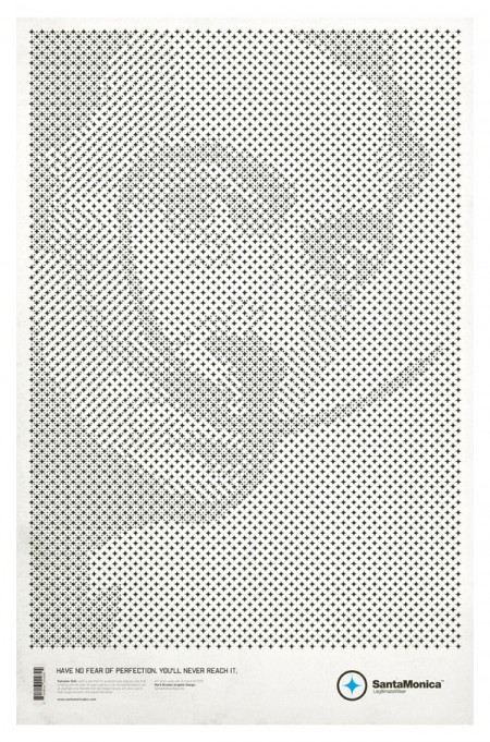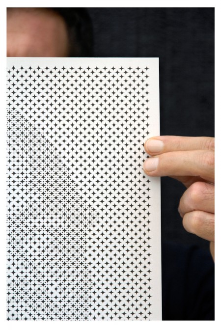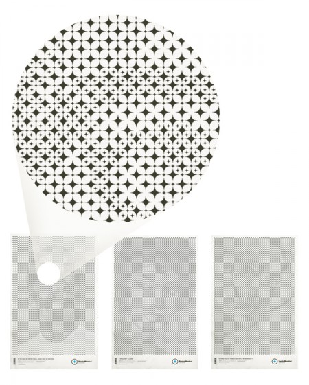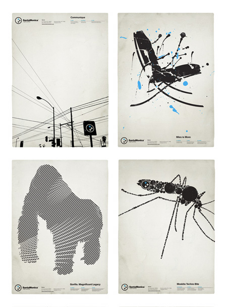


I first noticed of Mark Brooks’s work when he designed a series of very distinct black and white posters for Barcelona based Santamonica Apparel. Tonight I noticed that he’s back with a stylistically similar, but conceptually unique new series for the same company. While the originals were great in their own right, this new series — based on a grid of stars made from the Santamonica logo — takes things to another level. Very clever stuff.
Be sure to check out the rest of his work at Behance or his personal portfolio.


Very cool stuff. I love the type work at the bottom of the first series. Logo (randomly) reminds me of the HALO logo for a doublekill. It’s been a nerdy weekend.
Im sensing some inspiration for the ghostly poster?
The original power lines one reminds me of an evan hecox print.
Grant-
the first thing I thought when I saw this project was wow, very similar concept. But unless I’m psychic I don’t think there was any influence involved — Mark’s series came out last month, the Ghostly poster was first posted in June and July.
At any rate, I am sure it’s all just coincidental, our pieces are very different in their execution and I don’t think optical-illusion-ish stuff like this is anything all that new.
Reminds me of Soulwax’ Any Minute Now:
http://images.amazon.com/images/P/B0002FR11E.01._SCLZZZZZZZ_.jpg
Look closely / squint.
Cooler execution imho.
Scott,
I am flattered to have been featured in your blog.
I know it is normal to compare designers work we see for the first time with other work we have seen in the recent or not so recent past. I would rather be flattered if someone said that I was inspired by Scott’s work (and I can proudly say that in a way I have been in my career as a designer), but the truth is that these posters were simply the result of a very enjoyable, spontaneous, fun, and loooooong process in front of the computer, and, as Scott very well pointed out, none of what you see in the SantaMonica series is new or revolutionary in any way; optical effects in design and art have been used forever (Dalí was precisely a master at it) and in this particular case using the logo to portrait faces of people (very interesting people, don’t you think?) was maybe just the right thing to do to take it to another level.
Hi Scott
they are both great examples of using the logo to create an interesting image. i like them both.
They remind me of how hard i tried to see those fricken magic eye images when i was younger but never could quite do it. man the time i wasted.
Very cool work- the touch of blue really pops
is this some kind of generic process or klick-and-point hand craft?
looks great thought
I’m glad Mark pointed out how some of this stuff isn’t all that new. That isn’t a dig on his work, it is pretty cool and very well executed. But the “abstract-when-close” – “portrait-when-far” thing has certainly been used in a variety of ways.
Most famously by Chuck Close perhaps.
But again, it is very well done, I’m just glad he is aware that it isn’t totally new.
Mark-
thanks for writing in, great work all around in your port, love the direction of your newer stuff.
how did you go about setting these up? I just overlaid the 10 and used it as a guide to shade the logos what fell under it. your process looks more complex, mind sharing with us how you went about determining where the smaller stars would be placed? It seems as though this could have been done by eyeing it, but am curious to know if you used anything programatic or otherwise.
Amazing work. Just amazing. Anyone know if Mark is A Pittsburgh Steelers Fan?
Scott-
Its actually a simple process thanks to Illustrator. I developed this grid using stars that were spaced 1/3 its size between them. Then, I filled that space with a star 1/3 its original size. Using that same smaller star, I filled all of the white space (centered) until the grid was completely filled.
Once this process was complete (here’s when the hours begin to fly by) I used the photos (to which I had previously bumped up the contrast as much as possible) as a reference and started deleting all of the 1/3 stars in the white areas and only some of them in the gray areas (depending on the intensity of the grays) until the image was revealed.
Not sure this brief explanation makes sense but I sure want to thank you and everybody else for interest.
oh man, I could imagine that would get tedious. That’s about how I did it with the ghosts but sort of in reverse and with color instead of the resized images. thanks for sharing.
love that blow-up of the malcolm x image, even if it didn’t make a picture, this star pattern would still be cool.
the
empty
space
between
distance
is
nothing
Very nice ones I like the one with the wires best. But that’s mho.
The top ones reminded me of Trevor Jackson’s amazing work for Soulwax.
Great stuff tnx for sharing.