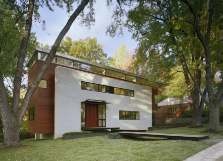
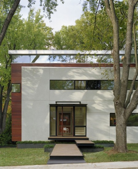
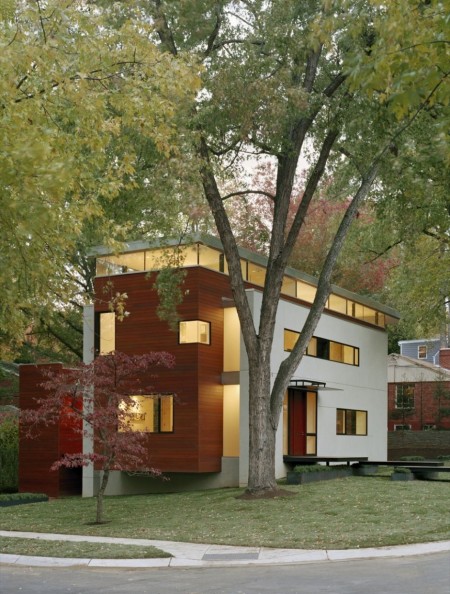
As a kid I grew up preferring objects that were round. Maybe it was because they seemed friendlier or maybe it even had to do with safety or maybe it was because I didn’t know any better. Regardless, I’ve come across David Jameson’s great portfolio that showcases a lot of rectangular form. Sure the same could be said for a lot of architecture but he does it very well.
This house in particular is designed with several sets of rectangular forms nested within one another. At the core of the house is a suspended meditation/lounge chamber. Although I’m not sure the exact intent of use for the chamber, I could imagine setting it up as my workspace. I wonder how the acoustics are in there…
Via Wanken
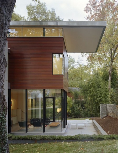
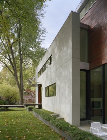
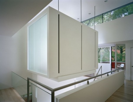
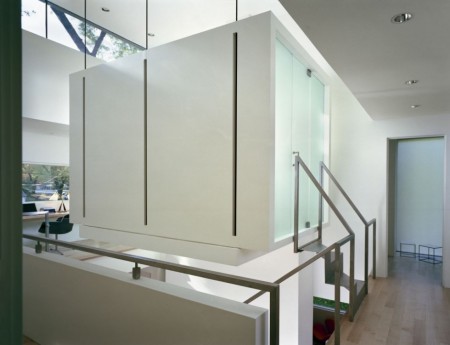
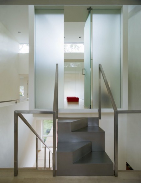
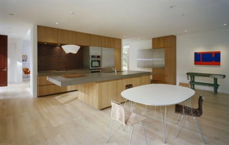
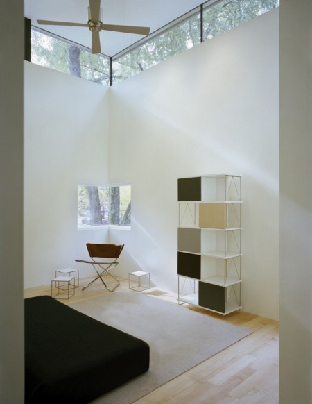
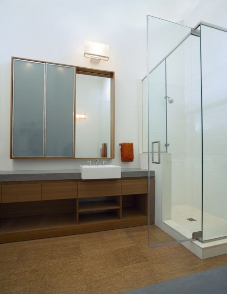


These smooth looking houses are sure very beautiful and calming, but they are just dreams out of a catalog for people like me and you. Also, what’s suppose to be that little room hanging in the air?
Lover the patio, corner window, the warmness from out side and the hugging placement of the house between those three trees.
Seriously, why does every architect have a terrible website?
Seriously, why does every architect have a terrible website? [#2]
I agree. The majority have bad sites… You could almost make a business out of redesigning only architecture sites.
Love the exterior, but the interior looks a little dead and emotionless, even with all that sunlight coming in.
Beautiful, non-wheelchair accessible design!
I am not sure about this house, there is just so much going on. Too messy for my taste.