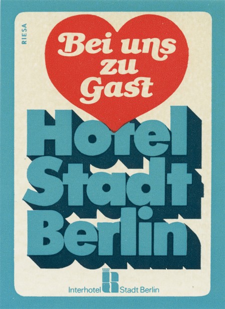
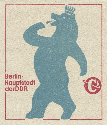
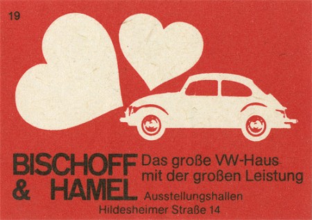
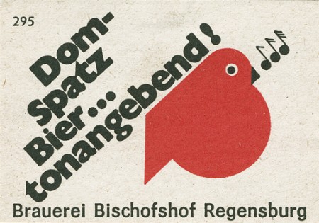
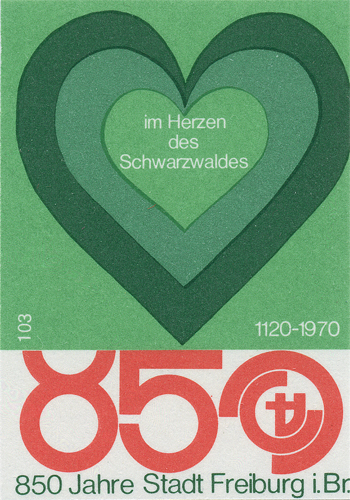
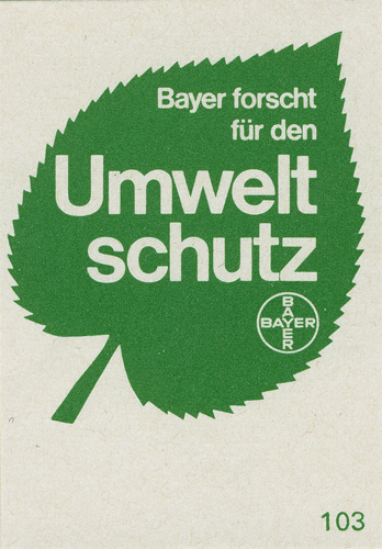
Shailesh Chavda has a beautiful collection of matchbox labels up on Flickr. I have a book of Czech labels but I’ve never seen these German ones. Dave from Grain Edit originally turned me on to matchbox labels when he showed me his collection (I think they were mostly Czech). They’re so incredibly detailed considering the format; most of these would do fine as posters. I think the most striking part to me is the printing, when blown up you can really see that nice grain and spacing in the ink.
Many more great examples can be found here


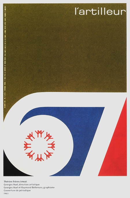
those are stunning, i cant pick a favorite. I am absolutely in love with the textures on those. Better texture is something I need to start working on. Thanks very much for the share!
Speaking of which, this has been doing the rounds on various design blogs the past week. Phenomenal amount of work by Pavel Fuska for The Navigators – http://www.youtube.com/watch?v=-qxrN93Xbpg
hey scott,
you should take a closer look on this huuuuuuge set on flickr
http://www.flickr.com/photos/maraid/sets/72157594234429063/
have a nice day..
Simply amazing type.
I’ve entered vintage overload.
If only I could use some of these on my site in a way that doesn’t look like I’m trying to take credit for other people’s work (which is amazing).
Simple design and nice texture!
Refined color layer
Vicissitudes sense of texture
Historical heavy sense
The interlocking hearts matchbox label is just sentaional !!!
Hello,
I´m collecting matchboxes and labels myself.
The two first labels of yours are from East Germany (GDR) and the two others are form West Germany.