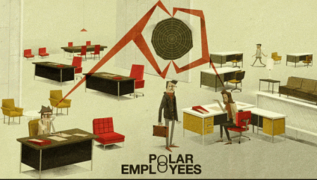
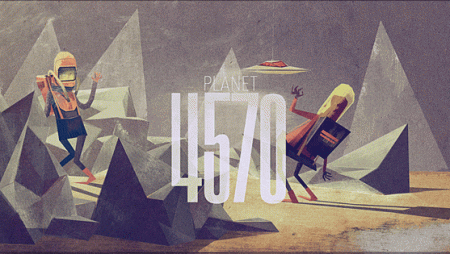
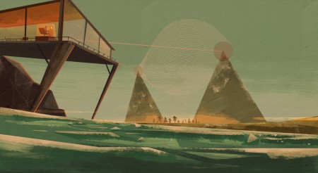
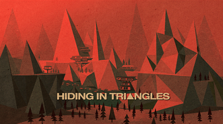
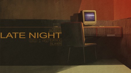
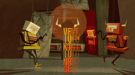
Absolutely killer illustrations by Matthew Lyons. My first assumption was that these pieces were very old, and the work of a grizzled old artist, who had developed exceptional skill and craft over years and years of animation grunt work. I was incorrect. Matthew is actually a 21 year old student at his final year at the Loughborough University in England. He’s clearly a natural. Not only is his eye for color and composition spot on, he also clearly has a vast imagination. I want to get in my spaceship and explore each of the scenes he has presented.
Matthew Lyons
01.13.2010


This kid has some serious skills.
stunning work. great find
I want most of these on my walls at home and definitely as a computer wallpaper. That first one – Polar Employees – would be incredible as an animated cartoon.
Funny that Mark should be the first to comment on here. I thought of Mark’s work immediately when looking at this. A totally different compositional take, but both evoke that same feeling of having travelled somewhere in a different time/place – like a parallel universe that is almost the same, but stuck in a beautiful color and textural palette where aliens and robots hang out in mountains and caves and fields and thats just the normal thing to do.
Beautiful find Alex – these are really cool.
Whoah! Third one down… Absolutely georgious way of illustrating the ocean!
lol @ Michael
I was seriously going to write that. Planet 4570 definitely reminded me of his work. They both love their desaturated colours and off whites too.
I’m jealous as hell. Partly because I’m a shitty illustrator, and partly because he’s a year younger than me.
Yeah, this guy is awesome.
F-ing greatness indeed.
These are great- file under young artists so talented that it angers you 🙂
This dude is serious! Mad good.
Those illustrations are actually f**king incredible. I’m finding it hard to rationalize how a 21 year old could produce such mature artwork.
These are excellent! I love the retro feel they have.
I wonder if Pixar is in his future.
Really beautiful and creative work. Great find! I love that building lying over the ocean.
They must be mine. Where can I purchase? Tell me quick, before I die from the awesome.
Stunning illustrations. The typography needs work, but again, the illustrative work is a TEN!
Such talent!
It’s interesting to see such young talent emerging.
great illustrations!…even better that he’s representing the youngin’s.
NICE!
I’d love to see some of these animated, they are so well stylized. This guy has a great future ahead of him!
Thanks for sharing
Unbeaten! It has a story and mood.
See also http://orlov-iv.livejournal.com.
Russian illustrator Iv Orlov
In my humble opinion, the “Late Night” illustration is best because it avoids the scthickiness (I hereby copyright that word) of the others. The angularity, and textures are absorbed pleasantly by the realism.
I enjoyed looking at the Russian illustrator of the previous post.
That guy is amazing. The way he plays with the lights, the textures and brushes he uses. I look at it and cannot quite understand how he did that. I just love it!
Amazing color and typography , ISO50 should have an interview with him
Do you people have a fb fan web page? I seemed for one on twitter however could not uncover one, I would love to grow to be a fan!
Can I reference some of this on my page if I incorporate a reference to this site?