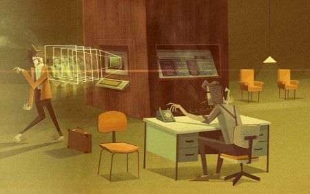
Matthew Lyons is an incredible illustrator. Just about every blog in existence has written a piece about him recently — and it’s no surprise — his work is absolutely stunning. As I mentioned in my post, the combination of his vast imagination and impeccable eye for color and composition begets some really exciting work.
I asked Matthew if he would prepare a short process description about one of his recent works. What follows is Matthew’s description of how he created the piece you see above, The Snide of a Scoundrel Man. Take it away Matthew!
—
This process looks at how I go about achieving my personal work. I’ve chosen to do illustrations of faux film stills because they allow me to depict everything I’m interested in. With film title stills I can involve typography and in general I can consider aspects like set design, composition and character poses. I have a lot of different inspirations, so through time this process has grown from the desire to figure out how I can show all those inspirations.
The process starts with an idea, which stems from visual inspiration and a story idea. I get excited about stuff real easy. For instance, in this idea for the faux film The Snide of a Scoundrel, I was thinking of the following story: The briefcase man is trying to sneak into a building by impersonating an employee, but the office knows he is coming and calls for him to be imprisoned. By thinking like this, I imagine the main elements of the illustration, the briefcase, what becomes a phone and the look of early ’80s CGI from the monitor. Then I begin to thumbnail around those elements.
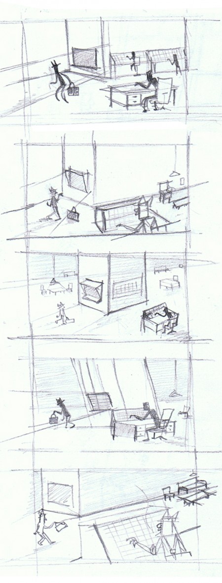
Rough thumbnails start with one idea I’ve formed from a barrage of different inspirations. I don’t get bogged down by any details at this point, just how I’ll stage the bare ingredients in the illustration. In this case those ingredients are a man (Dave) with a suspicious briefcase who’s being troubled by 1980s CGI and another guy (Steve) who is fiddling behind the desk. By doing a series of thumbnails I sometimes stumble across new aspects I didn’t think of before. The idea of having a big pillar in the middle of a massive room allowed me to imagine the illustration as being eerie and mysterious, so I looked at the clearest way to compose that.
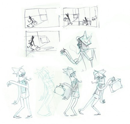
This illustration involves Dave. He is trying to gain access to the building, but we see him fail. When an idea for an illustration involves an aspect like this I look at the character pose separately. I know the space they’ll contain in the illustration and their intentions so I concentrate on how their silhouette and line of action will react to the actions in the rough story idea. By reading about traditional cartooning principles I try my hardest to inject fun and life into the picture as well as readability.
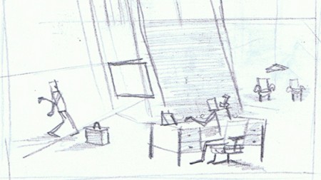
The character behind the desk is less important. I don’t want him hogging the lime light, but just displaying his actions in the clearest way. This is a brief example of how I try to achieve this in the illustration shown. The phone is spotted easily by being away from his body, while his arm reaching for the dial shows his need for communication to head office about snidey Dave and his stolen identity. The phone itself in his right hand is also held up being put purposely in front of the shadowed area of the pillar. This darker background allows him and the phone to stand out clearly. While Dave’s line of action is leaning away from the monitor’s capture to show his resistance to get caught, his briefcase contains its own space and is located near him to hopefully show he has been carrying it. Later on when creating the image I put in a chair by the desk to mark Dave’s intentional desire to sit and talk to Steve.
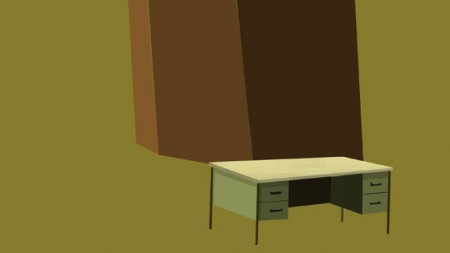
Jeez Louise sorry if I waffled too much before, that was because I was trying to explain the hard part. Now it’s generally the easy part. I don’t like to start by scanning the thumbnail, because personally I like to feel free to change some parts of the illustration while I’m working instead of feeling lost or restricted. I fill the background with the colour of the floor, then select areas with the lasso tool and begin to fill them in to create the objects that contain the most amounts of space first.
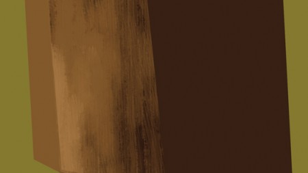
Now it’s hard to explain exactly how I go about painting the illustration. There is no set order like background to foreground as I work digitally with custom brushes. I have made a set of custom brushes by making marks with black ink, scanning them and then playing with it and manipulating them into a round circle shape. In this picture I’m half way through trying to represent wood with a custom brush. Basically my aim is to try and replicate the dry brush technique in traditional painting.
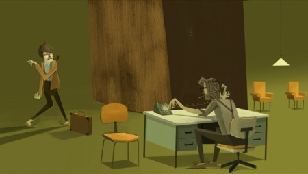
There is no real formula as to how I go about creating the illustration after blocking out its main elements. I just scoot around the image building it up as I go. Selecting areas with the lasso tool and then filling to create the basic structure of an object, while working with custom brushes to explain light and material. By working digitally I can also adjust the colour shades of layers if necessary.
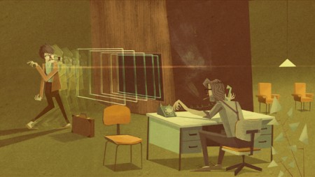
Now I add textures over the top, which are scanned from paper and card. In this particular illustration I have made a couple of changes. This only really happens if I’m working on a personal project. I wanted to bring something to the foreground, but the plant cluttered the image so I took it down. I also embedded a control panel and a monitor in the pillar to make the early CGI look more at home in its surroundings.
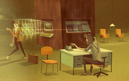
Overall I try to solve as many problems as I can in the thumbnail stage, so when I get stuck into creating the illustration it is an easy process. As mentioned I sometimes feel the image needs something extra I hadn’t planned for in the thumbnail to make sense to the environment I’m illustrating. In this case it’s the chair by the desk and a control panel in the now solid structure of the pillar. I hope this has been useful if you’ve been interested in my process. I’ve tried to keep it to the point and show why I make certain decisions as well as including my process.
By Matthew Lyons
Project: Faux Film Stills
Illustration: The Snide of a Scoundrel Man


This is great. It seems like the key to this sort of thing is don’t over think anything.
Thank you Alex and Matt, for shedding some light on the process.
Very cool look at your process. Thanks for sharing!
Hey man this is incredibly well thought out and in depth. I really enjoyed it. I wish you all the best luck, you certainly have a promising career ahead of you!
Good stuff!
That was excellent, thanks for sharing!
I’d love to see a timelapse screen recording of him working this out!
I really love his work!
Love the work, the imagination present throughout, and the style…so authentic and pleasant. Feature length animation in this style would do very well I think.
Thanks for giving some perspective into your process, I’ve been trying to incorporate more original drawings/illustration into my work, this will be a big help.
Truly inspirational,
Thanks so much for this!
What a tremendous talent you have. Beautiful work. Thanks for sharing too!
m
Excellent! Thank you, Matthew (and Alex).
Yeah, thanks guys. This is definitely inspiration for my own illustrating. I love understanding other peoples techniques and thought processes.
amazing! thank you
This is fantastic! Seeing the process is really inspirational. Thanks for taking the time to present it so well!
Wow…very inspirational! I’ve become a big fan of this guys work in the past few months.
A question for Matt, about how long do you spend on each stage and the whole process from start to finish?
Thanks, great work.
I’m such a fan of your work Matt! Thank you for the insight.
Finally some insight into Matt’s creative process! His work is truly unique and it’s fun to see every new piece he creates. Thanks for the great post.
– Josh
@Michael J.
It’s hard to explain how long each stage takes. Sometimes I have an idea half way through making it which I’ll follow and the final picture can come out looking very different to the thumbnails. I find this an advantage of digitally working, if the work starts looking bland or drying up from my first thoughts which excited and motivated me I can change things round while I’m working by moving layers and so on. I’ll still consider the composition overall, but just follow a different path if it appears and makes the work more interesting, so it’s hard to give an otherall time as it can vary.
I love this style. Thanks.
The illustrations in this project are amazing, and I have loved them ever since I had spotted them on ‘FFFFound!’ The aesthetic is wonderful and I admire the process he executes in the creation of each piece, giving them a story based in a very foundational setting. I am really looking forward to future work by this illustrator.
Once again, an amazing job by Matthew Lyons.
I think the ‘Eraser’ one might possibly be my favorite.
– Kyle John Hollings
bravo
Thank you for sharing! Great explanation.
<3