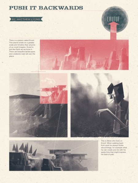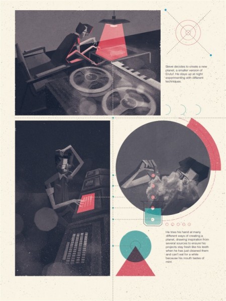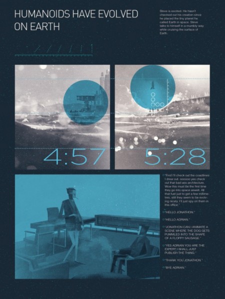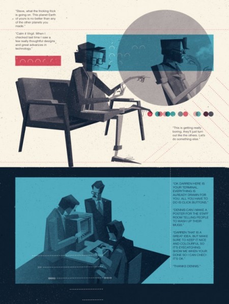


Matthew Lyons just posted a new comic called Push It Backwards. Consistent with everything he does, this looks absolutely amazing. I continue to be blown away by his talent, but more impressive to me is his imagination. The story he tells here (the pages you can read) is peculiar and wonderful. It’s really only a matter of time before we see his work absolutely everywhere (Pixar if you don’t hire him I will). A rare talent this one. Be sure to check out the process piece he did for us last year.
Matthew Lyons / Push it Backwards
01.25.2011


Jeez this guy makes me want to work harder.
Which is just what I’m going to do!
Awesome.
<3
I agree with Jimmyviola, it is so inspiring to see this kind of work with such quality, make me want to work harder, also I feel kind of jealous, but in a cool way, like every designer/Illustrator/Artist in front of an awesome piece of work I guess.
This is fantasmazingly great in every sense of the word!
Extremely coherent work! Respect!
Brilliant style and great execution.
Thanks for sharing this!
Nice work, the layouts remind me of Julian House’s work with the Ghost Box cd booklets
This is actually from Nobrow’s book ‘A Graphic Cosmogony’ which features 24 artists who’ve drawn their own take on the creation of Earth. It’s a wonderful book, and Matthew’s story looks even better on paper!
Amazing stuff as always.
So beautiful! So damn good combination of great digital drawing and great grid-based design. I always loved both
Dig. Lyons continuously right up my alley