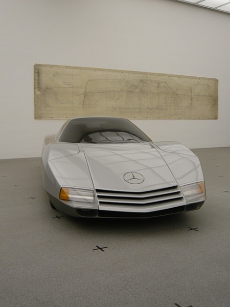
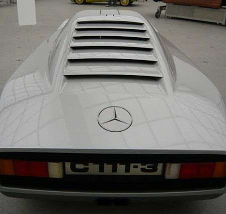
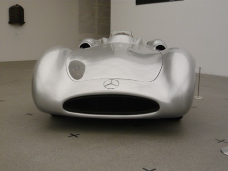
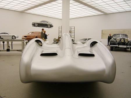
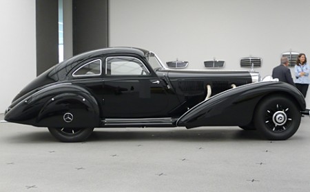
Stylepark has some beautiful photos (shot by Thomas Wagner) from the Mercedes collection at Pinakothek der Moderne, Munich. The show goes until Sep. 14 and features some incredible examples of the German auto maker’s inspiring creations.
I love the wall treatments, and the license plate in that second shot is incredible. Now compare that to this, and you start to understand why so many great designers come from Germany. It’s like those stupid faucet commercials (which I hate simply because of how the piano starts playing when she pulls a faucet out of her purse all dramatically and slams it down on the guy’s desk like it’s the most profound thing he’s ever seen when somebody starts throwing plumbing components around his office. What the hell does it even mean. Did you see how confused her husband looked? I felt the same way. She damaged the finish of that desk and I bet it wasn’t cheap considering how pretentious successful architects are.), I could seriously design a car around that license plate. I bet if you told the Mercedes designers they had to design the car for the US style plates they would just quit and throw a wrench or some molding clay or something. Also, if I moved to the states from Germany and had to do this, I would just drive the car of a cliff because the whole thing is ruined. I have a feeling the “California” font only looks like that because the state couldn’t afford to license Papyrus.
Also check out these posts for some more vintage Mercedes action
Stylepark via Simon Smith

Your comment about the commercial and the license plate thing is just amazing =)
The car in the last shot is the sexiest, classiest thing..
I’m thinking the same as John, the last shot is a winner.
It’s a ballsy move (and clever) from Mercedes considering Munich is the home town of BMW! But I’m surprised there’s no SLS on display …
I’m glad that other people notice how ridiculously weird that commercial is (also that someone else was thinking about what happened to the desk after that display of crazy), and the cars are gorgeous. About the California “font,” clearly we would be using Comic Sans if we could.
Haha. Isn’t the architect the Dyson vacuum dude? I don’t even think his vacuum cleaners have as much suction as that ad.
I always found Mercedes, especially now, cars very ugly. Seriously. BMW is a different story, however.
That’s not actually a license plate, it’s the model number of the car.