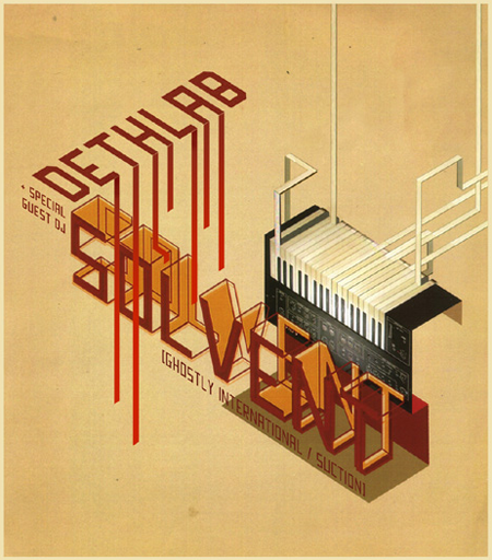
Our friend over at Burnlab did this flyer a few years back, still to this day it might the best flyer to come out of Michigan. Michael Doyle runs an experienced music/culture blog called BURNLAB.
Michael Doyle – Solvent Flyer
09.03.2008

Our friend over at Burnlab did this flyer a few years back, still to this day it might the best flyer to come out of Michigan. Michael Doyle runs an experienced music/culture blog called BURNLAB.
Comments are closed.
have you ever seen the posters by dan streeting? doyle and him have done shows together musically and their styles mix well. i think dan’s work is superior, but thats all a matter of taste. you should do a post on him.
http://www.squarerootmusic.com/designmain.html
@sean patrick I totally agree! (I owe Dan an e-mail too. Thanks for the reminder.)
And thanks for the kind words Jakub! There’s a series of variations here: http://www.flickr.com/photos/burnlab/sets/72057594068958223/
I like this very much and cant belive this is done a few years back, it’s so today! I agree you definitly should do a post about him.
Great artwork – I’m a totally sucker for vintage coloring and style (which my own blog obviously represent).
Beautiful shapes and choise of typography!
michael, i am sure he would appreciate hearing from you, as he thinks you are quite the dude.