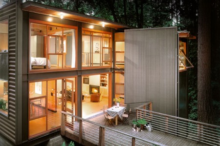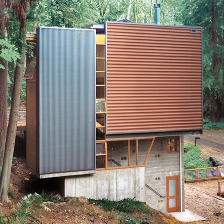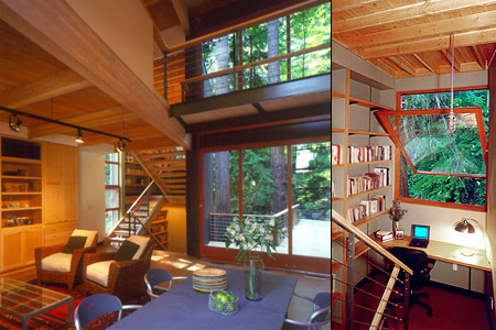


Miller/Hull designed this house for a young couple that had a high interest in modern architecture. The completed house fits perfectly with the Pacific Northwest theme and is situated in the woods of Mercer Island near Seattle.
Personally it’s one of my favorites in the Pacific Northwest. The ratio of wood to metal beams/siding seems nicely balanced, especially on the deck.


And, “only three trees were removed to accommodate the home.”
Wow, that is stunning.
I found that line particularly funny when I first read it. Maybe it should read something like:
“Only three trees were removed to accommodate the home—we didn’t plant new trees in place, but we did kill several more trees somewhere else to get wood to build the house.”
Great looking house. Wonder if the they have full sheet solid blinds that pull down when privacy is needed…
You guys supply the coolest links–thanks! I really dig the modern look of this residence. It’s the perfect mix of “home sweet home” and modern art piece…good sh!t!
I really do appreciate the modernist movement, despite the fact the word “modern” is a bit undeserving, considering it’s date of birth. The thing I have a slight problem with is the auto-dismisal of sceptisim when someone builds something “modern”.
Personally, I feel the style of this home does nothing, other than teach an abrupt lesson in juxtaposition, for it’s surrounding. Wouldn’t it be something if people actually started building living spaces which absorb, or reflect, their immediate environment? I’m not asking for neo-ewok revivalism here, but a considerable attempt to create living spaces rather than just installing them somewhere.
Just because something is different, it doesn’t make it beautiful. I will keep in mind, however, that I am analyzing this piece via a small jpeg on a blog. The home might possibly be the perfect fit when viewed in person, but until that happens, I won’t be calling my real estate agent anytime soon.
If Jeremy Miranda were designing homes, there might be more hope in the world of natural/modern design. http://www.jeremymiranda.com/
Also, this response is nothing against Shelby, or his taste & opinions, just a different observation. Your posts are always insightful.
http://www.re4a.com/
i love how that window tilts open like that! i could imagine working in front of that and loving it
@Police Officer, as an officer of design it’s your job to monitor these type of things, so good points.
Mac—great link. There is a lot of great work on that site. I always wonder how long it will take till this style becomes the standard design in the majority of homes.
A lot of cool housing stuff like this on dwell.com
there’s a cool off serie magazine too “100 Houses We Love” , a last 10 years favorites of Dwell Magazine