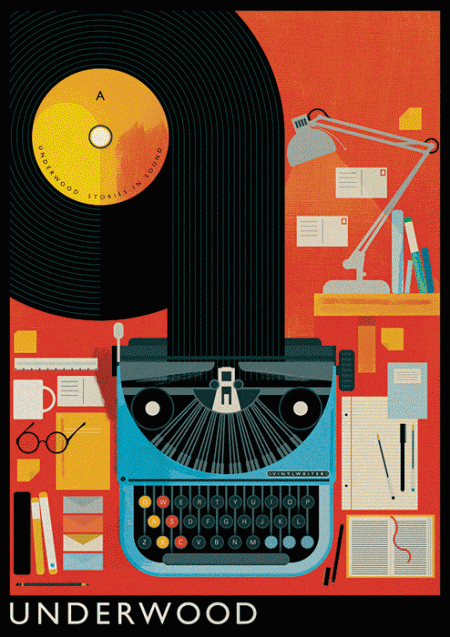
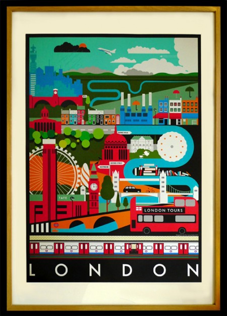
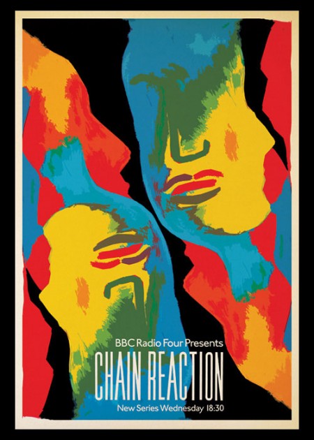
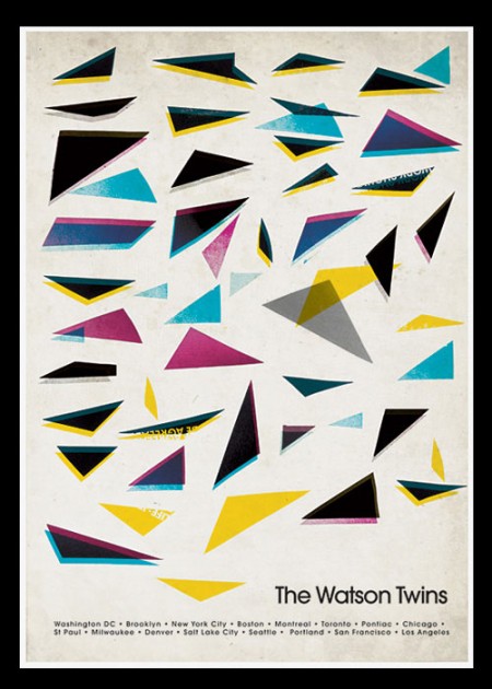
I just came across UK based illustrator Mike Lemanski’s work today and I’m so glad I did. A quick browse through his portfolio will leave no doubt this guy is on top of his game. I’m really enjoying his application of the 60’s playful illustration vibe without falling overboard into kitsch. Can’t wait to see more from him.
Via Grainedit (thanks!)


Wow, very inspiring work. I love how he restricts everything very simple geometrical shapes and primary colors, but in leaving very little negative space creates very complex designs.
P.S. Looking at his portfolio, does anybody know the name of the typeface he uses in the “The Modern Browser, Chrome” piece?
Great posters. I love the repetition of the two heads in the “Chain Reaction” poster.
Scott,
I can’t wait for the new album. When is it going to drop?
Looking forward to it.
I bought that Watson Twins poster at a show and had the girls sign it. Its weird seeing it featured here! Good find…