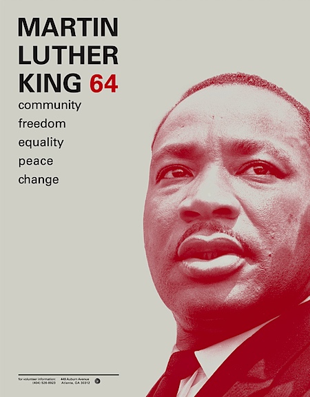
 This student project by Ryan Hageman caught my eye today. Very nice color / typo interaction and a clean, direct style. There’s more over at his site notfreelance.com
MLK 64
11.13.2008


 This student project by Ryan Hageman caught my eye today. Very nice color / typo interaction and a clean, direct style. There’s more over at his site notfreelance.com
Comments are closed.
why isn’t he freelance?
he’s a student at minneapolis art & design. (see “about” section on his site) very solid work already with great focus, probably a good guy to watch in the years to come.
oh cool what font is it???
thanks
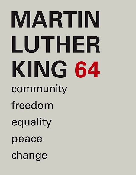
Nice work. He needs to pay more attention to the kerning, though, in the “community, freedom…” section. Otherwise, it’s excellent.
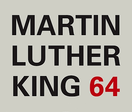
The typeface is Univers.
yeah, i think the only problem it’s the kerning. it’s incredible how the blank space in the left leads you to the photograph. nice work!
thanks GREG 😉
Clean work and great use of color. I would love to see him do his own photography, and get a little more experimental with the type like he did in his identity.
Just wanted to say thanks for the comments and critique. I am spending time revisiting this work and your words inspire me to tweak this design to its full potential. As a student, it is valuable to hear critical commentary outside of the classroom context.
-Ryan Hageman
NotFreelance.com
p.s. univers love.
Meh, sort of boring in my opinion. Seen it a billion times before.