Mrs. Eaves is one of my favorite typefaces. Especially when it comes to serifs — which admittedly, I use infrequently — Mrs. Eaves has long been a go-to. I agree with designer Zuzana Licko’s description that “Mrs Eaves was a mix of just enough tradition with an updated twist. It’s familiar enough to be friendly, yet different enough to be interesting.”
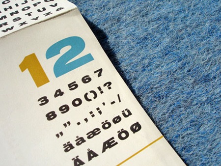
After much anticipation, the sans-serif companion Mr. Eaves is complete. It comes in two varieties; Mr. Eaves Modern and Mr. Eaves Sans (character map pictured above). Like Mrs. Eaves, both variations were designed by Zuzana Licko for Emigre. I’m excited to use this — especially the lowercase ‘a’ variant pictured at the bottom.
Mr Eaves was based on the proportions of Mrs Eaves, but Licko took some liberty with its design. One of the main concerns was to avoid creating a typeface that looked like it simply had its serifs cut off. And while it matches Mrs Eaves in weight, color, and armature, Mr Eaves stands as its own typeface with many unique characteristics. [ Purchase ]


Beautiful looking typeface. I am definitely going to have to try it out.
Looks a bit like Gill Sans.
I covet the capital Q! It’s an exceptionally clean font.
This is such a clean typeface. Love it love it love it.
Off Topic: Can anyone suggest a good font managment program for PC? One thats free hopefully?
Jaceoner,
I’m actually very happy with Suitcase Fusion 2 for Windows as a font management program. I had been using Suitcase 11 for Windows previously, which was—I’ll try not to use any expletives here—absolutely abysmal when compared with its far more advanced Mac counterparts. Fortunately they’ve finally caught it up, and the Windows version is now quite fully featured. It’s not free, though. There are free tools out there but I’ve never been impressed with any of them, mostly due to complex and distracting interfaces. Suitcase Fusion 2 is very simple looking with a minimal interface, which helps me find typefaces quickly.
It will bring you more love and beauty in your life.Go to http://www.lvlvb.com
dammnnnnn… that small caps is nice. so is the italics. This is going to be the next big wedding/stationery typeface just like its mother Mrs Eaves was.
ooooh… lookin’ good, like Gill Sans before the Humanist overdose or Futura minus the pungent geometry. Def agree with Lynn, too, loving the “Q” in all it’s Baskervillian glory. Licko has always been a type O.G.