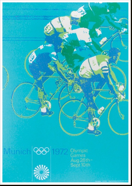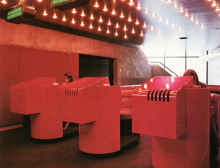
Part of a series of posters from ’72 Munich games by Otl Aicher. I’ll post some more examples in the coming weeks. These must have had a very modern feel when they came out, the colors certainly contrast the prevailing palettes of the time.
Munich 1972
10.17.2007


gnarly. it’s got that nice tactile, hand crafted, serigraphic feel to it. what’s the significance of the white symbol at the bottom?
it’s the logo from the ’72 games.
Hi, there!..7d3b084308d33ed32324018b9f72177d