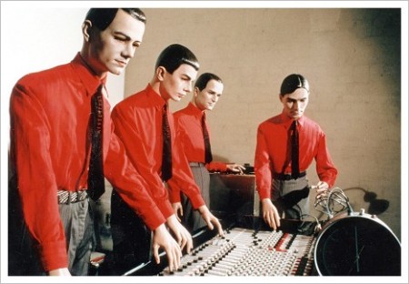
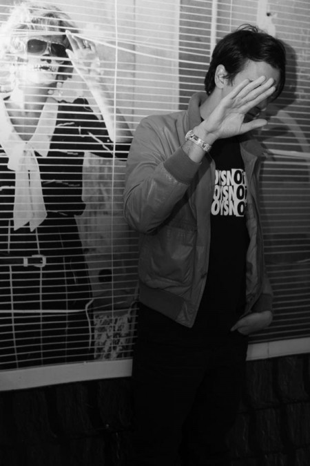
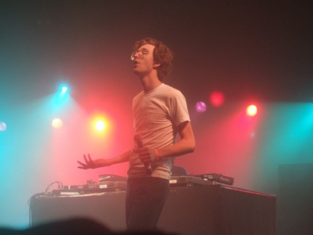
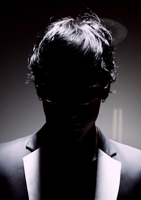
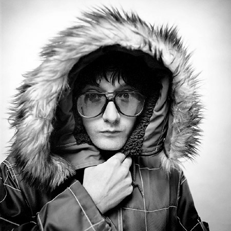
 One of the most important non musical to do’s for a musician/designer is getting a proper press photo in my opinion. This is your chance to show a ton of your personality and a big step in getting writers on board for a feature or helping them to understand your musical direction at that time. This doesn’t mean you have to show your face, take for example the fact that we never saw Burial’s face for more than a year — we just had that drawing of him — but it set the mood I thought. If you’re a musician or even graphic designer, I think brainstorming out some ideas first is well worth your time when doing a press shot. We’ve all worn out the standing in a urban landscape, the blurry shot at a live show, or standing still like a mannequin with a white background. So from 2009 and on i’d love to see photographers really grabbing the personality out of their subjects (Timothy Saccenti’s excellent work comes to mind). This kind of effort in a press photo could make or break you chances with bloggers or writers many times prompting them to use your photo above a couple other things they’re writing about that day. At any rate, a good shot definitely increases your chances of being written about.
Above are a few of my favorites [from top to bottom: Kraftwerk, Boys Noize, Erlend Oye, Jimmy Edgar, Jarvis Cocker]

You forgot the best press photo ever– our very own Scott Hanson!
http://virb.com/tycho/photos/627334
The above photo makes me want to [ http://www.youtube.com/watch?v=4pXfHLUlZf4 ]
Hahaha, but I agree, as a designer/photographer involved in the music business for a few years now, I find that creating a nice visual identity to go with the music is not only important to develop the artist as an act or a brand, but also to help visually separate them from the endless sea of small-time acts that generally don’t leave myspace.
For instance, take this guy Sean Fournier who posted his free CD in the comments on Tycho’s Virb page ( http://virb.com/tycho )…he included a small, visually appealing graphic that led to a well-designed page (even tho it doesn’t feature photos of him, just art), and even tho the music didn’t blow me away when I heard it, seeing that nice graphic made me click and check it out.
I’ve been involved with this in both the electronic and hip-hop/rap scenes, and both are equally crucial. People won’t get the idea that an artist is serious about his music if his press photo is him partying and playing beer pong or a cell phone pic of him playing at a coffee shop or something (unless it’s at least been stylized to look a little more provocative).
I think what you’re getting at here is more about artists developing a visual identity to go with their sound, as the current forms of media consumption have sort of paired the two. Of course, the most important and central aspect of this is the press photo.
Nice post!
I think Scott needs a new photo to replace the one here
https://blog.iso50.com/wp-content/uploads/2007/09/tycho-live-3.jpg
We should brainstorm some different concepts for him. I vote for a shot of him stepping out of one of these cars https://blog.iso50.com/2008/08/26/benedict-redgrove-bertone/ wearing a Nuggets jersey.
Love Kraftwerk’s photo above. Totally reminds me of that classic John Carpenter film: They Live.
Super! Amazing designer photo.
does anyone think that it would be useful for a product designer to have a photo similar to these on his website…i’d like to, but not sure if it would be viewed as superfluous information in comparison to my work…
Wouw, i like this post. And i agree. Since i felt a surplus value by seeing a photo that links to an artist i always search them up when i come across a new band/artist. here are some more examples. at the moment their my favorites:
crystal castles:
http://userserve-ak.last.fm/serve/_/18726287.jpg
Still unknow:
http://2.bp.blogspot.com/_Q_jdiRatXkA/SMGBJVRFU8I/AAAAAAAAAIc/hhMhTIEYfV8/s1600-h/BBC.jpg
Foals:
http://www.last.fm/music/Simian+Mobile+Disco/+images/10141461
Whoeps! correction the last image is the duo simain mobile disco