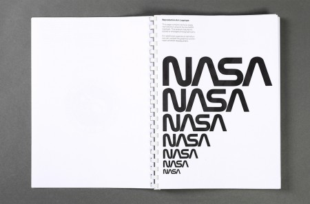
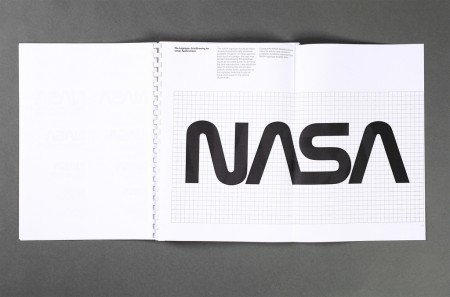
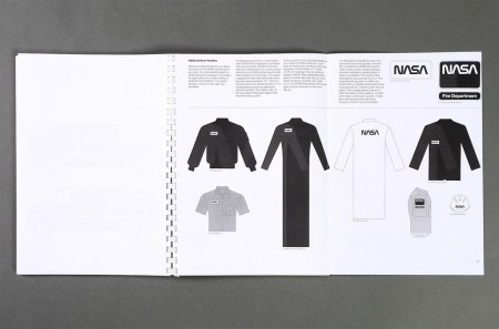
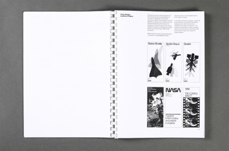
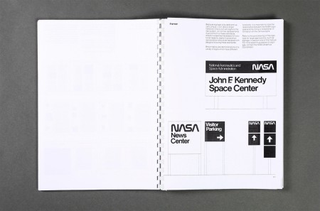
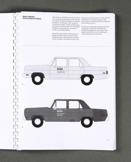
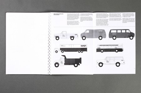
An original Graphics Standards Manual from 1976 when NASA transitioned to the “worm logo” (more info). Love the car graphics, was waiting for something on The Shuttle but then realized it was just a concept when this manual was written. Maybe it’s just an American thing, but is this not the most iconic logo ever?
Via Tim George

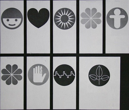

We beg to differ— Canada’s CN logo takes the prize in our minds (although NASA’s is pretty neat):
http://www.canadiandesignresource.ca/officialgallery/logo/cn-logo/
Any site where a PDF of the whole document can be downloaded?
Thanks!
Have to agree with Design + Conquer’s CN appraisal. It beat out the NASA logo by 16 years and is strikingly similar. Marshall McLuhan immediately called it “an icon” upon it’s release in 1960. It has stood the test of time (like the NASA logo) and truly has become an identifiable Canadian icon (to us Canadians anyway).
thanks for the tips on the CN logo guys. you’re right, it’s very iconic. As an American I had very limited exposure to it (mostly on trains / shipping containers I think). thanks for the link design+conquer, I’ll post that up tomorrow as the Canadian rebuttal to my arrogant claims or logo superiority!
silly canada, always trying to 1-up america.
CN is very cool though, just not as iconic as NASA outside of canada.
Seeing that logo placed on a graph paper grid reminded me of a funny mom-moment as a kid. I asked my mom how I could get my hands on a NASA patch and she very nicely offered to show me how to create one myself. She was on a counted cross-stitch kick at the time.
So I took a piece of graph paper and made X’s in squares corresponding to each of the letter forms. She set me up with some cross-stitch material on a circular frame and some black thread. I think I got half way through the N and was like—screw this.
Thanks to NASA for inspiring us kids and thanks to moms for inciting creative opportunities—no matter how seemingly uncool at the time.
I have to say, while I was looking at the NASA logo, all I could think of was its relation to the CN logo. Both have wonderful feel, and a nice relation of form to concept, but nothing can dig the YSL logo from the space it holds in my heart.
Mindless I agree the YSL Cassandra Logo is by far the chicest thing on the planet and very hard to imitate – CN Logo and Nasa look like siblings