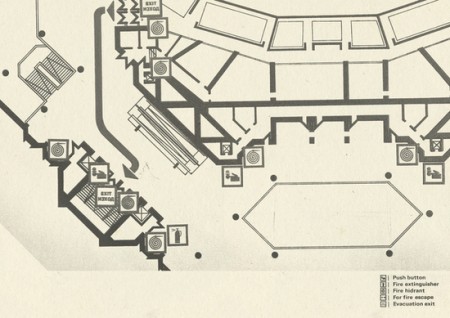
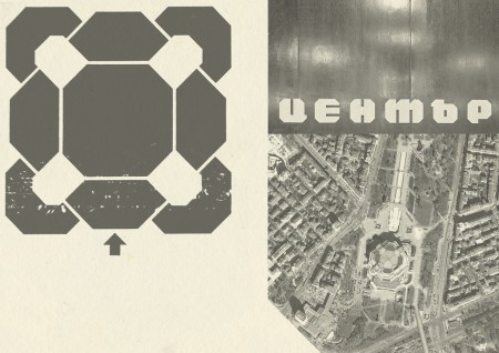
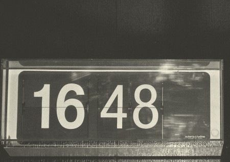
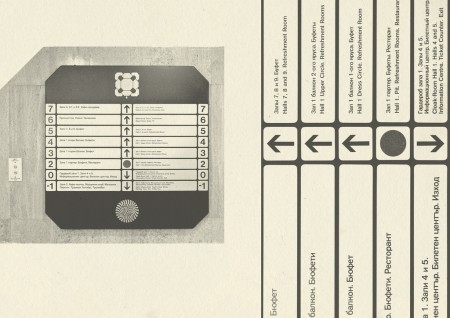
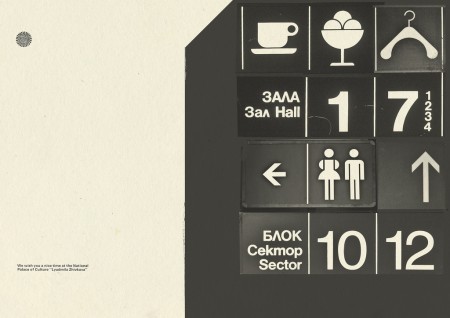
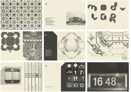
This project was created by Bulgarian designer Mihail Mihaylov. The project is an exploration of The National Palace of Culture’s signage system. The project is very stylistically pleasing, but I really wish there was more information to fill in the projects gaps.
NDK Research
08.10.2010


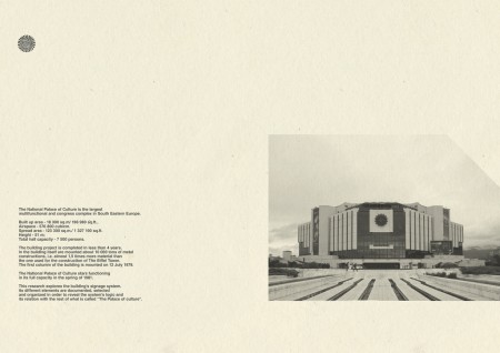
Is it just me or is that Palace really has a shape of some kind of head? I find it beautiful. So is the GD and the layouts.
Ivan are you talking from the front view (third pic down)? Kinda looks like a robot cyclops. I’m diggin the bathroom pictogram, specifically the women’s half-circle arms and skirt.
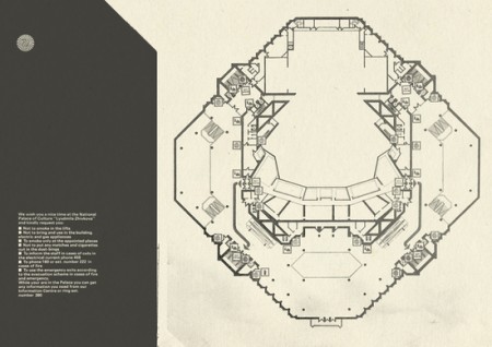
I think he means from the top/aerial view seen in this picture.
The iconography is particularly beautiful as well: Icons
I was thrilled to see this in your blog! I worked alone on this and haven’t got enough time to make a wider research. Those sheets are a result of 3 hours spent walking and shooting around then sorting in order to reveal the system’s integrity along with the architecture and interior. It was more as a “visual” challenge for me and It was done as a part of my portfolio when applying for Master’s of GD in Holland.
Be sure – this building deserves a whole book to feature all its history and interesting issues around it, I hope that soon I will be able to gather more complete information, but anyway I’m glad guys that you like it!
I’m happy I found this blog! Appreciated! It helps me do my research for the National Palace of Culture.
Good luck guys!