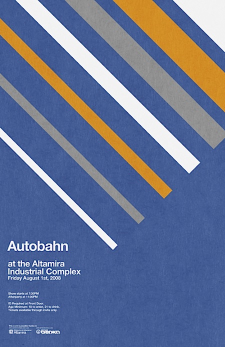
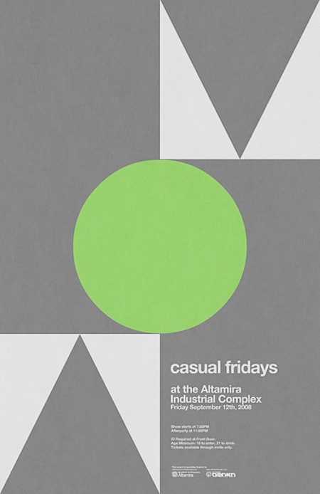
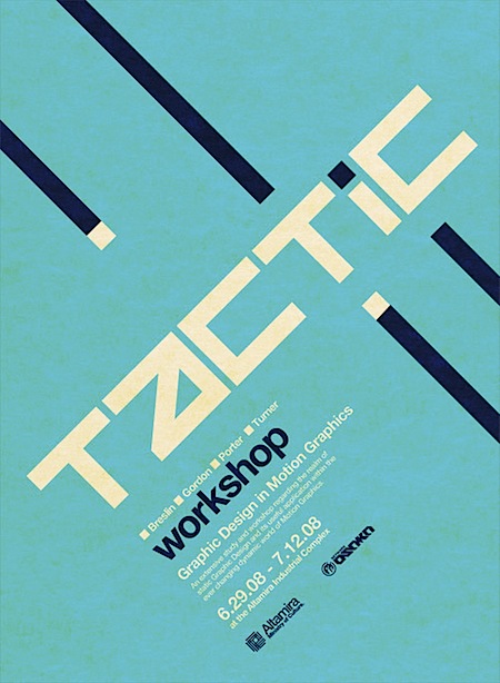
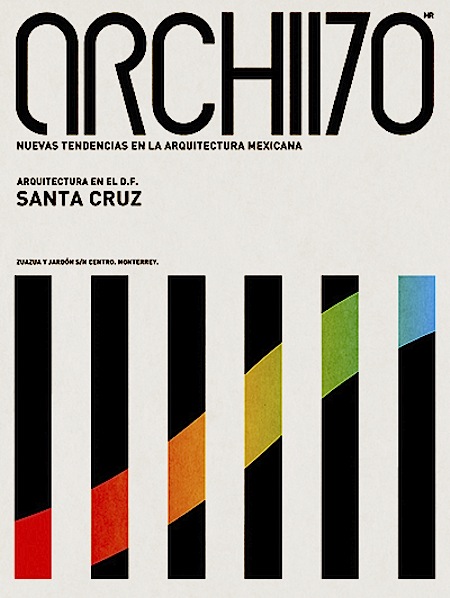
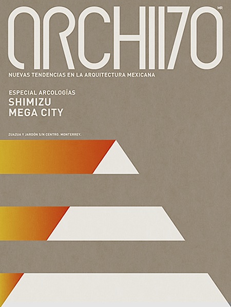
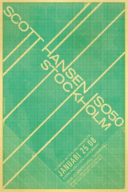
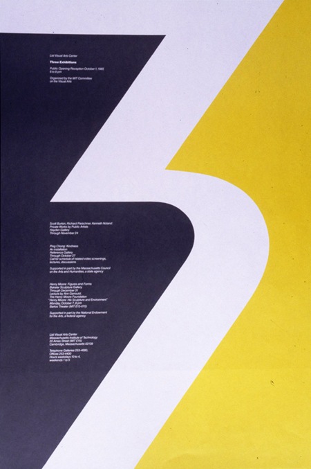
 Tonight I happened upon Network Osaka’s Flickr page via an unrelated search and was pleasantly surprised by a very nice collection of posters. The examples he’s posted range from classic modernism to more contemporary styles; all are well executed. Have a look at Network Osaka’s sites for more:
Network Osaka
10.27.2008

yeah, network is great 🙂
nice typography works
Yeah, I’ve been following his work for a bit now. I especially like the third from top. Really good stuff!
that last one is already bought and paid for, now I just have to find it online and buy it and pay for it. As hard as I try I will always fall for that color scheme.
Hey there Scott 🙂
It’s a nice surprise to see my work featured on your blog. Thanks for the link up and very kind regards 😀 I wanted to attend your workshop at OFFF in NYC but I didn’t get the chance to wake up on time 🙁
Kind regards to my fellow flickr buddies who’ve stopped by this post as well 🙂
PS: Jakub, that one will go on sale as soon as I get the money to go for an offset printout 🙂
Excellent. The first one’s my favorite. I love the subtle texture and color scheme.
YES. All of this.
Been a big fan of both of your stuff for a while now. Top work guys.
Just stumbled onto this through the “Featured Posts” section.
This stuff is amazing. It’s things like this that made me want to be a designer.
Tasty, but does anyone else see more than just a passing resemblance to DR’s work on Wipeout, especially the team logos? Particularly Tactic and Autobahn (http://bit.ly/cQOlYI http://bit.ly/9F7UAm http://bit.ly/aHrvgL)