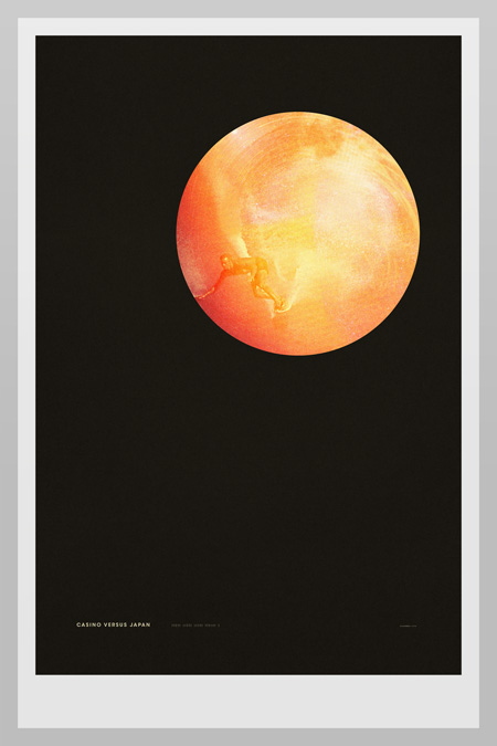
This is ISO50 Studio Edition #009. It features an edit of the artwork I did for Casino Versus Japan’s self-titled reissue this year. Each edition is printed on 310gsm Hahnemühle German Etching paper using the Epson 9900 10-ink HDR system and is available in four signed formats, three of them being limited.
More info and images at The ISO50 Shop


First! 🙂
LOVE the poster. The way you set type brings tears to my eyes.
Absolutely glorious Scott.
I loved the album cover and it did very well as a poster. Love the use of space here.
Wonderful work, Scott. I’m going to order some more work of yours.
Cheers
Yes! I’ve been waiting for this!
Whoa… I like how the surfer is in the original too, but blends into the terrain.
Looks amazing Scott….. I’m still crossing my fingers for the vinyl release of this!! Come on moodgadget you know it makes sense!
God damn that’s gorgeous.
I’m really digging this. But I couldn’t help but notice that the border on the left is larger than the right. It’s very slight but if I were to spend money on this, I would want to receive a print with properly aligned borders. Otherwise, it’s another excellent print.
Salemid-
thanks for the heads up. This is not an issue in the actual print, the image above is a mock-up composite of various images (hard to get undistorted photos of large prints) and was just composited together with one border slightly off. Refresh for updated image.
Insanely good work with the negative space and font size and placement. You’re a freakin genius dude…
You produce artwork that is so appealing to my eye.
Very modern very inspirational. Keep up the work, I’m excited for what more you will make.