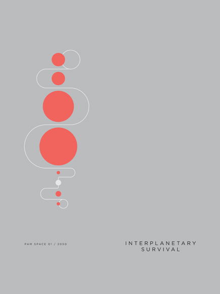
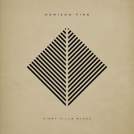
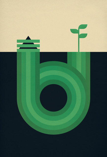
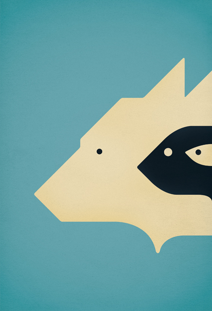
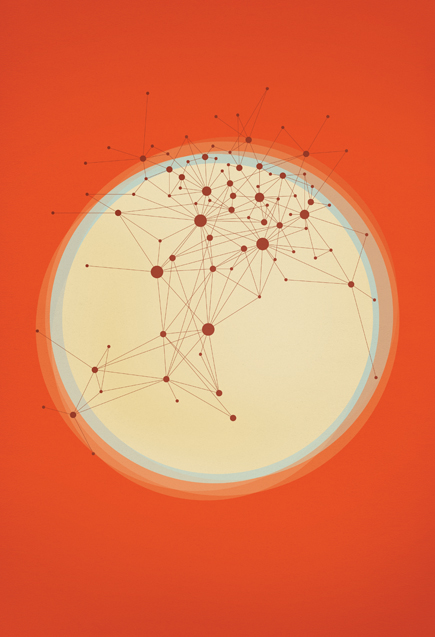
You may remember Paul Tebbott from this post a while back. I recently checked back in on his portfolio and was glad to see some beautiful new work up. He seems to have refined his style a bit, these compositions seem a little more restrained than the earlier stuff, if only a little. I really like what I’m seeing, his use of color is excellent. But I must admit, I kind miss type treatments like this. I’d like to see the bottom three mocked up with some type included.
You can check out more of Paul’s work at his portfolio


really nice, I love the layouts and the clean/simple look. With all the advances in technology, the work I am most drawn to is still the most simple. And throw in a bit of retro/industrial flair with a hint of futurism and I am all set.
I agree minimal text could help anchor the design, but fake text can get so tiring. Its funny too that just a little while ago you were talking about stripping un-necessary text from your older work, but it would probably add too these…
It would be interesting to see side-by-sides.
Thanks a lot for the post, man. I haven’t been using too much type in my work recently, as Jesse said the fake text can definitely get a little tiring. Having said that I am working on a project at the moment that is based almost entirely around type, I’ll keep you updated.
Thanks, Scott
The Chemtrail poster is my favorite.
@ Tebbott – Looking forward to it, I love your stuff and I would be excited to see what you come up with. I love what you did on the “Twenty One” piece.
Really nice and clean work. Some of it is almost too clean for my taste. I like the fact nothing is over complicated ,but they are original and unique enough that I’d gladly want to hang these up on my walls.
Not sure if adding type to these would really make it that much more of a difference. I can see how it would some how add more context to the image as some are a bit abstract. I think Paul is more open to their various meanings than rather having to give it all away with labels.
I think adding the type would be more of a obstruction to what the real main focus is here. However I think these artworks are set up greatly for type treatments. We are so used to having type accompany visuals I think we sometimes fail to see this kind of work for what it really is.
Always loved Paul’s work, you can really see the time and patience taken in the compositions.
Great stuff. I particularly like the composting print..would love to see that on my wall.
Love this kind of style, particularly the astronomically-themed posters evoke that retro-future thing really well. I think the poster of the planets is my favourite from this selection…
Loving Paul’s music as well… goes hand-in-hand with his visual work. http://horizonfire.bandcamp.com
the blue one (3rd one down) reminds me very much of the work of Noma Bar, the negative space book cover inparticular.
http://www.dutchuncle.co.uk/system/pictures/1691/large/Noma-Bar_Negative-space_Final-1.jpg?1252497452
which is never a bad thing, noma bar is incredible.
if you get a chance, i strongly suggest the negative space book and the many faces book, both are brilliant and feature some of the most thought provoking illustrations that i have seen.
Dave