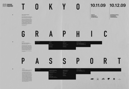
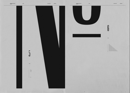
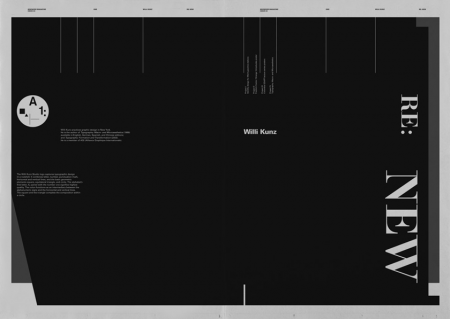
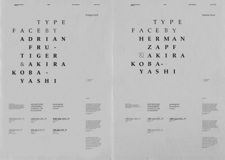
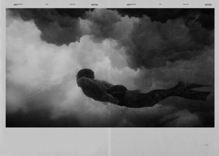
These spreads from Newwork Magazine are exceptionally awesome. At first I wasn’t sure why I was so taken by them, but I think it’s a combination of the following factors: sole use of (mostly) black and white, implementation of a strict grid, lots of little type details throughout, and a sophisticated and effective use of negative space. Newwork Magazine (ink on paper / 32″ x 23″) is put out by Studio Newwork.
Newwork Magazine
10.26.2009

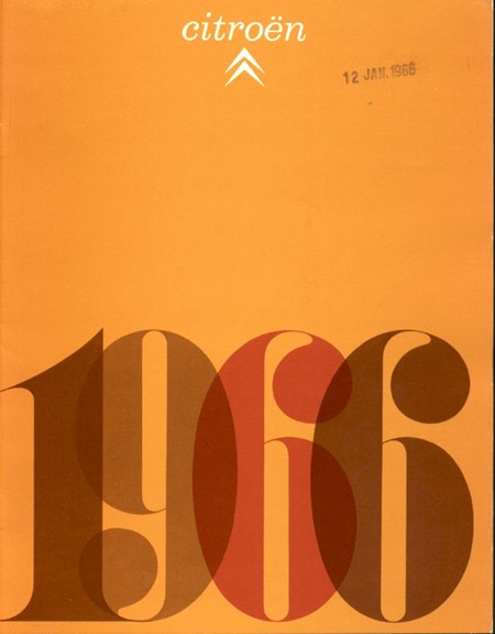
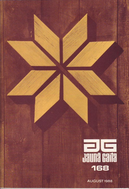
I absolutely love the type treatment and grid use in all of the spreads. My favorite is the use of the macro type in the second composition. Nice post.
http://www.lvlvb.com give me surprise!!!
that last photo is by wayne levin. he’s got a lot of really incredible b&w underwater photography. puts everything in a while new perspective. a lot of the images are really powerful. check it out:
http://www.waynelevinimages.com/
Third one is Willi Kunz.
yummy stuff. great post.
ah! check this out!!! picture over the fireplace!!!!
http://www.flickr.com/photos/55397648@N00/4016511435/
I agree. I think somethings will never change or go out of style. So sick.
quality stuff. thanks for sharing.
this is really good. how long did it take?
so chill