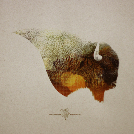
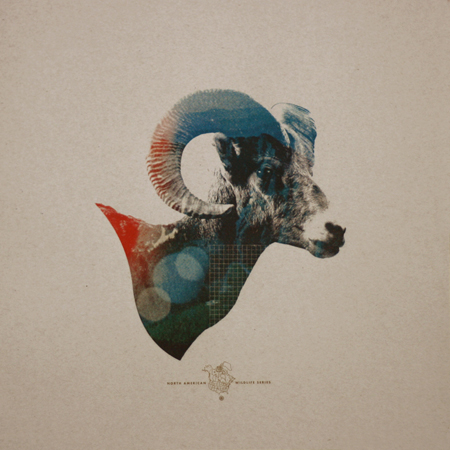
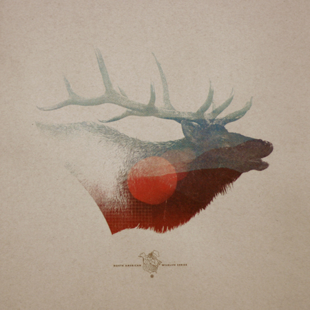
Mark Weaver has got to be one of the most consistently stellar (not to mention prolific) designers I know. I saw his “How To Destroy Angels” cover printed tinty tiny next to a review in Rolling Stone and knew immediately, Mark Weaver! The prints above are from his North American Wildlife limited edition series. They are for sale on his shop as of this week.
Be sure to also check out Mark’s answer to how he overcomes creative block: …”To achieve full creative potential I must sit in the woods, watch Mad Men, and listen to Boards of Canada simultaneously.” One of my favorite answers.
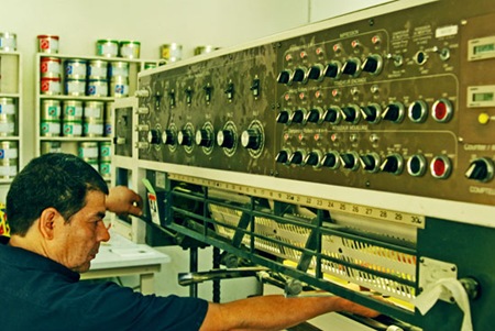

his is stunning work, I am a huge fan. i would love to know more about his printing/screening process.
I agree with Jesse. Also a huge fan of Mark’s work. Check out his Dribbble posts. http://dribbble.com/players/markweaver
Like trying to remember how it used to be before cell phones, is like trying to remember the design world before MW. His work has made a permanent mark(npi) on my soul. Waiting for mine in the mail – can’t wait to hold this masterpiece in my own hands!
If I had money, I would buy one of these straight away. His work is brilliant.
I get that you guys all lap this stuff up, but when are people going to start doing something new? Just feel like this is a bunch of recycled crap from over the last 5-8 years.
Animal head – check
Scott Hansen color scheme – check
Scott Hansen use of grid – check
Time to start developing unique styles… Start attacking me…. NOW!
If i had the money I would buy all 3 for sure. Its just too bad i don’t have a smoking room, or a game room of some kind. With a bear skin rug and an oak table. Or maybe a glass table with antlers for supports. And pheasants on the wall.
the animal head parts are ok, but i think the little logo underneath ruins them. makes them look like ads instead of prints.
Ron: Agreed. I don’t mind the first as much, maybe because its farther away from the image? Maybe if the layout was tall, there could be more distance and the logo/image relationship wouldn’t feel so tense and cramped. Especially in the 2nd image.
Mr. Pearson:
You forgot to include a link to some of your work. OR, did you mean that everyone else is supposed to come up with this stuff while you sit back and watch?
Time to change the batteries in your remote control…
Ron: You obviously don’t get it (.)
Design Police – It’s cool… I understand… Protect what you know… Just a bunch of hipster stuff with no substance.
Who are you? I bet you’re his wife or something…
i dig weaver, but i must admit i’m not crazy about these. i wonder if they’d look stronger without the color/circles/grid.. perhaps a couple more sessions of refining could have brought them to a more interesting place.
calling something finished and posting it for all to see is a difficult thing, it’s hard to feel pleased most of the time with the choice. i’m not sure i’ve felt like i’ve fully finished anything.. the feeling that i could’ve done more is always hanging around.
i do think you can do the opposite of this though, and “overpost” out of a lack of patience. i could be wrong, but these feel like they might’ve been prematurely called “finished”.
Certainly not his best work and I do agree with Ryan that they look a bit rushed and unfinished. I definitely prefer some of his earlier work.
I saw this quite a while ago but looks a bit more finished and these reminded me of it:
http://simoncpage.tumblr.com/post/407592060/ps20-one-off-style-design-celebrating-20-years-of
Wow!!! Mark Weaver is such a beast! I was actually at Amoeba on Sunday and I spotted his “How to Destroy Angels” cover. I didn’t even question it…I had to buy it.
I agree with Mark Pearson. His style is getting a bit tired. He is a one trick pony guys. He has one style and that’s it.
I’d be bored as fuck if I had to continue making the same thing everyday.
i agree the logo thingy’s underneath should be excluded.
i also feel the grid is needless and makes it feel overworked.
that said, lose those and these are badass.
This is really off topic but I wanted to see if anyone knew of the Sound Designer/ Composer Diego Stocco. He has a youtube and has done some tracks for Sega on The Conduit for Wii.
I didn’t really enjoy his stuff for The Conduit but if you search him on youtube he does some super interesting stuff. He fuses instruments together and makes experimental stuff. Lol Idk can’t really explain it. Just hoping someone from this blog thingy likes this guy and looks him up and enjoys him.
these are some sick pieces though. i love this type of art.
I read on his FormSpring that he finds a lot of his material from the Flickr Commons. If you haven’t been on there, I encourage you to check it out. Lots of high resolution scans with no copyrights.
http://www.flickr.com/commons
It’s great when an illustrators work can spark so much discussion. I think Weaver’s work is pretty spot on, and to my eyes his new work continues to look fresh – always self-referential yet progressive.
While his work looks cool, I can’t get over the fact that most of it consists of imagery that he didn’t shoot and is essentially someone else’s work that he rearranged in a way that looks interesting. When you see his work and think that the elk, or mountain scene or the person looks sweet, it’s hard (for me at least) to give him all the credit because he essentially just “found” the images off the net that anyone else could use in their work as well. That’s just my two cents though, everyone sees art differently and is entitled to their opinions.
I think that point of view is getting a little extreme. Most work uses things “found” from other places. If I use a photo of a car, it’s made by someone else. If I use a photo of a building, its designed by someone else. Would we really expect Mark to hike around north America searching for the perfect profile shot of different animals?
Sometimes – and maybe this is just me – when I worry too much about being completely original it stifles the creativity. Everyone borrows, uses, and adapts what they find. Thats part of the process and what makes us creative.
Harping on it may only make you more worried about artists liking you better, than being a better artist.
@Jesse You hit it on the money. I can agree fully with you. On top of what you’ve said:
From the moment we’ve entered this world, we’ve all been exposed to media that someone else has created—this is how we develop likeness for certain styles and our own.
@Brian While its very true that just about anyone could have found those images and used them in the same composition and style that Mark Weaver has done, it didn’t happen. It becomes easy to look at things in life and say that “anyone could have done this”, but prior to this artist “doing” it, more than likely no one had.
Just not very original… ISO50 used to have all the spot on stuff… Seems like things went downhill after you got all the new moderators…
@Jesse and Shelby
I completely agree with your point of views. I’m not doubting MW’s style at all, I think it is pretty compelling. It’s just that it would be nice to see some original stuff from time to time rather than always having to work off of other peoples perspective. I feel like it’s almost settling for what you were able to find rather than creating it yourself.
I like these prints more than his other stuff actually. Sure, he didn’t take the photos, but that’s not the point. What he’s doing is creating a visual for a particular moment/memory. Looking at these makes me want to find myself waking up tomorrow in a foggy mountaintop next crackling campfire coals with the sounds of these animals in the distance.
I feel like as designers, we can be too focused on picking out the production techniques like the fact that he put a grid in his design, added a logo, or used a found photo. For me, he seems to be one of the few designers that can successfully make me “feel” something rather than say “oh that’s a cool design” or “I like that effect you did.”
While I agree that I don’t think the grid is necessary, it takes me out of the visceral moment and back into the design application. Unless of course that grid means something that I can’t figure out.
I these these are solid.
Yeah… fuck Mark Weaver and his lack of original ideas. Such a cheese ball making ridiculous prints out of paper. I mean, why not print on diamonds or something no on else has done. I’m going to buy my giant Audrey Hepburn print at Ikea today and hang it next to my Shepard Fairey poster.
A big mistake on his map of North America – he leaves out Mexico and everything below. It really looks incomplete as is.
Nice work otherwise.
Mavis – you’re a toolbag… Only little kids jump to extremes like you.
The point is that it’s a totally tired style and Marks just ripping off a French artist that very few Americans know about. Unfortunately this artist is still alive to see his work get jacked…
You guys band together more than the cast of the breakfast club during a weekend of detention.
Wow, things got ugly in here pretty qucikly. I personally love these. Great work, Mark.
Chris – You come in here to comment on the work, but end up name-calling, putting down Scott’s blog and generalizing all of his readers? Talk about “little kids jumping to extremes”. Much of Mark’s work comes across as very fresh and new to my eyes and I’m sure many others and I think that’s all that matters. It inspires us, as artists, to explore new territory. Just like maybe he was inspired by “a French artist that very few Americans know about”, something you seem very certain about.
Curious to see who you are, I looked you up. I’m assuming you are the one with a music myspace page. Do people accuse you of “ripping-off” the voice of Ben Gibbard? Well then lay off the name calling.
Chris – take my comment more seriously plz. I wasn’t kidding around about printing on diamonds or anything.
But seriously everyone says he’s ripping off this French dude and this Siberian guy… it’s his style. It’s what’s made him Mark Weaver and a successful artist. I highly doubt Mr. Weaver sits behind his desk plotting a way to rip off other peoples work. I’m surprised no one’s brought up the infamous Shepard Fairey dilemma yet.
And what I’d do to be a little kid again… *sigh*
MP – Good call on the Mexico part BUT my guess is that he left out Mexico and those countries because you don’t really find Buffalo in Mexico. Or elk. So I’m guessing he used only the countries where those specific animals are found.
Kyle – I don’t even know how to respond… I made a point about Mark and you started stalking me? Why don’t you learn to use a high-pass filter the right way…? I am a jr. producer for MTV. Not a musician.
Bottom line, you guys all proved in your defensive responses that people protect what is familiar with intensity… People accept what is familiar and regard uniqueness with in slight variations of differences.
I have had my enjoyment pissing you guys off with my criticism, now to make sure Kyle isn’t peaking into my bedroom as I ravage hot coworker lady folk.
It’s been nice.
Nice work, not new or anything or remotely original but nice work.
Chris – Sorry, buddy, was just trying to prove a point. I admit, I was wrong. You have to admit though, if it was you thad’ve been pretty sweet on my end. “Musician” Chris is totally ripping off Ben Gibbard.
Anyway, the rest still stands for my previous comments though. You were out of line and I felt the need to speak up and defend the great work Scott & co have done to introduce us to so much inspiring artists. And the name-calling was just the icing on the cake.
Sorry I googled (stalked) your name. Enjoy the lady friend. Don’t worry, I ain’t looking.
um… yeah. mexico is a part of north america. thanks.
man, i wonder if alex thought posting a couple mw pieces would cause all this ??
damn you alex! you’ve turned us all into monsters!
Very lazy in my humble opinion. Seems like he’s self-paroding.
The name Mark Weaver means Flickr Commons, blend modes, and the lasso tool to me. So tired of this guy. He even sepiatoned his screenshot of Flickr pageviews: http://www.flickr.com/photos/markweaver/4563381738/
David I like your self portrait: http://davidboni.net/#138452/XIX
Thanks, RB.
Also—I was pretty harsh on Mark with my previous comment. He’s a cool guy, but I want to see his style evolve somehow because right now he is the poster boy of collage art and is an easy target for someone who doesn’t think it takes a whole lot of skill (i.e. me).
After reading all these comments (because I have no life) I came to one conclusion. Mark Weaver is a douche bag!!
I think Scott and Mark Weaver are butt-buddies or something… Who would pawn Weavers work off so hard when it sucks so bad?
In the off chance anyone ran out of room on their walls and wants to sell their Wildlife series, contact me at wallabeex at gmail dot com. Willing to pay above original purchase price.