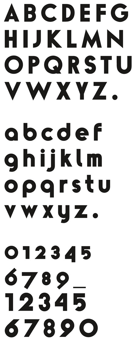
"Number 9" by Ian Brown as featured in the Lost + Found print. Wonderful; can we buy it?
NUMBER 9
12.06.2007

"Number 9" by Ian Brown as featured in the Lost + Found print. Wonderful; can we buy it?
Comments are closed.
I got an early Christmas present from a friend – 4 of your prints and a T-shirt. They are even more beautiful in person 🙂
Awesome type for sure – it’s ISO50 through and through.
I love your world Scott, and this blog (and your work) is always inspirational.
those #’s are gangster
Where’s the lower-case ‘n’ ?
at first I thought it was bauhaus 😮 Is that absurd or does it hold any truth?
So what is this font called? and is it available? It’s gorgeous.
Oh sorry, I see that it’s “number 9.” But again, beautiful.
There’s a lot of Futura in this design. I could whip out my copy of FontLab and digitize this bad boy if there’s any interest.
Oops. I see he’s drawing it now. Never mind.
the bauhaus notion, i meant it about the lowercase letters
Ethan – If thats possible I would love to have this font and Avant Garde Alternatives…
No offense but this typeface is badly drawn, there’s probably better typefaces out on typophile.com done by students that sometimes give them away for free. I wouldn’t pay a dime for this one.
And Ethan, that’s called a rip-off. Jon that’s called stealing, (not even worth it)