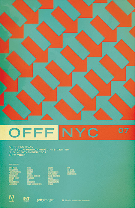
I will be speaking / giving workshops at this year’s OFFF in New York, November 2-4. In case you aren’t familiar with OFFF, it is a festival focusing on the “post-digital creation culture”. Translation: A lot of great people and great designers in one place talking about the things they do and how they do them. There are all sorts of people who attend and present at the OFFF: interactive designers, print designers, ad agencies, experimental artists; it really is an incredible experience and every year I am amazed at the things I see there. I have been involved for the past couple years, both of which were in Barcelona. This will be the first year the OFFF has come to the states, held at the BMCC Tribecca Performing Arts Center in New York, NY. There will be an ISO50 booth at the event with prints, shirts, and music. Stop by and say hello. Tickets and information are here.
The poster (above) is based on a pattern I saw painted on an old, crumbling wall in Barcelona (the city where OFFF began). I always wanted to incorporate it into a print and thought this was the perfect time. I think they sort of play on the energy of New York, lot’s of people and things moving in different directions and they tie the concept back to the origin of the festival itself. I played with having the arrows running up and down (as the original painting I saw had) but the 45 degree angle seemed to translate the dynamic, energetic vibe I was going for a bit better. The colors are meant to confuse the eye a bit and enhance the double arrow effect going on. I chose classic, practical typography to balance the piece and hopefully give it a more timeless feel.
Incidentally, after posting this I was looking at it on the front page of the blog. I scrolled down and saw the recent post on the NFB and realized how similar the two images are. Perhaps a case of subliminal inspiration? Funny how things like that can happen as I definitely didn’t have that NFB poster on my mind as I was designing this, but the similarities and time frame seem to rule out coincidence. And on another aside; this is one of the, if not the first posters I’ve ever done without a border. As I look back at my collective works it’s sometimes surprising to see these common themes and elements crop up here and there. Some are intentional, but others, like the borders, just seem to be these dogmatic devices which aren’t always necessarily the best choice for the given project. Ha, I feel like going back and turning on and off the borders of all my older works to see which looks better.
OFFF Festival NYC
10.08.2007


This poster is amazing, institutional and refined.
I really like it as well!! It like your choice of putting no borders, it really works! The color scheme is also very nice!
I was wondering if workshops is something that you do often? I wont be able to come down to OFFF this time, but I would be really into coming to a workshop of yours at some point.
it keeps getting better! 🙂 will you ever update the “exhibit” part of the site?
Rafael-
I treat the exhibit portion of the site as sort of an album. I don’t like to constantly be updating it. I like to release a site, let it stand on it’s own as a body of work, and then later release a whole new site with the new work included plus some of the highlights of the older work. I guess it seems more interesting when you release a new site for their to also be new work in the site, not just a new flash movie / interface. That said, I am in the planning stages of a new site right now. I really couldn’t give a specific release date but I am shooting for something in ’08…Although that depends on how smoothly recording the new Tycho album goes.
On the subject of subliminal inspiration, i once wrote a song that was almost an exact replica of a a track by a local band that i’d seen just once before (and not really paid too much attention to at that).
My band played the song for a few months before someone at a show asked me why i’d changed some of the lyrics in the “cover” we were doing.
It’s amazing the amount of information your brain actually retains, whether you’re aware of it or not.
Ah, rats, I was really looking forward to hearing you speak and buying some merch, but our company decided to send me to the Future of Web Design Conference instead. Are you at conferences in NYC often?
this isnt about this piece but i was wondering what font you are using on the Austin print? you seem to use this font often in your work but it especially works well on the Austin print.
I too was wondering on the font used in this poster actually, can’t put my finger on it, please help before I become obsessed and stay up all night drinking Mountain Dew and scouring the web frantically in another desperate, and often hopeless, font expedition. Thanks.
Kristian & Pants-
The font is Chalet Comprime, available through House Industries
Thanks Scott, you’re the best! ::puts down the mountain dew::
Kind of reminds me of the Fed Ex logo in a funny way….but anyways..thumbs up for another stunning piece Scott! =)
hi scott!
great poster! i love it
the composition also is great
just wanted to say I hope it’s not printed yet, as there’s a typo in TriBeCa which has no double c in it…
and here goes the painting in Barcelona http://www.flickr.com/photos/riccoboni6/420452995/
It always surprised me as I was walking around.
That’s a smart idea to use it as a reference to the energy of NYC and as a reminder of Barcelona 🙂
Lekin-
no it is not printed, the OFFF people caught that spelling mistake, I just haven’t updated this version….thanks for the heads up!
yes! that is the painting… was so striking when I first saw it, I knew I would have to incorporate it into something eventually. I want to do another version that’s truer to the original, next summer I will take some more pics of the painting and work it into something else.
thanks for the info.
BAD MANN
I will be there! And I will definitely come by for your workshop.. Love your style.. it’s super inspiring!
I grabbed a poster yesterday! Love it!
overflow vertebromammary purblindness sexto asset cheesemongery depickle apocholic
Midwest Philosophy of Mathematics Workshop
http://www.dbaol.com
overflow vertebromammary purblindness sexto asset cheesemongery depickle apocholic
Eypel and Rutherford – Coldwell Banker
http://www.noor-scientific.com
Optimism is the content of small men in high places.
— F. Scott Fitzgerald, “The Crack Up”
—————————————————————————————————-
http://vanwilkinsonod.easyjournal.com