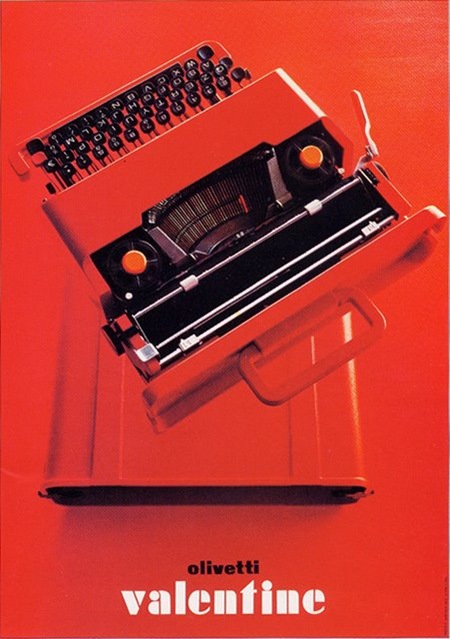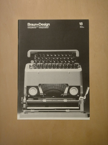

Olivetti Valentine Typewriter (c.1969)
"Sottsass designed the Valentine typewriter (with Perry A. King) for Olivetti in 1969 to be an "anti-machine machine," for use "anyplace but an office. Undoubtedly one of the great design classics, the Valentine expresses the mood of its time: goodbye to the bulky cast-iron housings of old typewriters, hello to the new mobility of a light, modern, plastic casing made from ABS. The Valentine typewriter is a very collectible portable in spite of the fact that it is relatively of recent vintage. "
Via mytypewriter.com
Top ad via ninonbooks, Braun + Design cover via Alphanumeric.


Ooh, the red one is so beautiful .. I adore red and good design!
I like the fact that the typewriters looks like faces.
I want to read ‘naked lunch’ again.
minor note, (really minor) the name of the typewriter should not have been translated. It was meant to stay “Valentina”, because it originally was a kind of “quotation”, E. Sottsass named the typewriter after the character of Guido Crepax’s comics, the journalist Valentina… then because typewriter in Sottsass mothertongue is a feminine substantive, therefore the female name fits quite well… ok anyway it’s fine, what matters is the fact that it’s a great design piece
check out my old school design flickr set:
http://flickr.com/photos/jeftavarwijk/sets/72157604426424509/
Some dutch design from decades ago… neat!
these studio shots and b&w-photomontage designs really inspire me. the letters sometimes are a bit over exposed, making them expand, loose a bit of their crispness, and fatten a little bit. im crazy about that.
i wonder how many designers would drench their products in pure red.
this is so inspiring, maybe it’s about time to do that.
Yeah, it’s a real beauty. I managed to snag a red one on eBay… Sadly it’s broken beyond repair, but I love just having it on a table as an object.