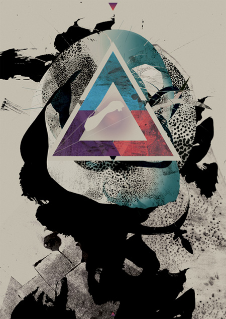
I stumbled across this incredible piece by Michael Paul Young today. Young — the man behind Designgraphik and co-founder of We Work For Them — created this image for the band Omega Code. More info on Young and this piece can be found here. Always nice to see such incredible print work still being produced; sometimes I feel like the only good stuff is decades behind us and then something like this pops up.
Omega Code
01.28.2009


Hm … i don’t see why you like this so much? It looks like a pile of rubbish randomly thrown together. A very bad use of brushes by a beginner. His work is amazing but I don’t see why you think this stands out from everything we find these days. I always thought your style went against the simple use of splatters and shapes. before posting this I tried to see if there is some kind of composition trick to be found in this mess. Like a some image to be found when you look from a distance. But no. It’s just a page filled with messiness and randomness?
many would say the same about this…. all in the eye of the beholder I suppose.
but why do I like this piece by Young in particular? I think the color choices, textures, balance, and overall composition are outstanding. I love the juxtaposition of b&w and color, and I don’t see mere randomness here, it feels very well crafted. Also, young is anything but a beginner, check the links above for evidence of that.
I really like it. Looks totally New Wave/New Romantic”. I’d expect the band to sound like Spandau Ballet or Berlin though.
I have to agree that this one isn’t really doing it for me. This piece is a victim of what my old GD professor used to call “photoshop sauce”. It just looks like the guy threw together about 95 layers of stuff with no real regards to composition and then slathered as many filters over it as he could. I have to respectfully disagree about the composition, there are no real anchor points besides the colored triangles and the overall proportions don’t really create a strong flow within the piece itself.
However, it really is in the eye of the beholder since we all react to different stuff, but from a strictly academic/critical point of view, this is not a successful piece.
I really like all of the subtle textures throughout the piece, especially within the colored triangle area. it just takes some further investigating to really see the depth of stuff like this sometimes. great stuff!
I like the peice but I wonder how it would lookwith the background elements inverted? I really enjoyed the triangle and the textures within.
Sent from iPhone
I think its pretty cool.
I like it very much as well.
Not everything has to be explained. I don’t believe graphic design always has to be academic and grid-based. That’s only one of the many ways to approach it. Sometimes it can be fun just to let loose and do something purely based on the fact that you like how it looks and feels. Improvisation, as in jazz. Also, I don’t see any text in this piece, so I would evaluate it as a non-commercial piece of art, rather than a piece of graphic design meant to sell something or communicate specific ideas.
In other words, every once in a while, you just gotta take off your clothes and run through a field screaming at the top of your lungs.
FYI, the artist explains this piece as such:
“I was commissioned by the band Omega Code to be one of the several artists creating an artwork for their upcoming 2009 release. The band had each artist choose a song and illustrate its emotional meaning. I choose the song Resistance, which provided the following text: It’s the point of equilibrium between the whole album. It sustains all the purposes in one. Means equity. The point of perfection, holding everything on its shoulders. Peace.”
I didn’t initially like the design at first but it’s one of the those designs that does drag you into it – very hard not to give it a double take.
I like it and think it works well. The color and textures blend together nicely, and I think the overall composition of elements flows.
Scott, I notice some of your style is veering into this type of layered abstraction. I noticed it in the “Tycho – adrift / from home” design. It seemed like a large departure from most of your previous work.
This is an interesting piece for sure. The textures are very well developed, and there is a lot going on to hold your eye. Initially, I was not a fan of the colors employed or the triangle’s placement, but reading the artist’s description of the piece explains why some of those choices were made. Without that information though, it looked like two divergent works to me.
Wow, I wasn’t going to say anything but then Ralph summed up my feelings precisely in the very first sentence of the first comment! It’s nice, but I don’t see why it’s particularly special. Saying that “sometimes I feel like the only good stuff is decades behind us and then something like this pops up.” kind of implies that this is the best piece of design you’ve seen in decades! Which is pretty wtf!?
Dude, what’s up with triangles and space? Every time I get on fffound it’s nothing but triangles, space and naked chicks. I know this particular image was linked to anther page, but in general triangles and space are taking over. There’s almost no reasoning behind it; no meaning. It seems like graphic design for style over concept, which is cool, but I think we need to dig deeper–myself included.
The triangle is apart of that Omega Code project logo. I would say using circles is Michael Young’s trademark to some degree, not triangles.
With MPY’s work you should look at the whole scope of it over the past 10 years, and his approach will make more sense (or not). I think he is less a Graphic Designer, more a artist or strange dabbler in the digital medium. When was the last time he released any client work anyways?
The ink imagery in his work is usually hand painted or screen printing techniques scanned in, according to an interview I read from him a few years back. I think his work in a single piece is nice and OK, but when you look at what seems his guidelines and system over time, its quite impressive. Look at his site, intense amount of work, even programming. The work inspires me at least.
Uh, I don’t know who the hell Michael Young is but if your trademark is “using circles” that’s pretty pathetic.
frank-
like I said, eye of the beholder. I think it is a great piece and more striking than a lot of the stuff I’ve seen recently. but perhaps that’s not saying much considering I spend about 14 hours per day in a basement making music and/or design, not listening to and/or looking at much of either. also, my statement didn’t imply this is the best thing I’ve seen in decades. it meant that, every so often I see a piece which strikes me in some way, I might not necessarily have a good reason for it, but either way, it makes me realize that people are still doing innovative work — which should go without saying, but every now and again I still need a reminder. at any rate, I’d say this piece probably should not be judged as design, it’s an abstract painting if anything.
anyways, sorry to offend, but I would hang this in a very nice spot on my wall… and if you don’t know who Young is, check out his site and his background, he’s done some very influential work.
I agree with you Scott, but only to a certain level. Saying you’d hang this on your wall depends on what this creation really is. A digital, flat, printed, 72dpi image which some punk could’ve posted on Flickr? Or a 5 foot poster with immense detail? Or even better, a real 5 foot painting which begs for you to come close and sniff its texture and paint blobs? For me this is a randomly thrown together composition of brushes. In other words, the easy lazy sunday afternoon 2-hour doodling in Photoshop. But you’re right – eye of the beholder. I just thought you and the other ‘beholders’ on this blog would fail to see the amazingness in this piece too. Ah, I’ll stare at it another five minutes, but then I give up 🙂
i agree with scott. i dig the triangle’s color juxpasition to the brushes black and white. ij would hang it on my wall as well
it took me a minute to notice the triangle on the bottom, ahahaah
There’s so much hate here! I just felt like I had to comment.
From some of you I get the impression that a piece is automaticly bullshit because brushes were used? Since when did that even become relevant? Anyone can use brushes as much as anyone can take a stock of a girl and cut it out and add some swirls around her body. Everything is OK to use as long as you use it the right way. According to Terrayut it’s probably ink and not even brushes but personally I don’t care what tools have been used because this piece has quality, a striking composition, emotion and Michael’s style that adds that little extra.
Now, you don’t need to like Michael’s style and that’s fine by me, like everyone said already, it’s in the eyes of the beholder, and I personally like this piece.
As for the triangles I couldn’t agree more, there is nothing that I hate more than triangles with eye’s in them (this one doesn’t have any eye’s but I’m just saying) and most of us would probably agree. This piece is an exception because it was designed for the omega code, obviously?!
To Ralph, I don’t want to bash you but please do show us your lazy sunday 2-hour doodling in Photoshop so we can compare it to this piece.