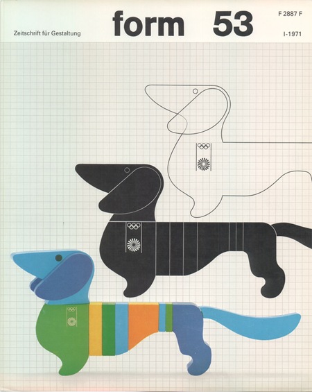
Another image by German Designer Otl Aicher who was responsible for the branding of the ’72 Munich Games. All of this stuff is amazing. I am not a huge fan of the Dachsund mascot, but this is about as good a treatment you could give to such a concept.
Simply do a Flickr Search for "Otl Aicher" and your head will explode. Incredible stuff, some really nice shots of the London Aicher exhibition. I just can’t get over how contemporary these colors and forms are. None of it feels dated, could have been from a pitch for 2012, if the people who oversee those sorts of things still had any taste that is. Seems like all the stuff now days is targeted at the lowest common denominator. All of the recent stuff I have seen for 2012 is throw-away, middle of the road with compromise written all over it. Aicher’s campaign is thought provoking and timeless, obviously a good argument against the design by committee ethics I have to imagine produced this sort of output.
Otl Aicher – Munich ’72
10.18.2007


Looking at the London and Munich designs side-by-side is amazing. I don’t know about anyone else, but I just don’t feel anything looking at the London 2012 designs… But that Munich stuff is just amazing.
And let me just say, Scott, that this new blog format for iso50 is fantastic – really enjoy reading it. Thanks.
Otl Aicher is my hero :^)
I particularly enjoy this piece:
http://flickr.com/photos/tobybarnes/397746659/
But seriously, the 2012 logo is.. well… it sucks. To me, it would be suited better for a logo for a game like Perfection. Maybe if you made the shapes the color of the Mexican flag, it could be some “wacky and zany” fiesta platter advertisement for Chilis’. X-Treme Fajitas anyone?
I miss design that lasts forever. I think people don’t design like that anymore. Thanks for bringing the masters alive again, maybe people go back to pay attention to the what really matters instead of dive into so-called “trends”.
long-live timeless design. may we all live by it.
Ahaha what a corny comment, sorry. Viewing those images just brought some feelings back. Otl is somewhat responsible for bringing design education to brazil, since he taught (in Ulm) the first generation of serious graphic designers, which founded the first design school here in the 60s. These guys are like local heroes and unfortunately those ideals seem to be diluted nowadays… I really hope people overcome the “digital-party” and stick to values instead of technology. I think it’s the thought behind these works that make them so strong.
cheers and thanks again
Navis-
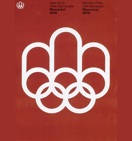
yes, that poster is one of my faves, will get around to posting on it soon.
Rafael-
you’re right, I don’t know what it is, but it doesn’t seem most designers these days are going for lasting designs. Perhaps it’s the web’s domination of the industry. It seems like most designers these days do mostly web work, which is by nature a temporary, disposable medium. With this in mind, there is a tendency not to mind the long term viability of the design. I think the companies and projects driving design these days have a fair bit of influence over these trends as well. Whereas the large budget design projects of the 60’s may have been commissioned for large public works projects and national interests (e.g. the Olympics), today’s big budget, high profile projects are purely manipulative campaigns by massive corporations hoping to “capture the youth market” or some other segment by pandering to a specific demographic while in turn influencing the rest of the world at the same time (think MTV) I think this leads to very specific and intense trends which most of the time lack any sort of merit outside of their intended purpose, to subvert the masses.
ah and by the way, I did follow your advice and found these:
http://flickr.com/photos/9713498@N08/
http://flickr.com/photos/20745656@N00/sets/
As for your comment: I think we live in an era of “enchantment” with technology and the possibilities of the web world, but as soon as this euphoria fades out we’ll find out what was lasting design in our time. But I think it all comes down to who are really interested in the process of making design, as were those crazy germans in the late 60s, and the thought behind it all.. a real sense of purpose and craft. In the end, I think that’s what makes a difference, since style is such a vague and volatile thing these days.
Thank you so much for posting these. Amazing!
I can’t get over how awesome this blog is. I’ve spent about 3 hours on it today alone.
Otl is legendary, I’ve been pining for a book about him for awhile but the are few and far between and very expensive. IT never occurred to me to search for images of his stuff on Flickr.
….you’re right, awesome design in head-exploding magnitudes. Thanks.
You’re doing a great job with this blog! You dig up things I had no idea about. Thanks!