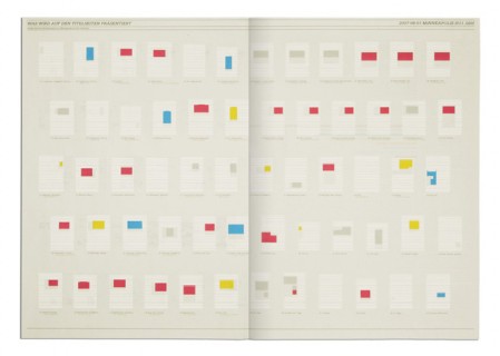
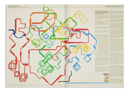
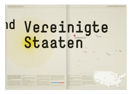
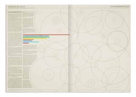
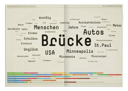
Overnewsed but Uninformed is a collection of infographics and by Stefan Bräutigam. When I first saw the title, I misread it thinking it said Overnewsed and Uniformed, which could also have made sense strangely enough. As it is, Stefan point is something we all can relate to: feeling overwhelmed with incoming “news” while actually learning nothing at all. At least that’s what I can gather, some may be lost in translation. Either way, the design is pretty brilliant.
Overnewsed but Uninformed
05.07.2010
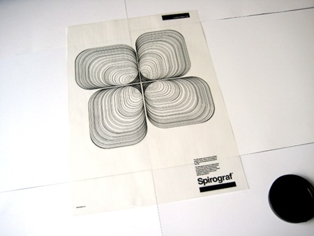
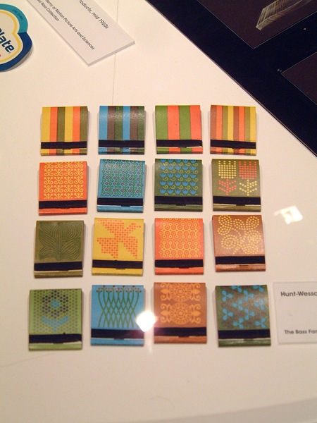

So glad you found this. Forever I’ve had a few of these in an inspiration folder on my desktop but never knew who created them.
Another fav: http://www.overnewsed-but-uninformed.de/images/05g.jpg
Can someone point me in the right direction for the monospaced font used in the above project? I can’t seem to find it anywhere. Thx!
Fonts are serifa and simple.
Also, according to the website, this book is about explaining the way modern media communication works, explaining processes, ownerships, dependencies and recipient behaviour. It analyses the medial reaction to a Minneapolis bridge that collapsed, and explains in detail how these reactions may be verified, gauged and compared in order to help recipients orient themselves better in a modern media environment and who should be trusted.