Gap Redesign Contest


Editor’s note – In answer to some of the questions in the comments: This contest is not for Gap. We are not affiliated with Gap. Gap has nothing to do with this contest. This is for fun, not Gap. Gap will not be using any of these logos. Gap will not be forcibly entering your home and removing belongings. This is not a secret conspiracy by Gap and the Freemasons to get you to design free logos. This is not crowd surfing. I bought some socks there one time like five years ago. Also, Gap has apparently been using the new Helvetica logo for nearly a year now, everyone just decided to notice and get super pissed off when they added a gradient square this week. If you submit a logo to this contest, you retain the rights to that logo.

By now you have seen the new Gap logo. By now you have sent a “this is terrible” rant to all your designer friends. By now Gap is probably about to pull a Tropicana. (Update, they did).

OK so I get it, you don’t like the new logo. I don’t either. I want the little gradient square to fall into the gap and never come back. But I couldn’t help but think: what would I have done if Gap had come knocking and asked me for a new logo? How do you rebrand a company as ubiquitous as The Gap?

So rather than rant and rave, let’s fix this. We are a community of designers and I’m sure someone here can come up with something better. So here’s the contest:

Your Job: Design a new logo for the Gap. Assume a fairly open brief and think about where their brand is and where it’s going.

Timeframe: 1 week. Contest ends on Wednesday October 13th. Short yes, but this isn’t school, let’s work quick.

First Place: Your choice of giclee print from the ISO50 shop (size 24 x 36), a shirt of your choice (also from the shop), and a process feature article here on ISO50 (If you choose to, you can write a process piece on how you developed the winning design, which we’ll post here on the blog).

Two Runners Up: Two shirts of choice from the ISO50 shop.

Instructions: Email alex [@ symbol] iso50.com with the subject line “New Gap Logo” and attach your redesigned Gap logo. Please make sure your file is in JPEG or PNG format and clearly displays your logo. Size 450w x 250h pixels please. Center the logo, make it look nice. Limit two entries per person.

Due to the extremely high volume of submissions, entries may not be posted right away, but we’ll do our best to get them all up before the 12th!

Voting: Winners will be determined by a popular vote after the last submission date on a separate post.

Legal: All entries remain the sole property of the designer who created/submitted them.

All entries will be posted here after the jump

(more…)
A Collection A Day


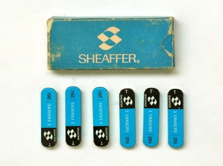
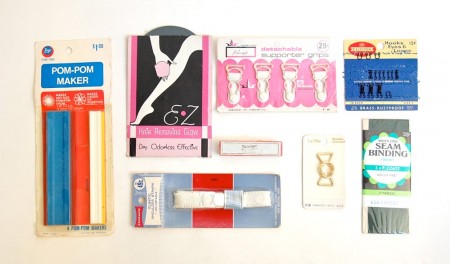
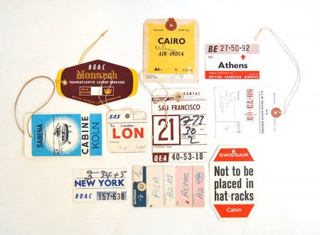
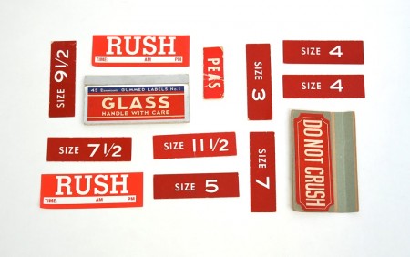
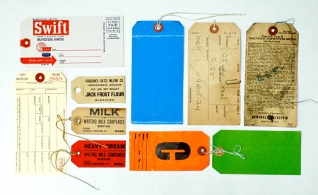
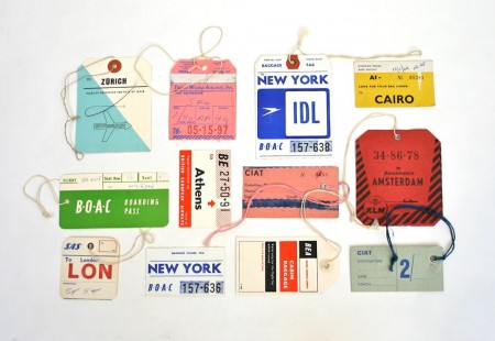
A Collection A Day is a blog by Lisa Congdon chronicling her daily obsession with assorted ephemera. I’ve always held onto little scraps and tokens like these, but none are as good as the stuff Congdon has on display. I often find this kind of stuff even more inspirational than straight-forward design, particularly the airline tags.

Source A Collection A Day via Grain Edit

Bibio + Samiyam + Rustie + Balam Acab


Free spirited Gonjasufi gets reworked by label mate Bibio and its a real unique outcome. Don’t expect the usual guitar or anything worn in sounding, instead organs driving the song into this distorted bass guitar breakdown, it sounds better than I can describe it.

To help promote the upcoming Shigeto debut album Full Circle, Ghostly International is giving away some high profile remixes. The head nod master Samiyam takes Shigeto’s And We Gonna and slaps it around a bit into a low key west coast jam, download it here.

You want a gnarly release to wrap your head around then go out and pick up Rustie’s new EP that came out on Warp today. Its like Sonic the Hedgehog spinning out of control and getting tangled in miles of cassette tape thats being fast forwarded, i’m a fan of this kids creativity, he’s really setting the bar high for how wild this beat music can get and still be super enjoyable.

I keep looking at the name Balam Acab and think its another word just spelled backwards but its not. With the success of Baths I keep running into more beat releases with reverbed lyrics. I really love the use of the water related field recordings in this one, I hope to see this act live.

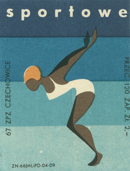
Matchbox Labels 2


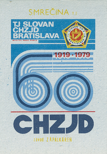
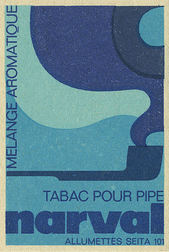
Shailesh has some excellent examples of various matchboxes up on his flickr. I forgot where I found this link but I’m going to take a wild guess and say it’s from Dave over at Grain Edit, who has a very impressive matchbox collection of his own.

Source

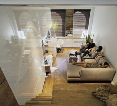
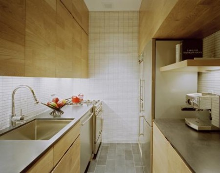
East Village Studio


Some of the most interesting homes aren’t those that are colossal. Take this East Village Studio in New York City for example. Sure its small apartment living but its also small, clean and minimal while having a warm, welcoming vibe. What more would you want in an apartment—besides an Eames chair.

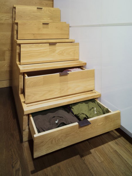
I’m not sure about hiding my clothes in the stairs but at the point of creating a more spacious home it works. Is it just me or does this seem like an apartment that would be great for someone who’s a fan of Dieter Rams?

Tycho Live Photos


I just got back in from Toronto which was the last stop on the short Tycho tour we just did (I was joined by Dusty Brown and Zac Brown for the live sets). I just wanted to thank everyone so much for having us, we had a great time playing for you and couldn’t have asked for a better vibe. Our very own contributing writer Shelby White was on hand at the Seattle show to shoot with his 1D MK2. As you can see (above) the results were beautiful, he really captured the feel of the lighting that night. And that last one of Dusty is amazing!

I’m going to take a break from shows for a little bit here while I tie up some loose ends on the music front, but we’ll be hitting the road again — and making it to a lot more cities — once the album comes out and we have time for a proper tour.

Images Source: Shelby White / Wanken Blog

Brian Eno + Redshape + Pandatone + Fenton


Oh man this first preview of the new Brian Eno’s LP on Warp Records has me geeked, have a listen above, it grows into a bit of an educated punk kids dream.

Deep techno wizard Redshape is always on my radar, I prefer his singles over any other material, if you ever want to hear someone holding down the early melodic Detroit sound than look no further than this man.

Brooklyn’s Pandatone glitches out on a low key folk venture, for some reason after hearing this I started to miss the labels like Hefty and earlier Mush, those were the days for this kind of sound.

I imagine that if I had a playlist for snowshoeing in the dark i’d putting a bunch of Fenton on it.

The Dark Side of the Lens


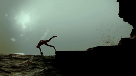
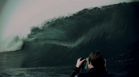
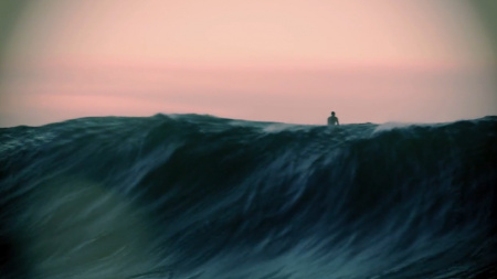
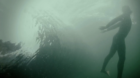
Do yourself a favor and watch this video right now. It’s filled to the brim with absolutely breathtaking shots — so many that I can’t believe they were taken all by the same team. The Planet Earth folks need to hire this guy RIGHT away. Honestly I’m speechless. This is an amazing piece of film. An amazing piece of art. Congratulations to Mickey Smith and Allan Wilson for making such a brilliant piece. And all for Relentless Energy — who knew.

“Still look forward to gettin amongst it” – The Dark Side of the Lens.

I should also mention that I love this video because I LOVE the ocean. I am terrified by the sea, but I love it. Of course I like the way it looks, but I also am constantly taken by its incomprehensible size and power. I am not a surfer (you should have seen me try in New Zealand), but I have always felt the same connection to the sea that I often hear the surfer describe. I like to sit in it, lay there, do nothing. My favorite thing in the world is getting tossed, turned and pummeled by waves — salt water filling my head every which way — then rolling up on shore and lying in the sun where the sea meets the sand.

Display


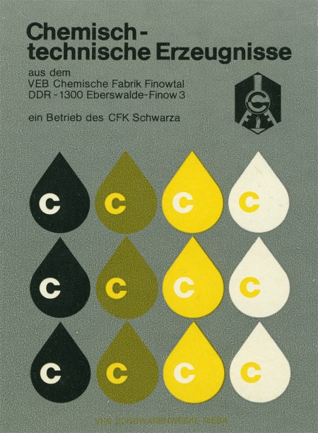
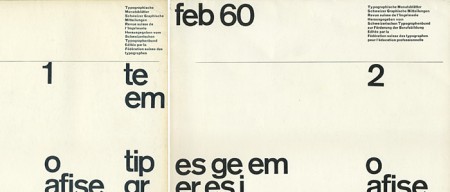
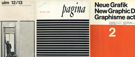
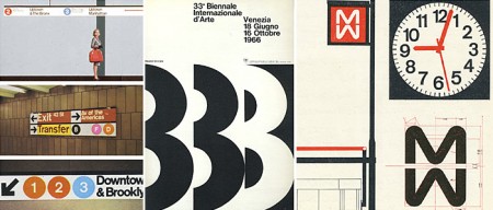
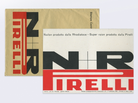
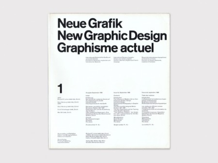
Display is a curated collection of important modern, mid 20th century graphic design books, periodicals, advertisements and ephemera. Documenting, preserving and providing public access to these original materials will raise the profile of Graphic Design as a source of educational, historical and scholarly analysis for teachers, students, designers and independent researchers. [link]

This is one of those sites I’m hesitant to blog about because I’m afraid you all will go there and buy all the books before I can. Of course Display is more than just a store: their collection is a terrific source of inspiration and history. I’m really impressed with how thoughtfully put together the whole site is; extremely well curated. Seriously you must visit this site — I am having a terrible time picking images for this post because they are all amazing.

Lapaglia + FiF & Weed + No Age + Hecker


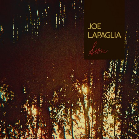
Joe Lapaglia is a native of Niagara Falls that has made me realize I should dip into more of this dark experimental folk. The fusion of folk and drone is soo appealing, it keeps things interesting when you listen to his album, you get a sense of how tense he wants you to feel after a string of his lyrics, grab a free song here from his LP.

Foxes In Fiction and Weed team up for a cross country(Vancouver – Toronto) cover to make Katy Perry’s hit single a lo-fi bedrock must have, download it here for free.

I liked No Age live more than on record, their new LP gets me excited to see what they do next on stage. This additional ethereal intro in Sorts should hopefully grab new ears for the bands already impressive recent success.

I gush over new Tim Hecker, its the most interesting noise in my opinion, to be able to grab this one track off iTunes for just $.99 is just robbery.