Dieter Rams in Frankfurt


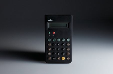
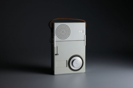
I am very jealous of any of our readers that are able to make it to this event. Starting May 22, the Less is More exhibit will be at the Museum für Angewandte Kunst in Frankfurt, Germany. The exhibit surveys Dieter Rams entire body of work and is also accompanied by a lecture series. I’m hoping this Vitsoe sponsored roving exhibit will eventually make its way to California. Though the last time I wanted to visit a design museum, I had to all the way to Milan.

If you can’t make it to the event, do remember the 800 page catalog I posted on not long ago. This book is terrific. If you haven’t picked up a copy yet, they are available from Vitsoe and Amazon.

Vintage Magazine Scans


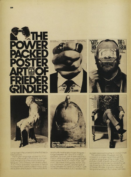
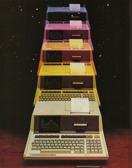
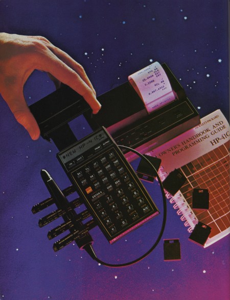
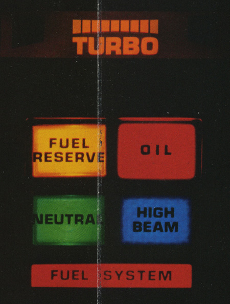
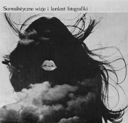
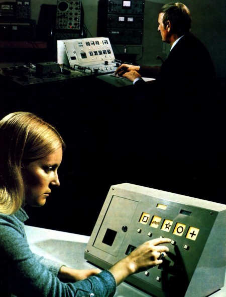
Eric Carl (who also brought us these vintage sci-fi book covers and these classic logos) has a beautifully scanned set of vintage ads from magazines up. They’re all high res so it’s a goldmine for textures and overlays. I love how magazine print breaks up at high resolution. The moire patterns are very useful when blown up in compositions; I use them a lot for posters.

Vintage Ads on Flickr by Eric Carl

100 In The Hands+H Of H+Jahcoozi+Interpol

Photo above unrelated to the music chosen


The Hundred In The Hands play next week in Brooklyn, i’m really looking forward to hear how this girls vocals translate live, this song is soo sugary and a perfect blend of electronic and rock, almost up there with School Of Seven Bells but without the sonic guitar work and twin vocal love.

House Of House was a big summer DJ duo last year here in Brooklyn, I hope they kick up some dirt this year and maybe even dish out a few more tracks like this, I always love the long edits.

A pleasant surprise signing for the B-Pitch label, Jahcoozi sometimes ride on that Bug LP tip that we all loved, liking this track Msoto Millions because of its hypnotic elements and that bit of wobble.

New Interpol FREE download, takes awhile to get to the meat and potatoes but once its going you remember why you loved Interpol in the first place.

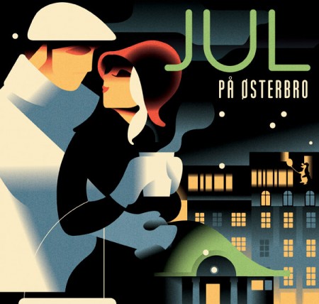
Mads Berg Illustration


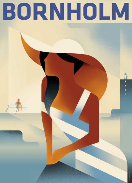
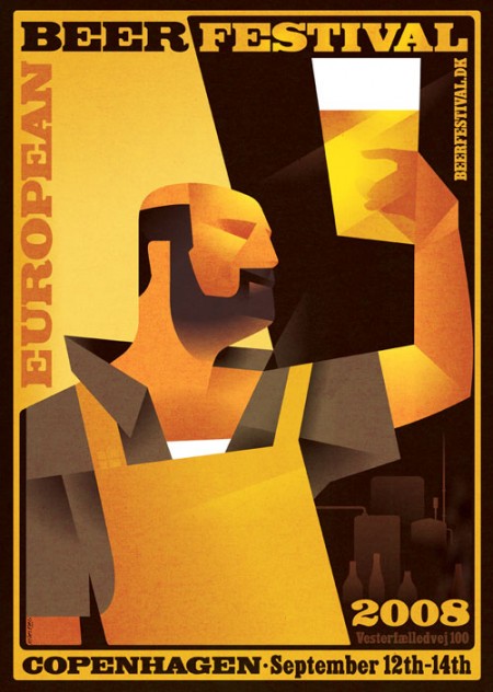
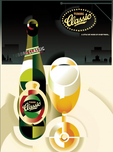
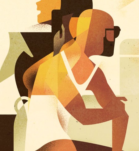
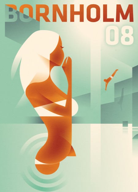
Mads Berg is by far one of the most refreshing illustrators I’ve seen in quite sometime. His works range from a crisp, modern Art Deco style to more 3-dimensional environment illustrations. Each of his pieces have such an engaging style that immediately welcomes you.

What I take from these illustrations is the execution of the core concepts. The amount of riffraff in these is nil—it’s down to the bare essentials which leaves us with a very simple illustration and clear message. What more can you ask for?

It’s a shame that I haven’t seen this style reflected more in today’s design trends. However, it could be that I’m just not tapping into the streams that they’re in.

(more…)

Funki Porcini + JDSY + Ratatat + Javelin


Before I get to the Funki Porcini song I want to talk about JDSY because this song keeps popping up in my head and i’m trying to give it justice. Imagine all the experimental avant pop that has been made and what usually turns you off, is it because of harsh sounds? or is it some style that your not familiar with? I think most avant pop even in the indie world doesn’t surface because the artist might go too far off and makes something too effect driven or messes around too much, well I want you to hear me out on this JDSY song because I think its an important piece of music because 1. Its not trendy, not one song he makes is what you might hear on Pandora or Last.fm 2. he isn’t reinventing anything but instrument choices together aren’t like anything i’ve heard before, its like Bjork leaving the Sugarcubes and instead of writing debut she writes a love song disguised as a children television theme songs for the 1990’s but at the 2 minute mark the melody hits me like a ton of bricks, I get this feeling he’s done it he has made a true avant pop for 2010 and i’m comfortable saying it. Here is the song Telluride for free.

Sorry for that tangent I just felt like I needed to get it out of me but now its going to be hard to describe all these other great songs. First off, I was geeked to hear a Funki Porcini song that i’ve wanted to hear over and over, its been awhile, probably close to 5 years. It’s on a dark tip with slow breaks but keeps my attention with the synth work, nice one Ninja Tune for supporting some of the guys that really got me into darker electronic music.

The new Ratatat isn’t anything new, you can feel its a Ratatat song right away when it sounds like a fake electronic guitar is playing a great melody, don’t break something that isn’t broken, looking forward to the rest of this record.

I’m embarrassed to say this is the first Javelin song i’ve ever heard, i’ve seen the name nearly 50+ times in my life and i’m from their home state Michigan so that makes me feel even worse, I just thought they were going to be a lot harsher but instead they give me that wonderful feeling of when I first heard Jacknuggeted by Caribou.
FITC Toronto Reel / Music by Tycho


FITC just released the highlight reel from this year’s festival in Toronto. The video was done by Stock Archive and features the most recent Tycho single, Coastal Brake as the soundtrack. I’m pretty sure the whole thing was shot with the Canon 5D MK2. I did an interview for the Stock Archive guys and they had a couple setups, one of which was the 5D on one of those body-mounted steady cam rigs. It was insane; the guy looked like a robot. Some of the panning shots definitely look like they were using it.

I’m really impressed with the editing, I’m not sure what I was expecting but this certainly exceeded it. I think as the quality of the 5D becomes ubiquitous people will stop being so blown away by the visual aspects alone and elements like editing and narrative will become much more important. Right now I feel like you could record a dumpster for 30 minutes with the 5D and it would be watchable.

Video Link

On a side note, I will be speaking at FITC San Francisco this summer. I’ll be posting more on that next week, but just a heads up if you want to score some tickets before they go up in price (May 28th I believe).

Dribbble


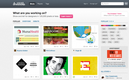
Dribbble is a place to share little snapshots of what you’re working on. It’s kind of like Twitter, except instead of being limited to 140 characters, you’re limited to 120,000 pixels. Better have a good eye for cropping!

Dribbble is show and tell for designers, developers and other creatives. Members share sneak peeks of their work as “shots” — small screenshots of the designs and applications they are working on. It’s also a place to talk design, give and receive feedback and iterate toward better work.

They exited private beta about a month ago and are in invite-only mode right now. I’m very impressed with how solid the site feels overall. Seems like they spent a really long time finessing all of the details. I haven’t had a chance to ‘dribbble’ any of my own projects, but I really like the concept and I think it could be really fun to use. If you want to try it out, you’ll need to be drafted.

Baths + Lorn + BRONZE + IKONS


Today I have some fresh picks, starting off with the very buzzworthy Baths who recently signed to Anticon. We need more Baths in the beat world so that the point of shows isn’t just all about playing the most hype track but more into the pleasure of hearing the artist perform their music, Baths definitely has some potential to help push this along if he hits the road hard, HIGHLY RECOMMENDED.

I’ve heard Lorn’s name thrown around a bit by Mux Mool, this track Cherry Moon reminds me of a more mellowed out Ratatat track with strings, spot on production.

Bronze was recommended to listeners by DFA‘s Free Energy, their giving away their EP on bandcamp for free.

This last track is the video below, I love how the director did so much with a still piece, which brings me back to the point of it doesn’t matter the size of your budget you just need the right creatives.

IKONS – SLOW LIGHT from Service on Vimeo.

Expo’70 Ephemera


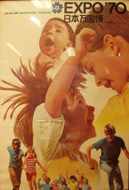
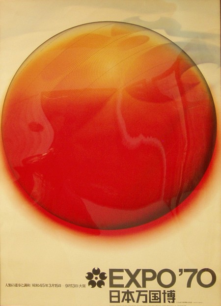
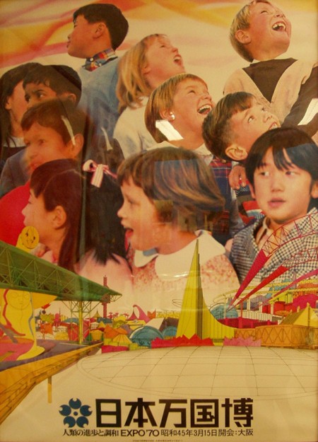
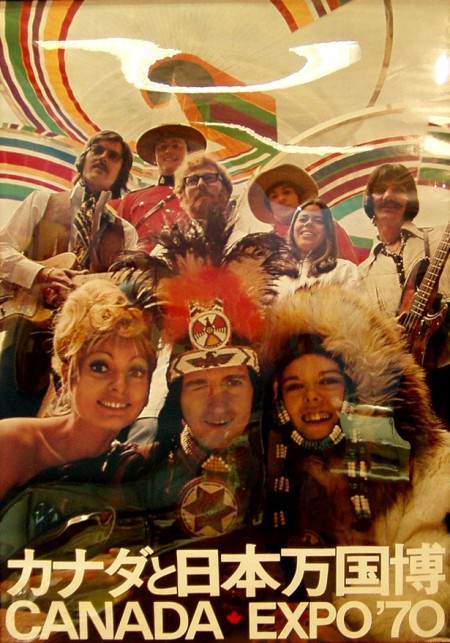
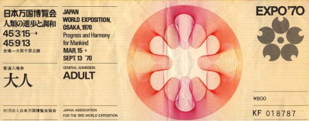
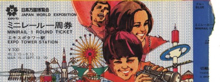
A nice collection of posters and tickets from the Expo’70 in Osaka Japan. I’ve been looking for proper scans of these posters forever but I settled on these corrected versions from this flickr set. Anybody know where you can score some copies of these? I found this one on eBay, but not really the style I’m looking for. Nothing I love more than 70’s phtography blow-up with bold Helvetica over top. It’s always a little sad to see stuff like this and realize how rare it is; it’s a shame there isn’t some sort of high res vintage poster repository.

On a side note, Canada: you always have great design instincts but I have to say, you really blew it on this one. Winking Caucasian Indian? Also, what’s with the attempted Geddy Lee up in the corner? Couldn’t you get the actual guy to be in your poster? But I guess not all 70’s Canadian bassists were in Rush. You saved it with the type lockup on the bottom though.

Images via Sanue and Lilakanarie

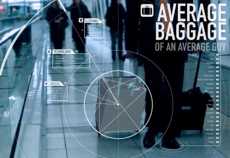
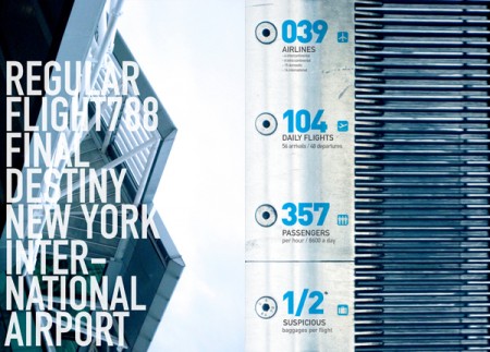
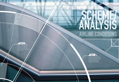
Welcome Aboard Info graphics


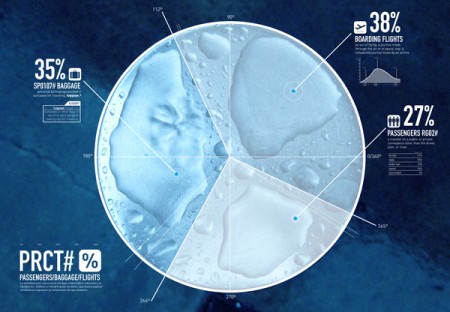
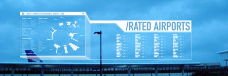
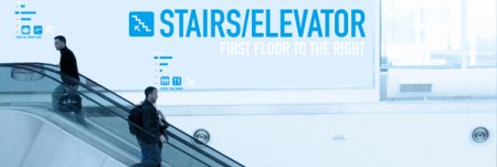
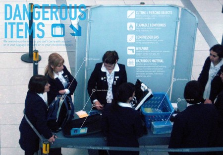
While this has been around the Behance block, I can’t help but admire this piece by Francisco Andriani. The use of typography in these pieces is gorgeous. The noisy photographs and large type along with a relaxed but secure color palette also really sets the mood of airports.

Seeing these info graphics makes me want to see this style implemented nicely in the terminal. Large monitors showing arrival and departure times with this style would be stunning. Especially if used on large installations like these. With a little collaboration I could see Tyler Thompson’s boarding passes and Francisco’s info graphics alongside one another in the near future in airports.

But part of me asks: how relevant would this style of design be to the traveler?