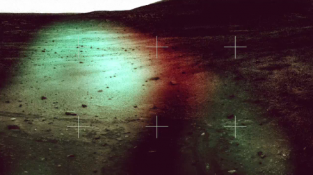
After seeing these videos I know now that if Charles Bergquist is doing visuals for a musician in Brooklyn then i’m there. It’s hard to find good visuals these days at a show, a ton of it seems like bland web archive footage and is always an after thought, i’m really liking the subject matter that Chris chooses and the select and simple effects done that fit the music.
Charles Bergquist Projection Collection
Young Friends+Depreciation Guild+Laurel
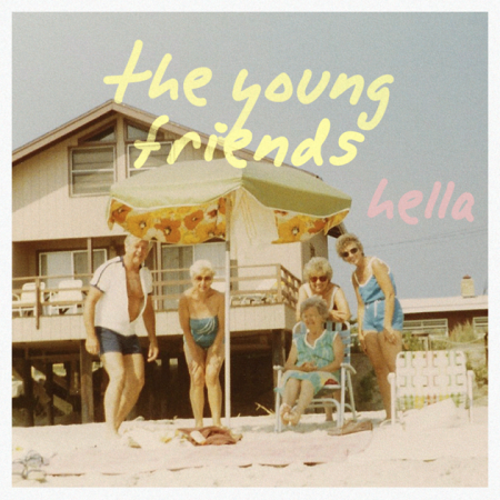
The Young Friends are teens from Arizona, teens!!! like 17 and 18 years old! making surf / 50’s pop, that blows my mind. Okay now that i’m over that and feel like an old man i’m more than happy to have heard them since its the first record that oozes youth and summer flings like having a gusher for the first time. If you like it stream the LP here with a free MP3 and check them out in the video below.
Going from one young band to another The Depreciation Guild are on the other side of teen feelings, the more sentimental teens. The guitars sound like your favorite early 90s dream pop band that you thought might finally fill that void of Slowdive being done.
Ann Arbor, MI / Brooklyn’s Laurel Halo I think made a song that people might of wished what the new Knife album should have sounded like. With her vocals set in the background while she plays dreamy keys (she plays that part live! I saw it, very impressive) I can put this song on repeat day after day.
M.I.A. went for it, her new video is relentless, shocking and NSFW but that doesn’t make me stop loving this track, should be a huge summer hit at the rowdy outdoor rock parties.
For Better or For Worse: $100 Bill design

In case you haven’t heard, a new $100 bill was recently unveiled and will be rolling out in early 2011. The good news is that the new bill will be flashy. It has been updated to include some new “3D” anti-counterfeiting features. The bad news is that the design suffered in doing so.
Maybe I’m expecting too much, but the new features that this bill has brought to the table aren’t doing it for me. The few techie “3D” color-shift features are cool but clearly look to be crammed alongside and over other elements in the design. If you look at an old $100 bill, you can see that the design has more of a structured layout from element to element. As hard as it is to say, the new design actually has a couple positive things going for it, but they still don’t outweigh the negatives.
The new design adds vibrant color which something that the old bill lacked. It seems to me that if such a vibrant color is added, it should only be in one location: either in the actual numbers or as the background of the entire bill. I do believe that the spot of color on the back of the bill (second image) is a nice accent when used with the larger ‘100’ type but I can’t say the same for the color accent on the front.
With that said, it’s pretty clear that I’m skeptical about this design, but what do you think. Were these design changes for better or for worse?
Medications+Daedelus+Astronomer+Dibiase
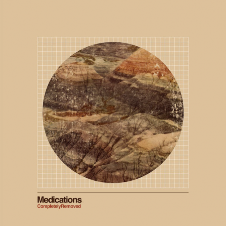
For the new Medications album they picked up Mark Weaver to do the art, I think it came out great, one of the best covers i’ve seen all year. I think it sits perfect with this song Brasil ’07 which is on a Sea and Cake, Lemon Jelly, etc vibe.
I was going to post some more Daedelus then this along with an interview or guest post but he never returned my emails so his loss, which is a bummer, here’s my favorite track from the new LP entitled Righteous Fists of Harmony. What a great month for beats! this, Bonobo, Mux Mool and Free The Robots, pretty on point.
I’ve grabbed up as much of this Glasser stuff as I can, the remixers seem to be more up my alley over the originals which isn’t a bad thing. I like a good 9 minute track with girl vox sometimes that isn’t trying to tear my face off.
The best name in hip hop since Silkk The Shocker is Mr. Dibiase hands down, Mux Mool put me onto him, sounds like Blackalicious playing video games at Barcade(for the Brooklyn readers).
Phil Ashcroft
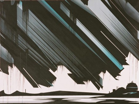
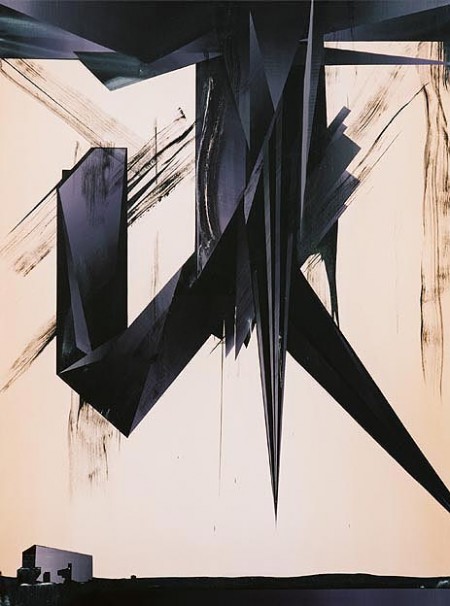
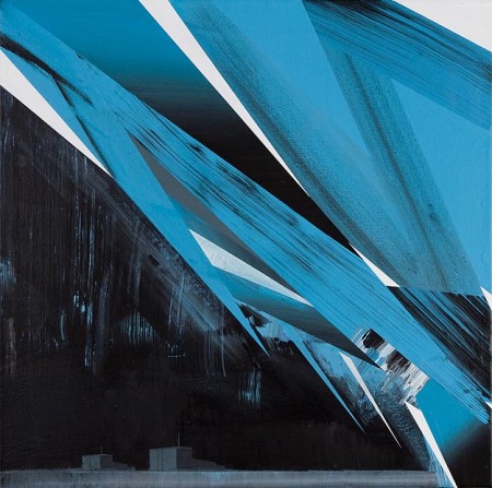
Big fan of these paintings by Phil Ashcroft
The unknown is a space at once fascinating and fearful by mankind’s technological advances and the romantic notion that there still lies undiscovered elements to the world in which we live. A derelict hospital, oil depots, nuclear power stations, the abominable snowman; collectively these semi-surreal settings and cartoon-like motifs appear as mysterious manifestations, phenomena both real and imagined. link
ISO50 x FITC Toronto: Today

Just a quick reminder I’ll be speaking at FITC Toronto today. The talk starts at 2:30pm in Toronto 1 room at the Hilton. Hope to see some of you out there!
Spirituals + Light Asylum + Ross 154 + Sega

Some of you might have bought the new Caribou record this week and want more or even prefer the old Manitoba sound well a nice new LP from Spirituals can fill this void in your life very quickly. The self titled LP from Spirituals has beautiful melodic swells and full of surprising light drives and builds using everything from woodblocks and warm organs.
The drums may remind you of Phil Collins and her vocals might hint at a tougher Annie Lennox and the synths might have picked up where Q Lazzarus(Goodbye Horses aka the song from Silence Of The Lambs) left off but there is one thing for sure this sound collected is new and fresh.
This is a rough rip from youtube so please excuse the quality but if I could say it does add a little charm to this track. Ross 154 is Newworldaquarium a Danish musical genius in my mind if you followed him on labels like MOS or Delsin. Using classic sequencing of underground raw Chicago House and Aphex Twim SAW like melodies makes me feel like i’m glowing every time I hear it.
Reaching deep into my archives I had to pull this out, maybe the best game ever for the Sega Genesis was Sonic The Hedgehog but soundtrack wise Streets Of Rage 2 was untouchable, here is a intro track that some people say was just be a rip of Enigma‘s Sadeness but the melody added on top of it always made my 12 year old nod.
200 Year Kalendar
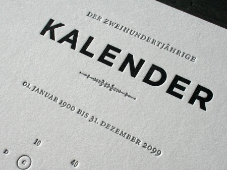
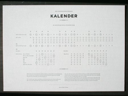
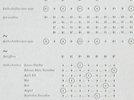
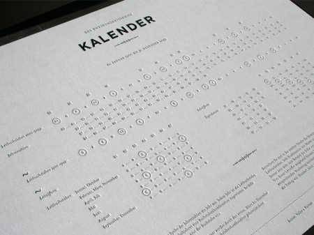
Calendars to me have always been items that I tell myself to use, but rarely do. However, I think that would change if I had this beautifully designed 200 year calendar by Sonner, Vallée u. Partner–a Munich, Germany based design studio.
This calendar was letterpress printed on a thick, 220lb cotton stock and is approximately 16.5 x 11.6 inches in size (click images to see larger).
Images via Beast Pieces.
Qubik
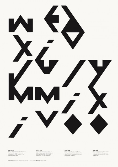
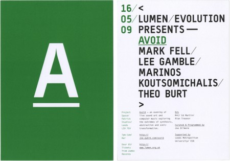
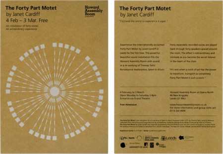
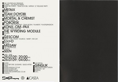
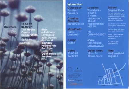
Qubik Design is a graphic studio based in Leeds UK. I like everything about these pieces except the color. The layout and type compositions I find very interesting; personally I just don’t prefer the chosen hues of green, blue or gold. Otherwise I think this work is fantastic. Especially that first one! I also like how clean and organized their site is. I’m starting to appreciate this much more now as a writer; recently I’ve come upon a number of sites that are so poorly laid out I give up researching, even if the work is amazing.
C111 B&W






Found these beautiful B&W images of the 1969 Mercedes C111 that I posted last month. These might just be big enough to make some prints out of (click for high res)
More images here
