BDDW – SoHo


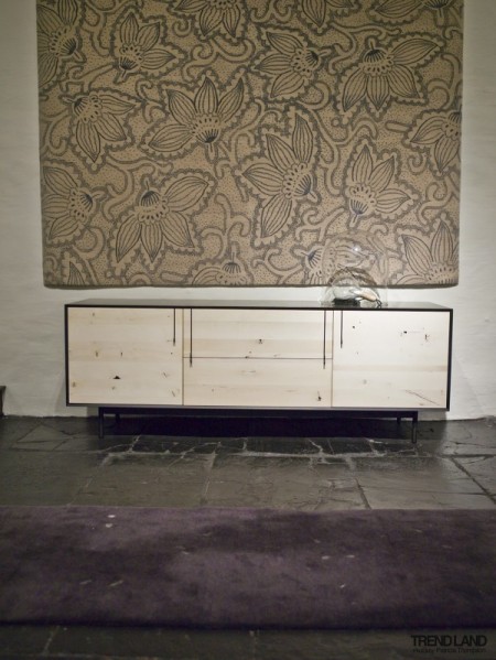
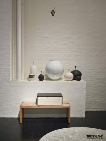
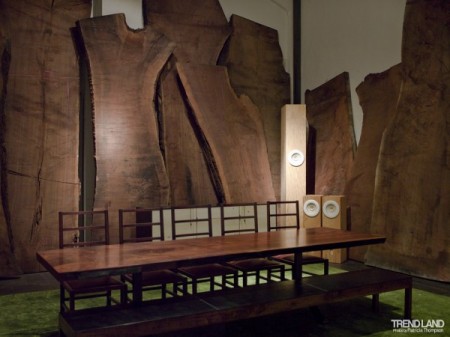
Tyler Hayes’ furniture label BDDW is a favorite of mine. The prices are — as with nearly all well-designed furniture — off the charts, but it’s always fun to look. I haven’t had a chance to check out their SoHo, NYC showroom in person but Trendland has a nice gallery by Patricia Thompson (who also has some great shots at her Flickr) detailing the interior.

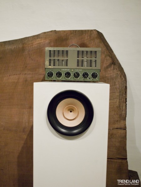
I’m getting a rustic-take-on-Dieter-Rams vibe from that second one. Really nice stuff.

Building a Site with Squarespace


I’ve written posts on Content Management Systems before (Cargo Collective, Indexhibit) and I figured it was time to round out my overviews with a look at Squarespace. My personal site runs on Cargo, but I’ve built a few client sites with Squarespace and find it to be a really enjoyable and extremely easy way to design a website.

Squarespace is a fully hosted, completely managed environment for creating and maintaining a website, blog or portfolio. Since its inception, Squarespace has blossomed into a product that powers tens of thousands of sophisticated websites for businesses, bloggers, and professionals worldwide and currently serves hundreds of millions of hits per month.

Noteworthy Features

-Building a site with Squarespace is very intuitive. You can easily go through the whole process without ever catching a glimpse of any code. Like Cargo, if you know even the slightest bit of HTML/CSS you can easily tweak the site to look unique and not easily identifiable as a Squarespace template etc. The basic design view allows you to edit everything in real-time; so if you change the point size of the “body copy”, you will see it update immediately after you slide the little font-size slider. Feels a lot like Firebug in this way, except you aren’t manipulating code, you are manipulating clearly laid out values for all of the page elements. You just have to remember to hit “save changes” after every change you make. I constantly forget to do this.

– Fully functional blog platform. Like many CMS sites, Squarespace works really well as a blog or portfolio site. It’s very easy to post entries, edit old ones, etc, everything you would expect. Once you have the design of your site locked in, it’s just as easy to maintain and update as it was to build. The interface for blog editing can feel a little clunky sometimes, though I think this is because I’m used to WordPress where each open entry gets its own page. Squarespace editing happens as an overlay to the page which feels slower (whether it actually is or not I don’t know).

– The backend of a Squarespace is very well done. Not only do you have access to just about every statistic you could hope for, you are also able to edit some of the more tricky part of your site design. Things like search engine parameters, meta data, and security permissions are all easily editable. It also looks nice, which is a plus.

– Helpful forum. I’ve had many issues (usually due to my own failings with attempts to customize my weird CSS) which I’ve posted to the forum and in each case, the problem has been solved quickly and correctly. I’m always pleasantly surprised.

– They have a slick iPhone app that allows you to post blog entries and check out site statistics (among other things) on the go. And it’s free!

– One important difference to note is cost. Many CMS platforms are free, Squarespace is not. They have a simple pricing structure, but like many sites, the cheaper options are essentially useless. For example, any option where you can’t use a custom URL is immediately off the table in my mind. I’ve found the “Business” option to be the most useful (the form builder is the main reason for this). The crucial thing to note is that Squarespace is hosting your site, so you’re not just paying for the CMS, you’re also getting server space. When you look at it like that, it’s a lot easier to justify a monthly charge. (Of course, you will also have to pay for domain name registration elsewhere. Kind of annoying to have to split this up.)

My Experience

As I mentioned, I’ve built a few sites with Squarespace. The most recent of which I hoped would be finished in time for this article, but unfortunately we are waiting on some of the final content to come through before launching. The one I will mention instead is aeolas.net, the website for the fake/real aeronautical research firm Aeolas International.

Basically I needed a quick site that could host a blog and quickly display information about the company. The construction of this particular site took about 6 hours. I attribute the speed of the creation to the ease of the Squarespace interface (as well as low page count and small amount of total content). I didn’t move terribly far from the initial template, but I felt like I was able to give the site a unique feel. The most fun aspect has been the contact form; I would have had no idea how to actually make one of these with code. The fact that I could just insert it into the site with the click of a button was pretty cool.

There were some hiccups here and there early on, but nothing too frustrating. The need to ‘save changes’ after every alteration you make can get pretty annoying, but you get used to it after a while. Usually if I had an issue, it was because I was trying to do something either A) impossible or B) the completely wrong way.

I’d highly suggest taking Squarespace for a spin. They offer a free 14 day trial, so at least get in there and muck around. Take the tour here.
iLemur


If you produce music or do any DJ/VJing you may have heard of the Lemur, a touchscreen device that allows you to design custom controller interfaces and transmit via OSC. I’ve always wanted one and it’s the first thing I thought of when they announced the iPad today. At $500 it would be a great deal compared to the Lemur’s nearly $2000 price point. You’d just need software and I assume the guys over at TouchOSC already have something cooking. (I used the TouchOSC interface elements to make the mock-up above)

All you musicians, DJs, and VJs out there: Would you buy an iPad to use it as a multi-touch controller? (Comment) I think it would make a great DAW controller, kind of like a customizable MCU or Tranzport. I guess the main issue would be the interface, I don’t really know if the OSC over WiFi would cut it as far as latency is concerned.

Now if there were just a Photoshop to OSC plugin, you could be running a custom interface via touchscreen.

Radio Dept+Jaga Jazzist+The Orb+Jacaszek


New album from The Radio Dept. called Clinging To A Scheme drops in March, the band has leaked one track, sounds really promising.

Yesterday Flying Lotus twittered that he loved the new Jaga Jazzist and also Psych-Electronic musician Calmer told me he’s beening listening to them a ton so I went out and bought their new album to find a stand out track to share with you and Book of Glass was a nice stand out track for me because of the drive and Stereolab like synth.

I recently did a Pop Ambient playlist on the blog of some of my favorite songs from each year of the 10 year old compilation and never really shared more about the compilation besides the other new song on Playlist #7 which was Brock Van Wey/BVDUBLest You Forget. I also have to share this track The Orb did which you may remember them from the Little Fluffy Clouds VW Beetle commercial.

My Polish countrymen Jacaszek definitely should have more songs on the blog then just this one, on this song Zal he does a magnificent and subtle job of cutting up piano parts and makes the piece a very interesting listen.

RIP Bose 901 V


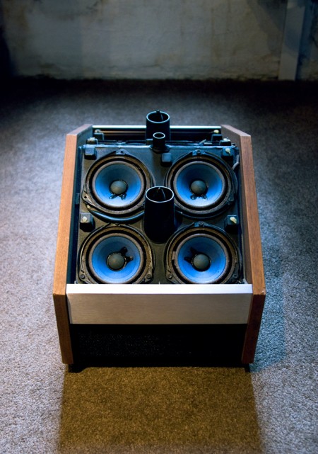
Opened up my Bose 901 Series V’s today and found that all the driver foam was completely disintegrated. So sad, such a beautiful set of speakers. Apparently you can re-foam them but seems time consuming and I’m not sure I have the skills anyways. Anyone have any experience with this? Mr. Coles?

FourTet+Caribou+JoyOrbison+TakenTrees

The new Four Tet LP came out today, its a pretty massive album to come out for a January release which is usually a slow month to put out albums. I tried to describe the opening song to the album as its like an organic cover by The Field of Sally Shapiro if she was fronting a Dream Pop group instead of doing Disco.

Here’s a preview/leaked single of the upcoming Caribou LP that’s coming out in March, Dan Snaith is sounding like Erlend Oye here in sections, really nice and upbeat but has a lo-fi touch to it, I wonder what this will do for Caribou live?

Joy Orbison may only have his second EP out and seeing how much talk there was about him in 2009 he will definitely make an impact on 2010 if and when he drops his LP for everyone. Its a nice take on Dubby Techno with small reference’s of Burial meets Pepe Bradock.

Now we completely change gears with a Southwestern feeling song by Taken By Trees, I know its maybe filed under indie rock but I can see slow disco heads playing the the crap out of this song.

The Haven of Contentment


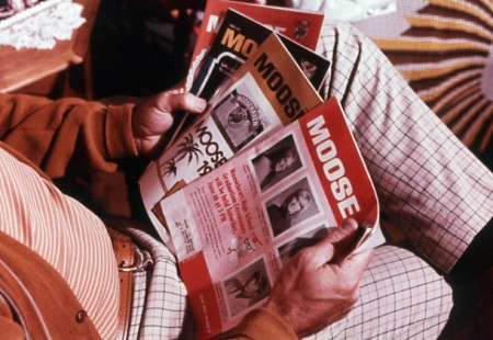
From Square America — the same people who brought us the excellent “IBM Slides: 1975” — comes this set of images depicting what seems to be a Moose Lodge-sponsored neighborhood watch program of some sort. I love hand-set type like that; so perfectly imperfect.

Also love the name, reminds me of this.

Vanishing Point

This is Vanishing Point, an absolutely mesmerizing video by Takuya Hosogane. There are some amazing compositions here, even when just viewed as stills. Seriously you could pause this video, print out half of it, and have yourself all the artwork you would ever need to decorate your place (or an art gallery…). The coolest part is how every single musical element effects the visuals — even the smallest little glitches cause something beautiful or cool to happen. All about the details. Song is awesome too; “LePetitPrince” by cubesato. Wish it was longer…

via today and tomorrow (one of my favorite blog names)

ISO50 Covers Series 2010: Vol.1

Cover art by S.Hansen


It was my birthday this weekend and I went out on a limb earlier in the week for a last minute HUGE favor from some close musician friends to do covers of some of my favorite songs or songs I thought the musician would do a cover of really well and surprisingly they agreed….20 of them! So here are the first 5:

Benoit Pioulard covers Hum: This is absolutely stunning, Benoit has a voice that i’d want to have if I could sing. I heard once that Benoit liked Hum so I asked him to cover a song by them and everyone should be more glad with this outcome.

Corbu covers Colder: This one was a touchy song since its probably one of my favorite songs of all time but I didn’t want an all electronic or post rock group to cover it so I asked Brooklyn’s experimental guitar duo to do it right and they did by taking it to a very unique and detailed level that i’m sure you’ll enjoy.

Alex Cornell covers Empire Of The Sun: You know him from his phenomenal work and posts on the blog and if you haven’t already seen him on youtube then here’s a very fine example of what he’s capable of creating musically.

A Setting Sun covers Tracy Chapman: A Setting Sun probably had the most challenging and off the radar cover to do but I thought a brighter doom metal approach might the only thing that would make this matchless pair up work and he killed it, especially check out how he gets to the end which is surprising after you hear the first few seconds.

Shigeto covers Boards Of Canada: This one is out there, as some of you may know Shigeto is a drummer that makes beats similar to Dabrye meets Caribou or something of that nature but loves to experiment so I thought why not see what he could do with a Boards Of Canada song since I know he’ll try to get crazy with it and not steer towards the guitar angle which I had to hear.

DOWNLOAD THE COVERS EP FOR FREE HERE

I hope you enjoy and collect them all. 5 more coming up next week.

Herman Miller Embody Review


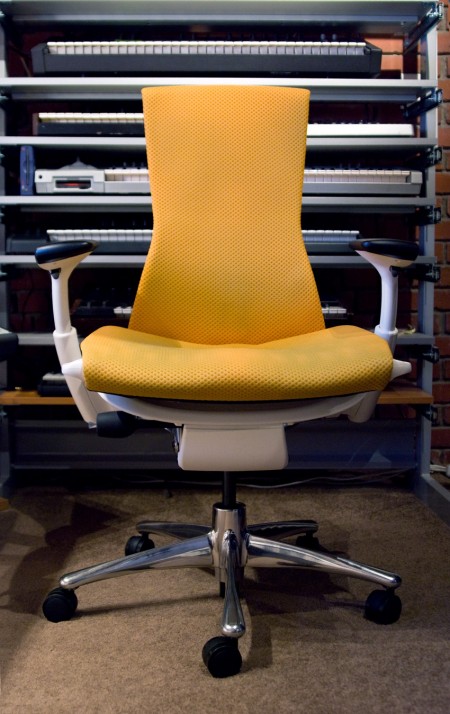
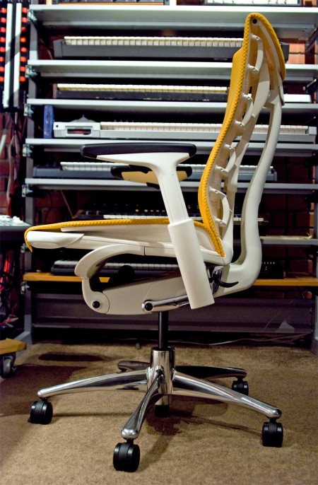
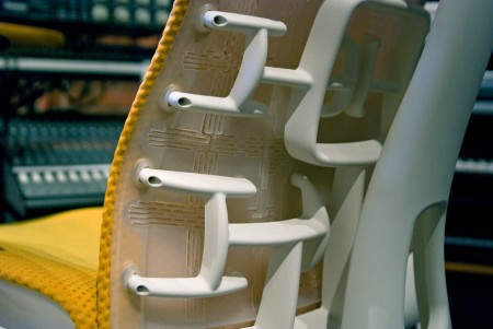
It’s been about 4 months now since I was able to get my hands on the Embody — Herman Miller’s latest flagship work chair — and now I feel like I’ve spent enough time in it to give a proper review. The Embody seems to be the logical successor to the throne of the ubiquitous Aeron chair and I have to say it’s a worthy one. I’ve had various repetitive stress related injuries throughout the course of my career so I’ve always been very sensitive to ergonomics. I’ve had Aerons and various other chairs but I’ve never really been truly satisfied with any of them. So it was with a healthy dose of skepticism that I approached my experience with the Embody.

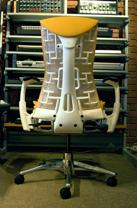
Before I got the Embody, I had a hard time finding any definitive information as to whether it did in fact live up to the initial hype surrounding it’s release. I guess chairs are pretty subjective, there’s never really a one size fits all solution. I heard a lot of people debating whether it was better than the Aeron and Humanscale’s Freedom Chair, and still more debating whether it was worth the decidedly high price point. But everything I had read pretty much went out the window when I sat in the Embody. It really is as incredible chair, it’s the first one I’ve had that I’m not constantly aware of. It acts almost as an extension of your body allowing for much longer periods of sitting without the common issues I’ve had with most chairs in the past. The unique seat back isn’t just there for looks, it does wonders for my back which was usually the biggest issue when working for extended periods. The arms are very flexible and can be easily dialed in for a perfect height which goes a long way to alleviate wrist pain issues. All in all, the fit and feel are top notch and honestly like nothing I’ve ever experienced. The bottom line is that this chair allows me to work longer and focus better. And the Embody is definitely a step up from the Aeron and light years beyond the Freedom Chair (which I really don’t like at all) or the Mirra (which many recommended as a cheaper alternative to the Embody).

As much as I love the Embody I do have a few issues with it, none are deal breakers for me, but you should be aware of them if this chair is on your short-list. First up is the design. Yes, I ordered the orange/white which in retrospect was a mistake. It can really overwhelm the space visually. The chair is also rather large so between that and the color, it certainly is a presence in the room. I have since seen the black on black version which is much more subtle and highly recommended. Second is the mobility of the chair. In the studio I have to move around from station to station a lot and the sheer weight of the Embody makes this difficult. The thing is build like a tank which is great for durability, but it’s not a chair you’re going to be gliding around the office in. Or course, this would be less of an issue on hard surfaces, but the downstairs at the studio is carpeted and you almost have to get out of the seat to move it around. I do have the optional chrome base and I would imagine the standard plastic base is a bit lighter. Finally, at around $1100 (which is at least better than the insane introductory price of $1700 and can be much less with an industry discount, see below) it is prohibitively expensive. But as they say, “buy it nice or buy it twice”. As someone who makes a living sitting in a chair all day it’s not hard to justify spending a chunk of that living on a high quality chair. It allows me to get more work done and avoid injuries that in the past would put me out for a while making it well worth the premium.

All things considered the Embody is a huge winner in my book. It’s the most comfortable and functional chair I’ve ever used and will be in my studio for a very long time.

I am told that discounts are available on the chair through Herman Miller. I got mine direct and at the time they had a promo deal going on that brought the price down to $800 fully loaded. You might try contacting them directly to find out whether they have any promotions going on or whether you can get a designer discount.