NYC LPR Show Ticket Giveaway

lpr-giveaway
Update: Cesar & Moira won, thanks everyone for playing. See you tonight.

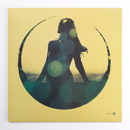
We’re giving away 2 tickets to tomorrow night’s show at Le Poisson Rouge in NYC. The first two people to answer the following question correctly will each get a free ticket:

Name the B-Side of Casino Versus Japan’s 2001 10″ release on Wobblyhead.

Enter your answer in the comments of this post along with your email in the address field (email is not publicly visible). Please enter only if you actually intend to come to the show.

Good luck, see you tomorrow night… (set time is 10:30)

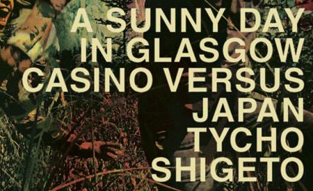
A Sunny Day in Glasgow, Casino Versus Japan, Tycho, Shigeto
Live @ Le Poisson Rouge – 158 Bleecker St. NYC


More Info / Buy Tickets

Mark E + Dabrye + Emperor X + J-Wow

Fever Ray
If you follow the blog you’ll noticed a repeat talented culprit always bringing me to a daze, Mark E is the king of dizzying slow repetition, I can have his songs on repeat for hours maybe even days.

The NEW Adult Swim Compilation is now available for FREE to download, It includes remixes of ATL rap artists by Dabrye, Flying Lotus, Prefuse 73, Michna, Mad Decent, Starkey, Memory Tapes, Salem, etc. If you need to get rowdy in an Escalade this weekend then here’s your soundtrack.

And now for something completely different, keeping the folk pop ball in the air while the end of the year draws closer is Emperor X, I like this song but I wouldn’t at all if it wasn’t lo-fi, definitely a nice wake up song if you get a chance to make it to a cabin this winter in the woods.

I feel like I shouldn’t post this song because overall I don’t really like it, its wanting to be clubby puts a bad taste in my mouth but the downtime with Fever Ray’s voice made it bearable, I hope you can wade thru the garbage and find the beautiful glimpses.

Good Guy Mikesh & Filburt – Cleaning Up (Mark E Remix)

[audio:cleane.mp3]

Goodie Mob – Is That You God? (Dabrye remix)

[audio:goodied.mp3]

Emperor X – A Violent Translation of the Concordia Headscarp

[audio:empx.mp3]

Fever Ray – Now’s The Only Time I Know (J-Wow Mix)

[audio:feverjay.mp3]

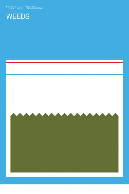
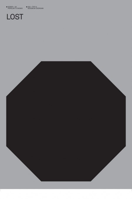
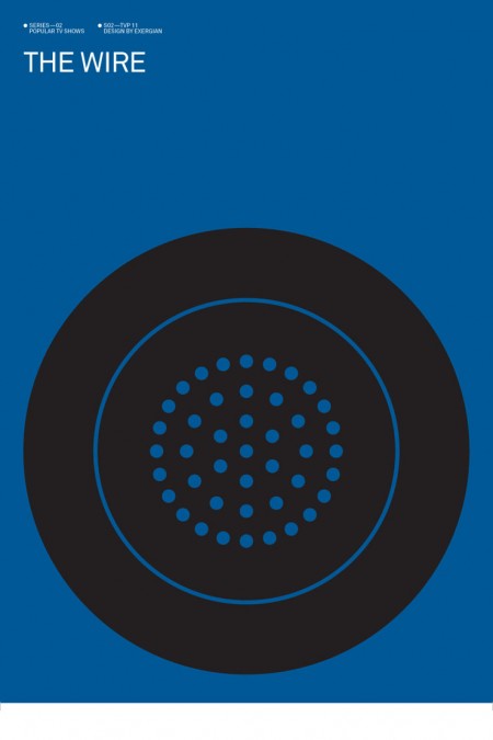
Albert Exergian: Minimalized TV

3359
3366
3356
3353
3344
3352
3343

Update: Thanks Wilamagamid for pointing me over to Blanka, where you can purchase these prints.

Albert Exergian created this series of posters depicting popular television shows boiled down into their most simplified forms. He describes them as “A HUMOROUS VIEW ON TV CULTURE” but they don’t strike me as being particularly humorous. Intriguing is a better word, Exergian’s sense of efficiency is uncanny. This would make a great set of screen prints, if only he were selling them. I guess he might have some legal issues though. Although, he’s only really putting words on a page; does writing “Dexter” (my favorite poster by the way) constitute copyright infringement? I hope not. Anyways, if anyone knows where to get prints of these, please let me know.

More posters at Albert Exergian’s portfolio (scroll down)

Update: Found better images over at Blanka, but the following gripe still stands! Major tangent here: Sorry for the white lines around the edges, I got these directly from Exergian’s site and that’s how they came. This brings up a HUGE gripe I have with Photoshop: If you don’t flatten a file before you resize it, the edges tend to show through to the transparent background so when you save as JPEG, it ends up with these annoying white lines. I have no idea why this is so, but it is. I guess it’s time for another “Dear Adobe” post.

Color of the Year

pantone
Pantone has just announced that PANTONE® 15-5519 Turquoise is the Color of the Year for 2010. I gather that they are predicting its heavy saturation throughout the fashion and interior design worlds, but I’m not entirely sure what “color of the year” is supposed mean. Besides gut feelings and casual observations, I’m not sure how on earth a color of the year would be chosen. Perhaps there is some magical color metric that I am not aware of. Personally I think the color of the year is grey but that might be a little too depressing for Pantone. Last year was yellow after all…

An interesting aspect of this story that I’ve been struggling with is which version of PANTONE® 15-5519 to trust when you come across it reblogged on the web. I’ve seen some pretty divergent interpretations of the color that are clearly the result of some wacky color profile. Even the one I’ve saved above looks a little darker than Pantone’s website to me. Anyway, you get the point, turquoise is the color of the year. Now paint your walls and buy a new shirt.

Combining the serene qualities of blue and the invigorating aspects of green, Turquoise evokes thoughts of soothing, tropical waters and a languorous, effective escape from the everyday troubles of the world, while at the same time restoring our sense of wellbeing.

More info here.

Tycho – Coastal Brake Out Now

ISO50-Tycho-Coastal-Brake-12EP-Outnow
The new Tycho 12″ EP, “Coastal Brake” is officially out in physical (12″ Vinyl+Digital) and Digital (MP3+WAV) formats. You can get it directly from The ISO50 Shop, iTunes, or your favorite online retailer. There are very few copies of the limited edition 12″ vinyl (which includes the digital edition MP3+WAV) left, those can be had here.

On a related note, after their Forkcast post last week, Pitckfork did a full review of the track this week. Check it out here.

For those of you who already ordered the vinyl, those began shipping yesterday (some orders going out from Merchline). You should have received a download code with instructions for getting the digital files as well. If you bought the vinyl at a show prior to the official release, email talk (AT) ISO50 with the UPC code from the back of the cover and we’ll send you a download coupon.

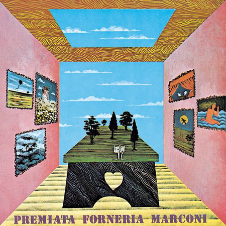
Premiata Forneria Marconi – Per Un Amico

Premiata Forneria Marconi - Per un Amico

As far as Italian prog goes, PFM are the poster children. I’ve yet to find another group in the genre that makes it so smooth and buttery. The segways between movements (or lack there of, generally) is to die for. This album fails to leave my rotation.

There’s not much to say. The music speaks for itself. There’s quite a few movements, so give it a full listen.

If you’re looking for similar stuff, be sure to check out:

  • Locanda Delle Fate’s “Forse le Lucciole Non Si Amano Più”
  • Camel’s “Moon Madness” (England)
  • Grobschnitt’s “Rockpommel’s Land” (Germany)

Premiata Forneria Marconi – Appena un Pò (1972)

[audio:pfm_appena-un-po.mp3]

Premiata Forneria Marconi – Per Un Amico (1972)

[audio:pfm_per-un-amico.mp3]

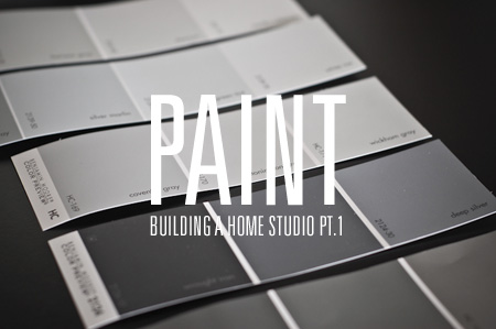
Building a Home Studio Pt.1: Paint

iso50-homestudio-1
I am in the process of moving into a new apartment in San Francisco. Amidst the endless furniture shopping, cleaning, painting, and waiting during absurdly long delivery-time windows, I have been planning the construction of the ultimate apartment-based graphic design studio. As I’ve always set up shop in a room with another purpose (currently my studio also serves as my bedroom and recording area), the prospect of having a dedicated design room is very exciting. I figure this move will be a good opportunity to really take my time and build the perfect work room — from the paint on the walls, to the the table tops and filing cabinets — every detail will be meticulously considered.

The room itself is 11.5′ x 9′, plus a generous closet. The purpose of the room will be a place where I can work, file, cut, store, display, print and create. Basically a little graphic design super room. Unfortunately there will not be space for my music set up, so my guitars are going to have to bunk with me in the bedroom. You’ll notice there is also a small window. Ideally, for consistency reasons, I would prefer to have no window — but I’ve come around on the issue in hopes of the keeping studio morale high…

(more…)

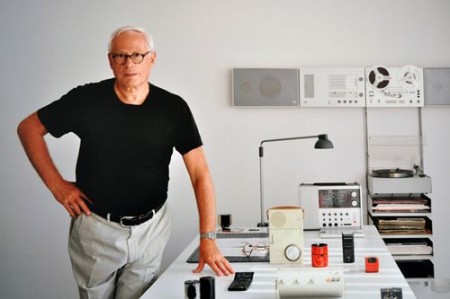
Dieter Rams Interviews

6a00d8341c796653ef0120a6f628c6970b-500wi

Mid-Century Modernist posted a couple interviews with Dieter Rams. One is by Gestalten and the other by The Design Museum. It’s great to see this pioneer of product design is still getting the recognition he deserves.

By the way, can you believe this guy is still around? He’s the true definition of a living legend. That’s one of the coolest things about graphic design, our heroes don’t overdose on heroin at 27. They seem to live long, healthy lives, maintaining productivity well into later life. Must be all the sitting, or maybe all the designer reading glasses.

“Weniger, aber besser”

Via The Mid-Century Modernist

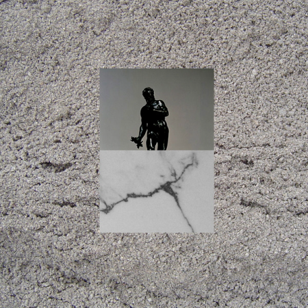
Jonsi+Fleet Foxes+Pantha+Gatekeeper

Gatekeeper
Jónsi of Sigur Ros is back with a more daily listenable LP but still keeps the classic Icelandic sound that he’s known and loved for. This song gets me excited to think there might be more days ahead that will make me what to put on albums by Jónsi.

Now with David Letterman and Rolling Stone fame I wonder what Fleet Foxes has has in store for us in 2010, I hope we get something like Blue Ridge Mountains, it has that Midlake, Band Of Horses and Choir Of Young Believers touch with infectious piano and strumming.

One thing I like to ask certain boutique record stores is what is the most surprising selling record and a couple times the clerks have said Pantha Da Prince, Etherea which was in East Village in New York told me they went thru over 200 copies which blew my mind. Well his new release is on Rough Trade and the only song i’ve heard is pretty interesting, a lot of random bells, glasses, and maybe even ornaments being played over Bola like IDM techno, looking forward to the rest of the LP.

If Hollywood decides to keep butchering up our childhood favorite cartoons then I hope when they get to He-Man they atleast get Gatekeeper to do the soundtrack, they’d be perfect for it, its like Moroder-esque with these more distort organic field recordings during the epic parts, looking for more from these guys.

Jónsi – Boy Lilikoi

[audio:jonsi_boy.mp3]

Fleet Foxes – Blue Ridge Mountains

[audio:ff_blue.mp3]

Pantha Du Prince – The Splendour

[audio:pdp_s.mp3]

Gatekeeper – Forgotten

[audio:gate_for.mp3]

Workspace: Parliament Design, Portland

parliament6
parliament4
parliament7
parliament5
parliament1
parliament8
parliament2
parliament3
parliament9

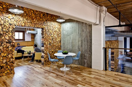
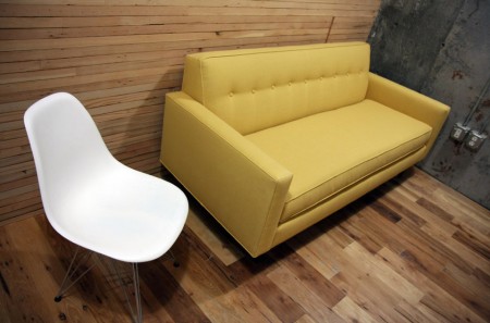
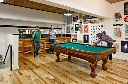
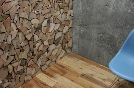
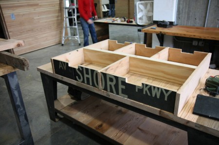
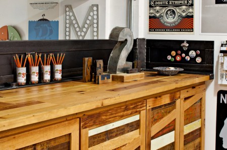
I just got back from Portland tonight, I had a great time up there, thanks to everyone who made it out Friday for the show. I’ve always been impressed by Portland’s overall design sensibility, they have that very distinct kind of industrial aesthetic that is the hallmark of the Pacific Northwest. Portland based Parliament Design’s studio embodies that ethic to a tee. The reclaimed warehouse space has been meticulously crafted into a living, breathing workspace that oozes creativity. The really striking part is that most of the space was purpose-built for the studio from reclaimed materials and design relics. More pictures here.

I’ve never taken the aesthetics of my workspace very seriously, but seeing this makes me want to reconsider. I do envy pure design studios like this, it seems much easier to make a space look clean and minimal with just computers and graphic design tools. Trying to house my music and design studio in the same space has always posed a challenge, I end up feeling crowded by all the equipment and it’s hard to create a layout that’s both accessible and clean. Hopefully someday I can split them up, but until then I will have to look at pictures like these and be jealous.

How about you? How important do you feel the look and layout of your workspace is to your overall creativity and productivity? Sound off in the comments »